Recently I started playing with one interesting dataset. I had dataset of 150k rows that comes from one big European bank. I was interested to figure out if there is any correlation between monthly salary and default probability of borrower.
First thing that I tried to chart was histogram of monthly salary. Next thing I tried to do was to show histogram with default/non-default borrowers separated with different colour.
Since dataset is strictly confidential, let's artificially create data set for testing purpose.
import pandas as pd
import numpy as np
import plotly.express as px

import plotly.io as pio
pio.renderers.default = 'browser'

x = np.random.exponential(size=100000, scale=20) + 50000

df = pd.DataFrame({
            'monthly_salary': x,
            'default': np.random.choice([1, 0], size=len(x))
            })

# Purpose of this column is to help us count number of clients
# that belong to each bin group.
df['help_column'] = 1
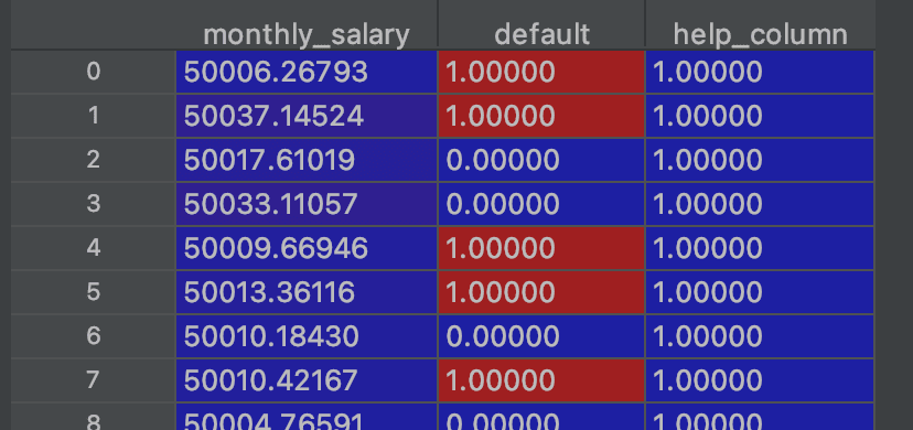
This is how generated table looks like.
Idea here is to create histogram of monthly salaries. There are two ways, one quicker, and another where we have more control over what is going under the hood.
Let's start with easier approach.
fig = px.histogram(
    data_frame=df,
    x='monthly_salary',
    nbins=200
)
fig.show()
This is how chart looks like.
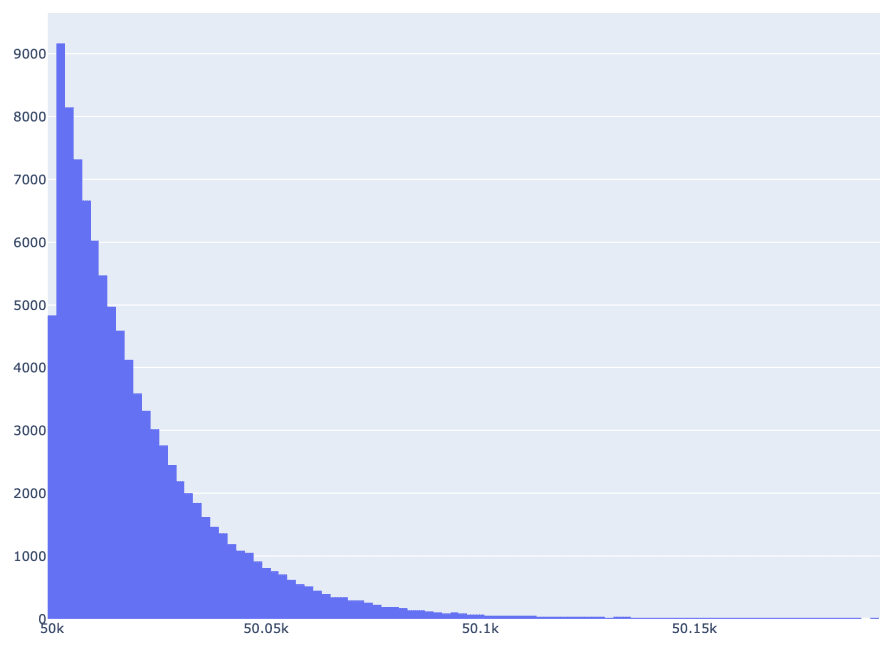
In this case, bins are automatically created in Plotly Express function. We do not have control about size of bin, it is created automatically. We just supplied number of bins.
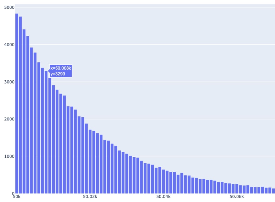
Another approach, which is a bit more complicated, is to use pandas functions to create bins of arbitrary size. After that, we will classify clients into corresponding bin groups.
bins_ = pd.interval_range(start=50000, end=50100, freq=1)
df['monthly_salary_BINS'] = pd.cut(x=x, bins=bins_)

# Idea is to have lower left boundary instead of upper-lower bound
# It is easier for plotting
df['monthly_salary_BINS_left'] = df['monthly_salary_BINS'].apply(func=lambda x: x.left)

xx = df[['help_column', 'monthly_salary_BINS_left']].groupby(by='monthly_salary_BINS_left').sum().reset_index()

fig = px.bar(
    x=xx['monthly_salary_BINS_left'],
    y=xx['help_column']
)

fig.show()
Let's take a look at this chart.
...
What if we want to have one histogram for default and one for non-default borrowers?
Again, there are two approaches.
Let's start with easier again.
fig = px.histogram(
    data_frame=df_filtered,
    x='monthly_salary',
    color='default',
    nbins=200,
    barmode='group'
)
fig.show()
Here is newly added chart.
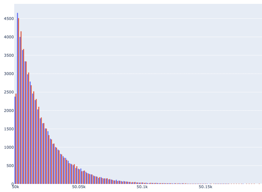
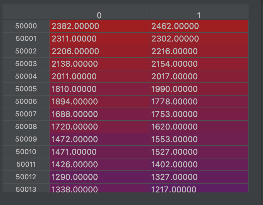
Second way of plotting histogram requires pivoting data. Idea is to create cross tabulation first, and then to plot data.
Personally, I prefer this way. It gives me more control, I can clearly see table that is underlying chart and consequently I can do quality assurance timely.
Also, this way is more efficient. Not all data is going to be sent to browser. Only aggregated data will be stored on front end side, which is significantly lower amount.
df_pivoted = pd.pivot_table(data=df,
               values='help_column',
               index='monthly_salary_BINS_left',
               columns='default',
               aggfunc='sum')
fig = px.bar(
    df_pivoted,
    barmode='group'
)
fig.show()
Pivot table that is underlying chart.
Here is amazing chart.

I hope you have enjoyed this tutorial. Happy cooking and see you in next plotting endeavour :)

Top comments (0)