
What is graphic design?
Graphic design is creating visual images, symbols, or pictures that easily translate a message to whoever sees it. Graphic design means creating art where the meaning behind it is clear and concise. The goal of graphic design is not meant to confuse consumers, but rather it is meant to appeal to the human eye and captivate consumers. It’s a fun and enjoyable process where anyone’s creativity can freely be expressed.
Graphic design is used to create logos, websites, and icons--all of which you can design on your own to make a perfectly unique website, however knowing how to begin might be challenging.
Examples of graphic design: From creditreconstructed.com
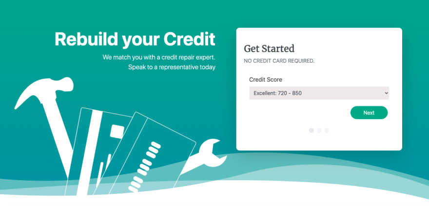
This website features a graphic design of tools and credit cards which are easily identifiable and neatly presented on the website.
What is an icon?
Icons are essential in effectively translating concepts and ideas without words so people can easily understand the messages being conveyed. Every day we look at different icons that tell us what application on our phones we’re using or which direction to head towards when walking down a street. Learning how to effectively design an icon for user interface platforms assists in ensuring easy navigation and understanding what a website is presenting.
Examples of good icons versus bad icons:


The scissors are easy to identify as such, while the icon on the right is harder to decipher. It looks like a gear but the hole is off-centered the color does not represent that of an actual gear.
What are the elements of designing an icon?
There are six key elements in icon design: (1) clarity, (2) legibility, (3) alignment, (4) concise, (5) consistency, and finally (6) creativity. Considering these six elements will help guarantee a simple and effective icon, but the terms themselves might be confusing, so let’s break them down.
What is clarity?
When you see a confusing icon, you first try to guess what it could be and go through all the possibilities and eventually reach a conclusion as to what the icon is--but this is not helpful for users and consumers. Additionally, icons should not represent underlying meanings or metaphors as that can once again confuse the user.
An icon that can easily communicate a concept within seconds of looking at the image means the icon presents clarity. The icon should be simple and represent concepts that many people can easily recognize such as a music note icon representing music; it is a basic icon yet almost everyone across the world can recognize what it means.
Example of a clear icon versus an unclear icon:
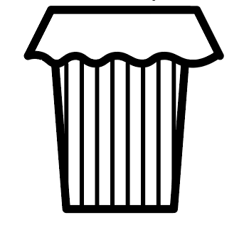

It is clear the trash can represents trash but the spiral could have multiple meanings, making it harder for users to understand the purpose of the icon.
What is legibility?
Legibility means the icon is clear, easy to read, and does not need deciphering. Icons with too many fine details or blurry edges make it difficult for users to easily view and understand what the icon represents. For example, a building has intricate details and designs, but when designing a building as an icon it is critical to leave out the details and focus on the main features such as windows and a door. It’s okay if fancy details are not incorporated into the icon as even the simplest details are just as effective.
Example of a legible icon:

What is alignment?
Alignment means an object is perfectly symmetrical and is in the correct position with no imbalances. A well-aligned icon creates a simplistic and clean look which ultimately assists in making the icon easy to understand for users. To assure proper alignment, it is easy to use various shapes (circles and squares) to make your icon so you can always make sure everything is balanced.
Additionally, the program you use to design the icon would likely have a grid, but if you are designing icons by hand either sketch it on graph paper or keep a ruler nearby.
Example of an aligned icon versus an unaligned icon:

What is concise?
Concise means brief. Having concise icons is also effective as it is best to simply express ideas and thoughts rather than over-complicate them. Even though one way may sound “prettier”, the same message can be translated with simple words which helps avoid any confusion.
Similar to legibility, try to avoid fine details and focus on the key features that represent the image you want as your icon. You could design a camera icon with buttons, stickers, flashes, and other small details or the same message can be delivered with just the camera’s key features.
Example of a concise icon:

What is consistency?
Consistency means there is a recognizable pattern between all the icons or images. If you happen to be designing a dozen icons for your project, remember consistency is essential! Designing uniform and matching icons allows for a nice flow and pattern to occur on the website. Try to think of a specific theme you want, such as all the icons being black or all having rounded edges. The possibilities are endless and you get to choose!
Example of consistent icons:

What is unique?
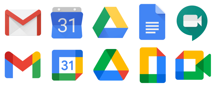
Unique means the design is different and never been seen before. Designing unique icons also helps in captivating more users. Not only that, but it is exciting to design icons exactly how you desire! A lot of businesses use unique icons that allow users to automatically know the icon belongs to such a company. Apple, Twitter, and Google as examples all have creative, easy-to-understand, and unique icons which have allowed users to easily identify the icon with the business.
Example of Google’s unique icons: From Google.com
Even if you are new to icon design or have been designing for years, these are still important concepts to recall in order to consistently and effectively design icons that are easy to understand for the user. Feel free to express your creativity and as always enjoy and learn from it!

Top comments (0)