Highlights
First, we recommend folks checkout our latest update on the Component Lifecycle Process and our Component Roadmap as it's been updated for FY23Q2.
Here's what we'll cover in this post:
- Added a dedicated shim package for v8 to v9 migration
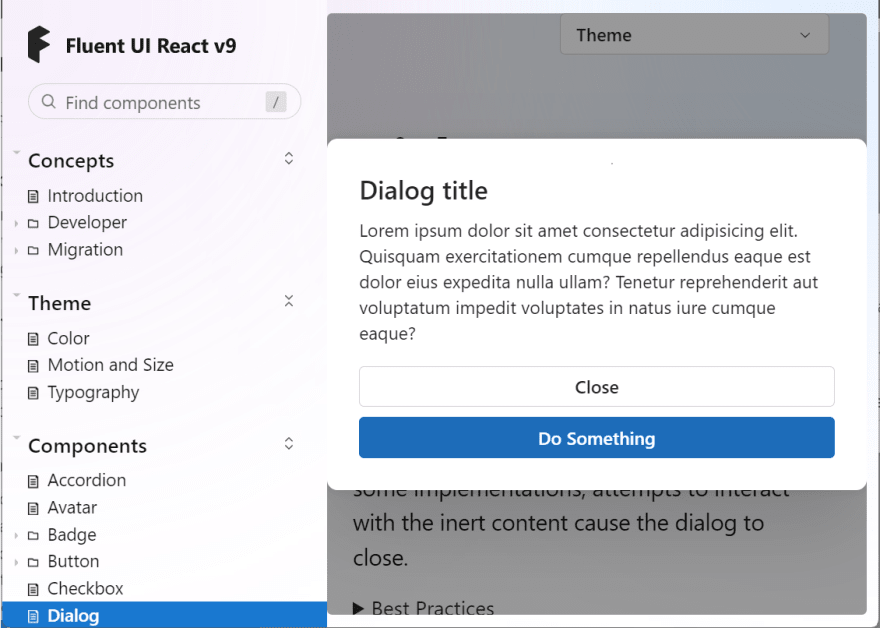
- Released new components in Stable: Dialog 🎉
- Added new components in Preview: Table, Field, AvatarGroup, Persona, Toolbar
- Check out a Fluent UI React v9 based Teams App demo at Ignite 2022
Migration shims
We know a lot of customers are migrating from Fluent UI React v8 to v9 and we're trying to balance the amount of compatibility shims we build verses building new features in v9.
So we've elevated the Migration section in documentation to cover some of the common migration shims when moving from v8 to v9.
Also we've released those shims in a separate migration package to help you along the way.
To set expectations, at this time we don't intend to shim every component in v8 (as we want customers to adopt v9), but we understand the need to having a compatibility layer for time-sensitive feature development.
Let us know if there are common migration issues you've been hitting so that we help smooth out the experience.
New components in stable
Dialog
This is our latest component to be promoted to stable!
The Dialog provides the fundamental building blocks components needed to create a Dialog experience:
- Dialog
- DialogTrigger
- DialogSurface
- DialogTitle
- DialogActions
This allows you to easily compose an experience for specific applications to customize the UX.
It also provides a minimum breakpoint to reposition content within the DialogActions.
Give it a try and let us know what you think!
New components in preview
Note: These components are currently under development and are subject to change.
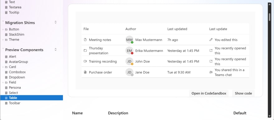
Table
This component has been a long time coming and we're making great progress.
Leveraging the composition-based principles already in the UI library, the Table component is a way for developers to build a "DataGrid" like experience and compose in the functionality that's only necessary for your application.
We've been experimenting with a hooks base approach that allows you to add things like sorting, filtering, and selection. Meaning, you can spare a little bit on bundle size by including only the things you want.
Stay tuned, when we're ready, we'll provide a more in-depth post on using the table component in the future!
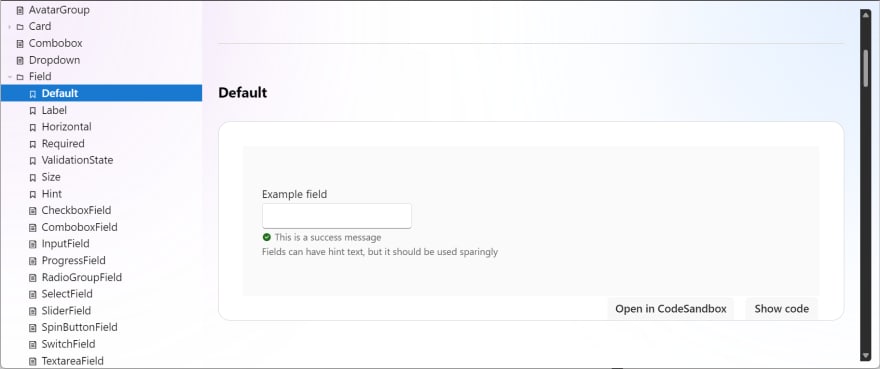
Field
This component is the next iteration in supporting form based scenarios.
If you recall my previous post on using Fluent UI React v9 with Formik and Yup, I had to implement my own "ErrorText" component to handle the validation UX.

Fluent UI React v9 with Formik and Yup
Paul Gildea ・ Jul 15 ・ 3 min read
Now with the addition of the Field component, that validation UX is provided straight out of the UI library.
Coming up, an updated post once field hits stable. For more details on the rest of the preview components, head over to: https://react.fluentui.dev
Fluent UI React v9 at Ignite 2022
This year, I had the opportunity to demo a Teams App leveraging Fluent UI React v9 to extend it across M365 to Outlook and Office.com.
Be sure to check out the breakout session, from low code to pro code: building and buying collaborative apps to power an evolving workplace to see Fluent UI React v9 in action.
If you've reached the bottom of this post, thank you! Our team is proud of the work put in this month and we welcome your feedback.
Have questions? Don't hesitate to reach out on:
GitHub: https://github.com/microsoft/fluentui
Docs: https://react.fluentui.dev
Twitter: https://twitter.com/fluentui
Enjoy!


Top comments (0)