
Hello everyone! 🧡
Before we start Let’s stay connected.
GitHub⭐LinkedIn and also follow me here for more useful blogs.
In this article, we will learn what gradients are and also types of CSS gradients.
Let's get started🤩

What is a gradient?
Gradients are CSS elements of the image data type that show a transition between two or more colours. Gradients are very much important as they give good UX to the users. The most popular use for gradients would be in a background element. Backgrounds have a massive impact on a website’s design. So I hope this blog will help you to make beautiful coloured gradients.
The term background-image refers specifically to gradients. Because gradients have a stacking order, you can think of them as layered background images
Types of Gradients ✨
There are three types of gradient functions in CSS:
- Linear-Gradient (created with the linear-gradient() function)
- *Radial-Gradient *(created with the radial-gradient() function)
- Conic-Gradient (created with the conic-gradient() function).
Linear Gradient
- A linear gradient creates a band of colours that progress in a straight line.
- A linear gradient is made up of two basic components: direction and color-stops.
- To create a gradient, You must have at least two colors, but you can have as many as you want.
1. Direction
// Default direction will be from top-bottom if no direction is given
  background-image: linear-gradient( #fc00ff, #00dbde);
// From left to right
  background-image: linear-gradient( to right, #fc00ff, #00dbde);
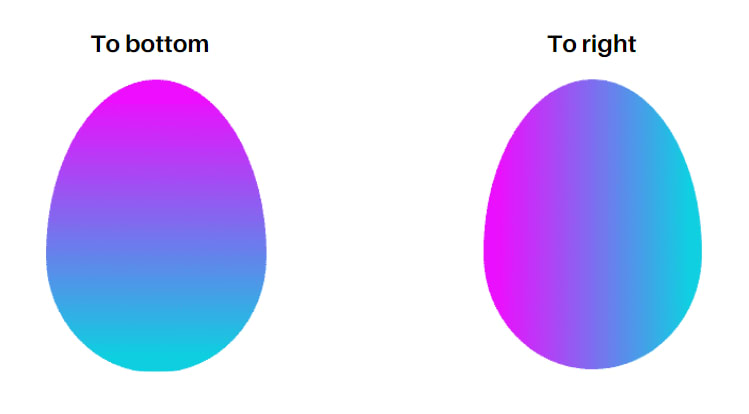
In the same way, we can change their rotation by specifying a direction.
// Diagonally, From corner to corner
background-image: linear-gradient( to bottom right, #fc00ff, #00dbde);
// Specific angle
background-image: linear-gradient( 70deg , #fc00ff, #00dbde);

2. Color stops
- Color stops define what colors make up the gradient and optionally, where to put them.
- If you specify the location as a percentage, 0% represents the starting point, while 100% represents the ending point
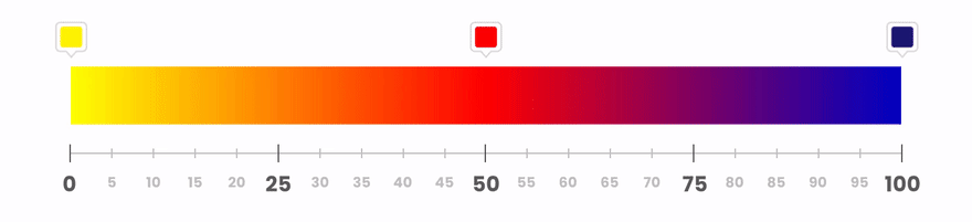
background-image: linear-gradient(#eb622c ,#fc00ff 70%, #00dbde);

Radial Gradient
- Radial gradients are similar to linear gradients, except that they radiate out from a central point
// Simple Radial-gradient
  background-image: radial-gradient(#1CD8D2,#ff77cd);
// Radial color stops
  background-image: radial-gradient(#1CD8D2 12px,#ED4264 30%,#7474BF 60%);

Conic Gradient
- Creates an image consisting of a gradient with color transitions rotated around a center point.
// Simple Conic Gradient
  background: conic-gradient( #EECDA3, #EF629F);
// Positioning the conic center
  background: conic-gradient(at 10% 30%, #fffb00 20%, #e246cd 30%, #27f1f1 40%);

Bonus ✨
Here are some websites which provide a huge collection of gradients where you can copy CSS codes.
My work here is done, We have Hundreds of beautiful colors out there. Now it's your work to use your creativity and make beautiful Gradients for your websites.🥳🧡
That's all for today! 😁 You reached the end of the article 😍
If you found this article helpful, please like and share it 🧡.

Don’t forget to share this article with your friends or colleagues. I'm Ramesh Chandra pola who loves to build projects and share valuable tips in my Blogs. Feel free to connect with me on any of the platforms below!🧡
GitHub⭐LinkedIn

Oldest comments (0)