Today I came across Proportional Resizing with CSS Variables written by Ahmad Shadeed. He shares how to control element dimensions and aspect-ratios via CSS custom properties.
The post includes the following snippet:
.rect {
  --size: 10em;
  --aspect-ratio: 0.5625;
  width: var(--size);
  height: calc(var(--size) / var(--aspect-ratio));
}
The rect class-rule uses two custom properties to calculate the element height depending on --width and --aspect-ratio using calc.
How to use fallback values for custom properties
This snippet is already pretty smart. I see two possible improvements:
- it only works with absolute dimensions
- it hard codes the values in the CSS rule itself
What if we could create a container class that defines default custom property values that can be overwritten and adjusted if needed? It could be a reusable CSS class (you might even say a component class 🙈) that works out of the box and is configurable.
The HTML could look like the following:
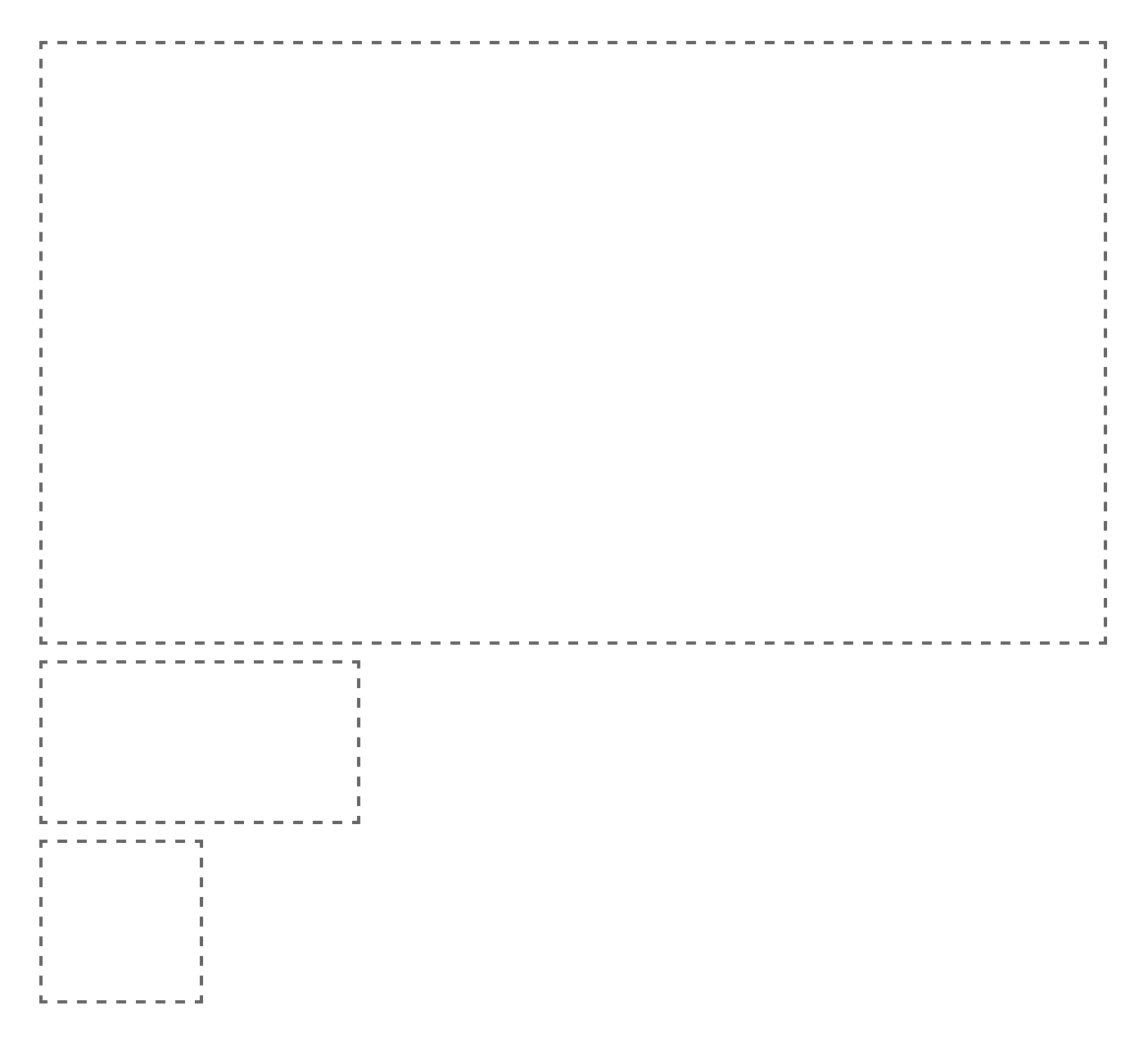
<div class="aspect-ratio-container"></div>
<div class="aspect-ratio-container" style="--width: 10em; --aspect-ratio: 0.5;"></div>
<div class="aspect-ratio-container" style="--width: 5em; --aspect-ratio: 1;"></div>
aspect-ratio-container uses default values (--width: 100%; --aspect-ratio: 0.5625; – 100% width and a 16:9 ratio) but you can configure these values with custom properties if needed.
The CSS class including the fallback logic looks like this.
.aspect-ratio-container {
  /* define default values */
  --w: var(--width, 100%);
  --ar: var(--aspect-ratio, 0.5625);

  width: var(--w);
  /* use padding-top because it is relative
     to the element width in case percentages are used */
  padding: calc(var(--w) * var(--ar)) 0 0;
  border: 2px dashed #666;

  > * {
    position: absolute;
    top: 0;
    left: 0;
    right: 0;
    bottom: 0;
  }
}
I'm thinking a lot about this pattern. Having pre-defined custom properties to configure components makes a lot of sense in my opinion. I didn't wrap my head around it completely, though.
How configurable should classes become in the future? Could we formalize conventions around this pattern? If you have ideas or opinions on this topic, please share them with me. :)
Here's a quick CodePen to see the aspect-ratio-container class in action, and you can look at Ahmad's post, too. 👋

Oldest comments (0)