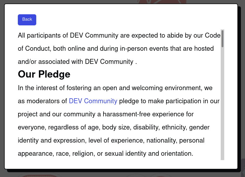
I just joined this site and I wanted to give a thumbs up to dev.to for having short and understandable Terms of use and code of conduct: https://dev.to/terms https://dev.to/code-of-conduct 👍
Whenever you register or sign-up to something online the term of use feel like you are about to crack open the Bible, the Baghavad Gita or the Iliad. It's long, it's hard and it puts you right to sleep.
Why is that? No seriously, why is that?
Here is the thing : those terms are an agreement between two parties. I agree to it and the owner of the website on the other side agrees to it. Both parties should be on an even level.
When the terms of use are long and in and with a legalese wording, whoever is on the other side basically says "My rights are more important than yours. Your ability to understand this binding agreement does not matter to me. I crafted this to my advantage. " How rude!
Another question you might have is : who cares? To be honest with you. Nobody cares. It's just an inconvenience. Until there is some disagreement that is. That's the thing with legal agreement : it doesn't matter a lot until it matters... a lot.
It's like prenup agreement. You don't get married expecting divorce. But if it happens the prenup sure becomes important. Just ask Britney Spears. She didn't want a prenuptial agreement when she married Kevin Federline. She loved him after all! Her lawyer insisted. It sure came in handy when she did divorce https://www.standard.co.uk/showbiz/exclusive-every-detail-of-britney-spears-prenup-and-ps65-million-fortune-7278314.html . So I guess the moral of the story is : do get lawyers to craft a very specific written in a legalese way after all? I don't know.
So yeah, thanks again dev.to.
Just a favor dev.to : when we right-click 'open in a new tab' the terms link it would be nice not to instantly redirect the terms page to the onboarding one (https://dev.to/code-of-conduct redirects to https://dev.to/onboarding?referrer=https://dev.to/terms when we have created an account but have not yet accepted the terms and conditions, woops). Also it is nice to have the terms in a nice big font but could you make the lightbox containing the terms bigger? Thanks!


Top comments (0)