
Navigating the web as a colour blind person can be difficult sometimes. It's not a life ender or anything but it can be annoying and some times frustrating. Infact, as a developer it can be even worse.
According to Colour Blind Awareness 4.5% of the population are color-blind. If your audience is mostly male this increases to 8%. Designing for color-blind people can be easily forgotten because most designers aren’t color-blind.
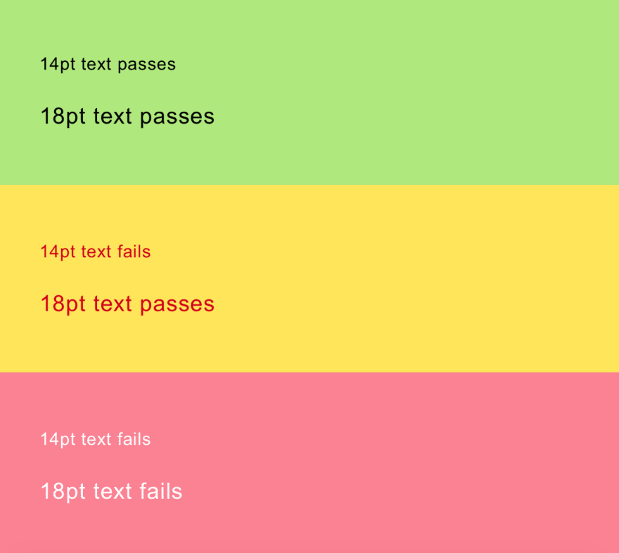
Text Readability
To ensure text is readable it should pass accessibility guidelines based on the combination of text color, background color and text size as follows:
"WCAG 2.0 level AA requires a contrast ratio of 4.5:1 for normal text and 3:1 for large text (14 point and bold or larger, or 18 point or larger).” —WebAim color contrast checker
Here are a few examples of color and size combinations that do and do not pass:
Fonts
In terms of font accessibility, there are a number of principles to keep in mind:
- Use real text rather than text within graphics.
- Select basic, simple, easily-readable fonts.
- Use a limited number of fonts.
- Ensure sufficient contrast between the text and the background.
- Avoid small font sizes.
- Use relative units for font size.
- Limit the use of font variations such as bold, italics, and ALL CAPITAL LETTERS.
- Don't rely only on the appearance of the font (color, shape, font variation, placement, etc.) to convey meaning.
- Avoid blinking or moving text.
When all else fails, the best option for an accessible website is a popular font with a clean, sans serif aesthetic. Some of the most appropriate fonts in this regard are Arial, Helvetica, Lucida Sans, Tahoma, and Verdana.
Text Overlaid On Background Images

When using text on an image dev's should reduce the opacity of the image to ensure maximum readability of the text. Ensure you are using proper alt descriptions as well.

Alert Messaging
Success and error messages are often colored green and red respectively. Most color-blind people don’t suffer from achromatism, and so will naturally associate different colors with different messages. However, using prefix text such as “Success” or, my preference, an icon makes it quick and easy to read as shown below:

These are all pretty easy fixes but make a world of difference for a colour blind person.
In the next article I am going to be tackling forms. This has always been a really big issue for me so I'm excited to share what I have found on this.

Top comments (0)