Starting of, this is a beautiful website. I can see you put a lot of attention to detail in every single corner of the pages. Everything looks great from animations to accessibility. There are two minor things that I think will improve the usability/experience of your website.
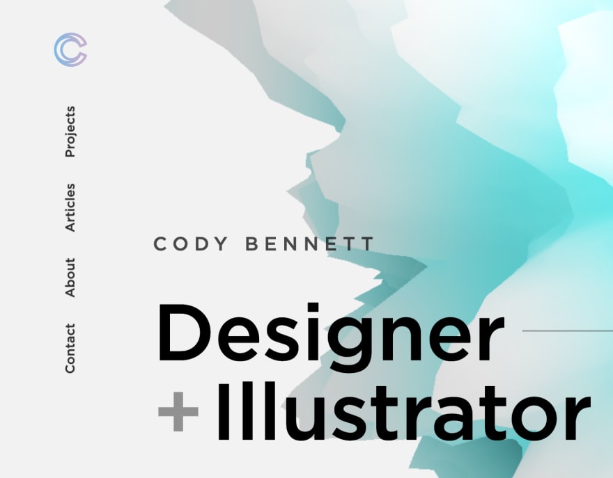
1 Navigation
The vertical navigation looks great, but my experience tells me that there's a reduced change of people using it accordingly when it doesn't meet their expectations. I'd recommend for it to be placed horizontally on top of the page.
2 A personal touch
At the bottom of your page, you tell a little bit about yourself as a person. Something very important to do. I think this section could be greatly improved and add a little more personal connection by using a (professional) image of yourself.
Besides these small points, a great website! I'd love to see more of your articles on your own website 😄
For further actions, you may consider blocking this person and/or reporting abuse
We're a place where coders share, stay up-to-date and grow their careers.

Starting of, this is a beautiful website. I can see you put a lot of attention to detail in every single corner of the pages. Everything looks great from animations to accessibility. There are two minor things that I think will improve the usability/experience of your website.
1 Navigation
The vertical navigation looks great, but my experience tells me that there's a reduced change of people using it accordingly when it doesn't meet their expectations. I'd recommend for it to be placed horizontally on top of the page.
2 A personal touch

At the bottom of your page, you tell a little bit about yourself as a person. Something very important to do. I think this section could be greatly improved and add a little more personal connection by using a (professional) image of yourself.
Besides these small points, a great website! I'd love to see more of your articles on your own website 😄