Neomorphism is the new trend of 2020 applied to UI/UX. Instagram has full examples of it but there is not much information about how to do it.
1 Understanding the Concept.
Material and Flat Design are based on the concept of flat design (material design add the concept of elevation but still work in a 2d concept). Skeuomorphism, which was a trend in 2000, on the contrary, was based on the illusion of 3d surface. Here is were Neomorphism was born between the fusion of flat surface and 3d concept.
It's all about light source, flat design means that no shadow or light is present on the design; the only source of light comes, normally but not strictly, from brilliant and contrast colour. The colour wheel was the perfect tool for it. Material design uses the same concept but adds some old fashion way to use a focus light source to add focus on the content; the content is then elevated.
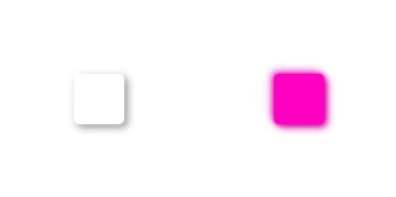
Adding mass to the elevated elements of material is what Neomorphism do.

Neomorphism works with any colour technics but works does it much better in a monochrome colour scheme. But there are a few rules to follow:
2. Da Rules

2.1. White and Black are not your friends anymore.
With Flat and Material design White and Black were almost your best friends for background or text. in Neomorphism these are forbidden colour, there are no more lighten colour than white nor darken colour than black so is not easy to make it look as 3d platform with mass. A colour surface may help but is no the best solution neither.
2.2. Meet a new tool, HSL colour model and the 15% light rule.
Most of the time, front-end developers and UI designers we use RGB colour model to define elements colours. But with Neomorphism is maybe better to use the HSL colour model to define light and shadow colour, even to define the primary and secondary colour.
HSL mean Hue, Saturation and Lightness, and the last parameter is the vector that needs to be controlled, that why we use the 15% rule. Light reflexion has a 15% more light than the original colour and the shadow 15% less light. It also helps you to find the whiteness colour admitted for your project background.
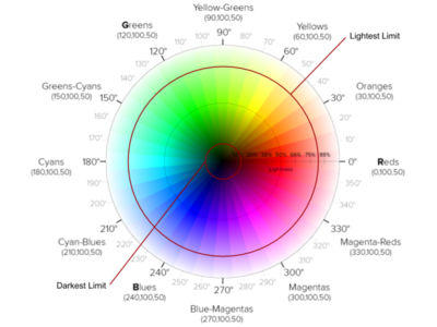
Colour wheel (by Erin Sowards) with limits of light and darkness for background.
Let's say try a little example, for a task, the primary colour will be #00aaff. If you analyze the colour by HSL model, you will find a vector of HSL(200, 100%, 50%), it means that your light reflexion and shadow colours have to be HSL(200, 100%, 65%) and HSL(200, 100%, 35%) each one or in RGB #4dc3ff and #0077b3. According to this, your div.card should look like this:
To work with HSL model directly you can use SCSS or LESS preprocessor of style for the web. With SCSS darken and lighten may not work well so it's recommended to user HSL functions. For Native (React native, Vue native, or Flutter) inline style has HSL functions to work.
2.3. "I need my space" rule.
Skeuomorphism was about widgets, tons of them, "glassie" elements that would make any minimalist designer bleeding of his eyes.
But don't worry, Neomorphism is about minimalist with a touch a reality. It means that it surface some kind look of feeling textures.
But it works given each item the correct amount spaces. Only add elevation for those items who need more attention.
You can see some cases of study by looking at Instagrams posts:
3. Let's code!
-
Select some colours, remember to use colours with Lightness between 15% and 85%. Recommended: use pastel colours.
Background Colour: #262626 HSL(200, 0, 15) Text and Icon Colour: #d9d9d9 HSL(200, 0, 85) -
Base on this colour Light Reflex and Shadow colour must be:
Light Colour: #4d4d4d HSL(200, 0, 30) Shadow Colour: #000000 HSL(200, 0, 0) -
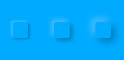
Add two "box-shadow" on the same div, use an x,y-offset of 4px for the shadow and -4px for light reflex. In both cases add a blur of 8px
 div.card{
      background: #262626
      box-shadow:
           #000000 4px 4px 8px,
           #4d4d4d -4px -4px 8px;
      }
And here a small example of the result:
BONUS: Add some edge blur to the edges and add some small radius border to the div and you will get a softer definition of elevation.

Oldest comments (2)
Hola, ¿tienes algún tutorial? Realmente deseo aprender eso. Muchas gracias, Paty.
I just discovered that new trend in UI design and I love it!
Thanks for the article!