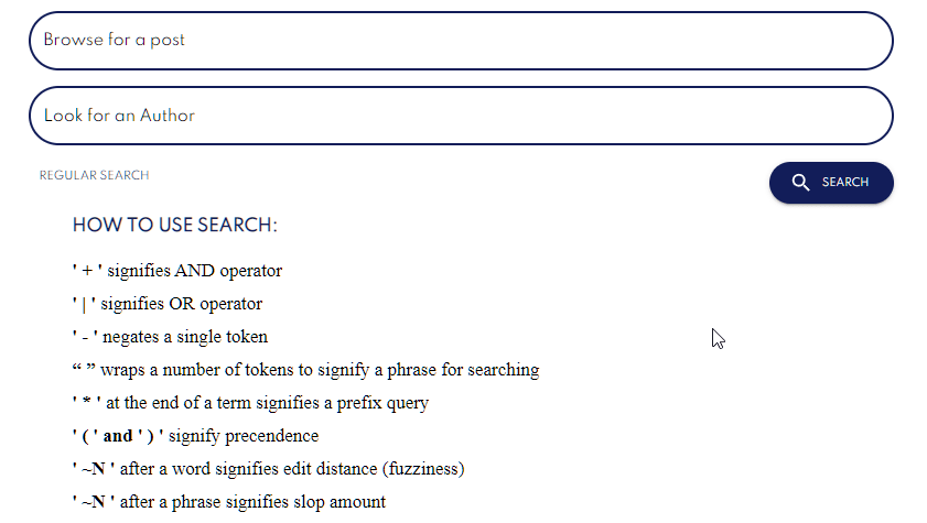
This week I want to talk about all the feedback I received for my PR about the searchbar UI. I had some really good reviews, and we caught a few bugs that almost got by. Here are some of the feedback I got:
- Responsiveness of the advanced search button and input:
- Our color themes for dark and light mode:
My reaction:
Responsiveness:
I really don't want to say anything on this because how disappointing it is to me. I guess at the beginning I added the button and made sure the click event worked to open up the advanced tray items, and then I forgot about it (seems very me).
Color Themes:
The color themes were something I had never had to consider. Surprisingly, for all the work I had done to this day, I have not run into this code yet. I look forward to explaining how it works down below! :)
Addressing my issues:
Responsiveness:
This wasn't too difficult of a task for me. I am really lucky to be able to understand how the grid/flex system works now and was able to apply my knowledge on this here. Another thing I forgot had existed was the float property. I love this property for making elements sit where they need to sit without having to play with so much other props.
Color Themes:
We use MUI for the color themes. Having worked with themes previously on another project I got the jist of it. Basically we are creating our own themes for colors to use. So every time you want to use that blue color you find relaxing, you can put it under a name and use it, instead of you know... "what is the HEX code again???".
When I started, I put my own color name telescope-blue for the color of the telescope logo. From this I was getting many errors. I learned that I can't just name telescope-blue and that I would have to specify this name as a palette in the createPalette.ts. So if you want to go with this approach - by all means. Otherwise you can use the PaletteColorOptions provided by MUI.
I decided that the info color is usually blue, and that I could define the color of blue for this as our Telescope blue. I explored some good color contrasts for the hover states through trial and error, and came to consensus with the new theme.
One of the other problems I had was understanding how the MUI Textarea worked for adding custom CSS. To explain this I will first show the code I ended up putting in:
        <TextField
        variant="outlined"
        size="medium"
        fullWidth
        label={labelFor}
        onChange={(event) => setText(event.target.value)}
        value={text}
        InputProps={{
          classes: {
            root: classes.customInput,
            focused: classes.customInput,
            notchedOutline: classes.customInput,
          },
        }}
        InputLabelProps={{
          classes: {
            root: classes.customInputText,
            focused: classes.customInputText,
          },
        }}
      />
There's two props we see here InputProps and InputLabelProps. They are different.
So InputProps is the CSS props for the input itself. Whereas the InputLabelProps is the props for the label where it says "Look for an Author". After a lot of trial and error, I realized we can set different classes for focused, but adding classes.focused. Lastly, to change the color of the border we use notchedOutline.
One other issue I ran into here with this was that if you make the fontSize of the two InputProps and InputLabelPropsdifferent, you run into some overlapping with the label and the round border.
After pushing my changes...
After putting up my changes, I am really excited to get this PR in. Although for now it's only the author and post search, it still makes a difference and you can refine the search by BOTH and not just one anymore.


Top comments (0)