The CSS grid-template-areas is my favorite CSS property and I'd like to devote this short article to it.
How it works
grid-template-areas is used as part of the CSS grid layout system. Before you can use it, you have to initialize a grid container with display: grid; and then you can use grid-template-areas to specify the layout you want.
<body>
<div class="grid">
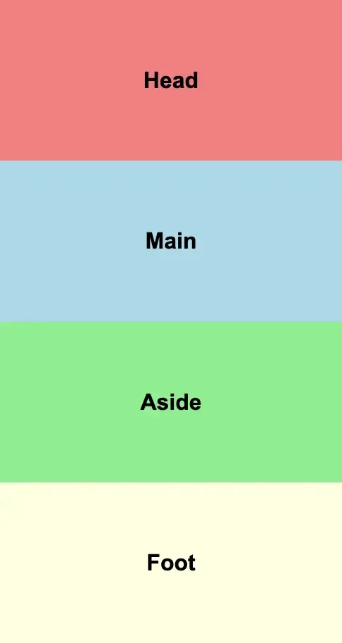
<div class="grid-item grid-item-1" style="background-color: lightcoral;">Head</div>
<div class="grid-item grid-item-2" style="background-color: lightblue;">Main</div>
<div class="grid-item grid-item-3" style="background-color: lightgreen;">Aside</div>
<div class="grid-item grid-item-4" style="background-color: lightyellow;">Foot</div>
</body>
.grid {
height: 100vh;
display: grid;
grid-template-areas:
'head head head'
'main main aside'
'foot foot foot';
This simple example creates a 3x3 grid with the top row consisting of only the header. 2/3 of the middle row is occupied by main and 1/3 is occupied by aside. Finally, the footer spans the entire width.
See how easy it is to read and understand this?

CSS grid-template-columns on a Desktop viewport
Making it responsive
You can use media queries to effortlessly set a different layout structure at the breakpoints you want.
@media (max-width: 768px) {
.grid {
grid-template-areas:
'head'
'main'
'aside'
'foot';
}
}```
At this point, on devices less than or equal to 768px the areas are stacked on top of each other.
##Pretty cool, right?

Top comments (0)