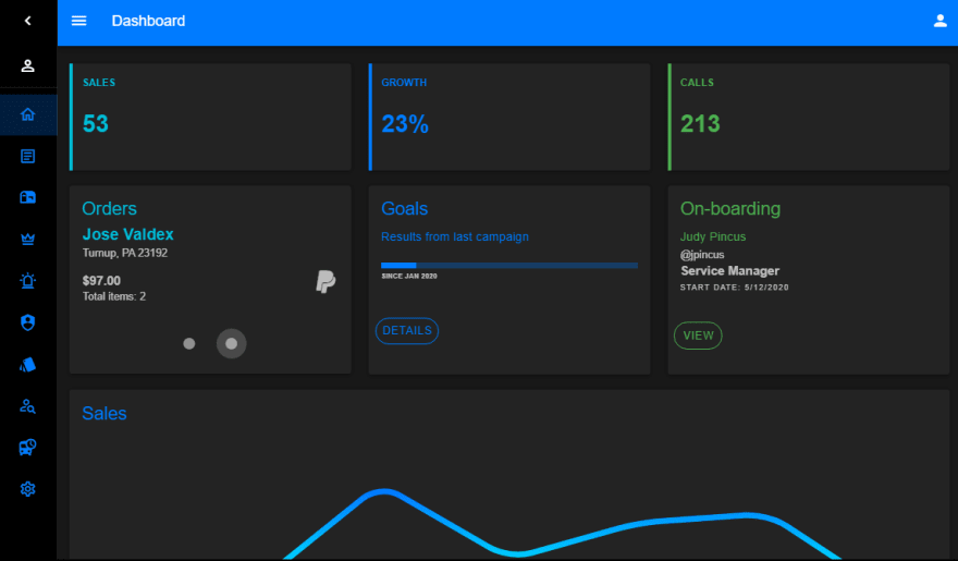
Lately I've been playing with Vue & Vuetify a lot so I decided to share this dashboard starter template. This may be helpful to kick start your next "admin" project, or as a basis for a creating simple collapsing sidebar layout with Vuetify.
Features
- Vue 2.x, Vuetify 2.2.x, Vue Router, Material Design Icons
- Light/Dark Theme Switcher
- Collapsing/Toggleable Sidebar
- Material Design Icons
Vue App and Router
I started with a typical Vue app and router set-up...
const routes = [
    { path:'/', component: Home },
    { path:'/detections', component: Page },
    { path:'/comp', component: Page },
    { path:'/customers', component: Page },
    { path:'/orders', component: Page },
    { path:'/settings', component: Page },
]

new Vue({
  el: '#app',
  router: new VueRouter({routes}),
  vuetify: new Vuetify(),
})
App Layout
The overlay layout was 🍰 easy to achieve using Vuetify's v-app-bar, v-navigation-drawer and v-content components...
<div id="app">
    <v-app>
        <v-app-bar app color="primary" dark>
            ..
        </v-app-bar>
        <v-navigation-drawer
            app
            floating
            >
            <v-list dense color="primary" dark>
                ...
            </v-list>
        </v-navigation-drawer>
        <v-content>
            <v-container fluid>
                <v-row class="fill-height">
                    <v-col>
                        <transition name="fade">
                            <router-view></router-view>
                        </transition>
                    </v-col>
                </v-row>
            </v-container>
        </v-content>
        <v-footer>
            ...
        </v-footer>
    </v-app>
</div>
Next I fine tuned the Sidebar (v-navigation-drawer) using a v-list with items bound to my list of menu items data. The toggling of the Sidebar is controlled with the sidebarMenu menu boolean. You'll also see the toggleMenu boolean for controlling the mini-variant prop Vuetify's navigation-drawer.
In my App.vue...
new Vue({
  el: '#app',
  data: () => ({
      sidebarMenu: true,
      toggleMini: false,
      items: [
        { title:"Home", href:"/", icon:"mdi-home-outline" },
        { title:"Detections", href:"/detections", icon:"mdi-shield-account" },
        { title:"Components", href:"/comp", icon:"mdi-palette-swatch" },
        { title:"Customers", href:"/customers", icon:"mdi-account" },
        { title:"Orders", href:"/orders", icon:"mdi-bus-clock" },
        { title:"Settings", href:"/settings", icon:"mdi-settings-outline" },
      ],
  })
})
   <v-navigation-drawer
          v-model="sidebarMenu"
          app
          floating
          :permanent="sidebarMenu"
          :mini-variant.sync="mini"
          >
          <v-list dense color="primary" dark>
                <v-list-item>
                    <v-list-item-action>
                        <v-icon @click.stop="sidebarMenu = !sidebarMenu">mdi-chevron-left</v-icon>
                    </v-list-item-action>
                    <v-list-item-content>
                        <v-list-item-title>
                            <h3 class="font-weight-thin">Dashboard</h3>
                        </v-list-item-title>
                    </v-list-item-content>
                </v-list-item>
            </v-list>
            <v-list-item class="px-2" @click="toggleMini = !toggleMini">
                <v-list-item-avatar>
                    <v-icon>mdi-account-outline</v-icon>
                </v-list-item-avatar>
                <v-list-item-content class="text-truncate">
                    Jane Doeski
                </v-list-item-content>
                <v-btn icon small>
                    <v-icon>mdi-chevron-left</v-icon>
                </v-btn>
            </v-list-item>
            <v-divider></v-divider>
            <v-list>
                <v-list-item v-for="item in items" :key="item.title" link :to="item.href">
                    <v-list-item-icon>
                        <v-icon color="primary">{{ item.icon }}</v-icon>
                    </v-list-item-icon>
                    <v-list-item-content>
                        <v-list-item-title class="primary--text">{{ item.title }}</v-list-item-title>
                    </v-list-item-content>
                </v-list-item>
          </v-list>
    </v-navigation-drawer>
Since I wanted the Sidebar (v-navigation-drawer) to auto collapse to icons (the mini-variant) on smaller screens I added a mini computed prop to control this. This value comes from Vuetify's breakpoint this.$vuetify.breakpoint.smAndDown, otherwise the toggleMini state that's already stored in our data object...
new Vue({
  el: '#app',
  router: router,
  vuetify: new Vuetify(),
  computed: {
    mini() {
        return (this.$vuetify.breakpoint.smAndDown) || this.toggleMini
    },
    buttonText() {
        return !this.$vuetify.theme.dark ? 'Go Dark' : 'Go Light'
    }
  },
  data: () => ({
      sidebarMenu: true,
      toggleMini: false,
      items: [
        { title:"Home", href:"/", icon:"mdi-home-outline" },
        { title:"Detections", href:"/detections", icon:"mdi-shield-account" },
        { title:"Components", href:"/comp", icon:"mdi-palette-swatch" },
        { title:"Customers", href:"/customers", icon:"mdi-account-search-outline" },
        { title:"Orders", href:"/orders", icon:"mdi-bus-clock" },
        { title:"Settings", href:"/settings", icon:"mdi-settings-outline" },
      ],
  }),
  methods: {
    toggleTheme() {
        this.$vuetify.theme.dark = !this.$vuetify.theme.dark;
    },
  }
})
Lastly I added the theme switcher logic. As you may know Vuetify has a light or dark theme option. I added a button to the app-bar...
     <v-app-bar app color="primary" dark elevation="0">
        <v-app-bar-nav-icon @click.stop="sidebarMenu = !sidebarMenu"></v-app-bar-nav-icon>
         <v-spacer></v-spacer>
         <v-btn @click="toggleTheme" color="primary" class="mr-2">{{buttonText}}</v-btn>
         <v-icon>mdi-account</v-icon>
     </v-app-bar>
And the a method for the theme switch, and buttonText computed value for the button...
computed: {
    mini() {
        return (this.$vuetify.breakpoint.smAndDown) || this.toggleMini
    },
    buttonText() {
        return !this.$vuetify.theme.dark ? 'Go Dark' : 'Go Light'
    }
},
methods: {
    toggleTheme() {
        this.$vuetify.theme.dark = !this.$vuetify.theme.dark;
    },
}
Checkout the finished product on Codeply😎
Vuetify Dashboard Example
Full source: https://codeply.com/p/AtcbXz9Ybg
Light / Dark Theme Switch Example: https://codeply.com/p/AtcbXz9Ybg

Top comments (1)
I created a library: github.com/SebastienBtr/vue-dashboard to easily create a dashboard app, my motivations for this library is that I didn't want to use a big dashboard template that you can find online, where you always have to do some refactor and remove all the things you don't need. Instead my library just give you a vue component to have a dashboard layout setup. Feedback would be appreciated, and of course, a star if you think it's great :)