
One of our energy coaches (Pam) shared some customer feedback about a significant share of our customers who have difficulty interpreting data visualizations because of color vision deficiency, a condition which affects 1 in 12 men (8%). When Pam was instructing her class to observe the “red line” on a graph, a participant raised their hand and said “it’s all the same to me”, and when Pam asked the group who else has trouble distinguishing colors, more members of the class spoke up.
The most common form of color vision deficiency is Deuteranomaly, which makes greens appear more weak. Below is an example of how one of our graphs would appear to someone with this condition:
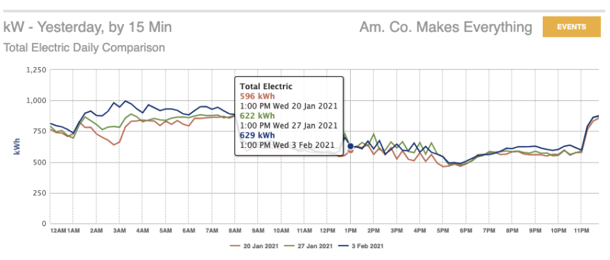
In order to distinguish the multiple data series, one must compare the color of the line, and of the tooltip text, to the legend below, and by that infer which data series they are looking at, a task that requires more effort and difficulty even if you do not have any color vision deficiencies, but merely are looking at a small screen, or a dimly lit screen, or with vision. impairment more generally.
This is why it is important to communicate information in multiple ways in addition to colors, such as using icons and text. When this feedback came in, we happened to be in the middle of designing some new graphs. With color vision deficiencies top-of-mind, we made the following interventions:
- Use a high-visibility color palette, and choose colors that avoid the hazardous red-green distinction. Our data visualization library offers one of these out of the box.
- Vary scatter series by not only color, but shape as well
- Include the color, shape and series name text in all tooltips

This is an insight that isn’t limited to software per se - it is also something you can keep in mind if you are responsible for preparing reports that use data visualizations to share with others. You can even run your graph through this color vision deficiency simulator to see your report through others’ eyes.
Like with most accessibility work, designing for people living with disabilities often benefits a much broader group of people. It's just simply more mental effort to interpret information through an implicit color code - we have to keep the code in our memory as we evaluate new information. The more you explicitly spell out key information, the easier it will be for people affected by color vision deficiencies, and everybody else, to comprehend your data presentations.

Oldest comments (0)