React is open-source JavaScript library that helps you build a top interface for both the web as well as mobile apps. It combines conveniently with other JavaScript frameworks and libraries and contains tiny, standalone bits of code called components. It’s these components that are going to be in the spotlight in this list of Best React UI component libraries and frameworks.
The nice thing about components is that they’re modular without many app-specific dependencies. This means that you get to reuse the components to build awesome apps and interfaces super fast. And thanks to Bit, you can share them with other React enthusiasts too.
Before you start your next project with React, take a few minutes to scan this list of best React UI component libraries that can help you create an awesome looking UI.
Best React UI component libraries and frameworks in 2020
Material Kit React

Created with inspiration from Google’s material design, Material Kit React builds a set of elements that put consistency as the main feature. That way, your web project retains a similarity in appearance and functions all through.
The general layout resembles multiple sheets of paper. This imparts a depth and order to the layouts. Three example pages are included. Not only will these pages illustrate what’s possible with this kit, they also serve as templates where you can substitute text and images with your own.
The kit also contains a number of basic elements such as buttons, badges, sliders, menu, pagination, navigation bars, tabs and pills. You’ll be able to customize the style, size and color for most elements. The JavaScript elements include Modals, tooltips, date-time picker, carousels and popovers. Besides using the kit to start a new project, you can also restyle any old Bootstrap project. The Pro version contains a lot more components, sections and example pages.
Shards React

Shards React is an open source, modern React UI kit that’s built from scratch and geared towards fast performance. The modern design system allows you to change many things. What’s more, you can download the source files to change things at code level too. The SCSS used for styling only enhances developer experience.
This library is based on Shards, and uses React Datepicker, React Popper (a positioning engine) and noUIShlider. It supports Material and Fontawesome icons. The Shards Pro package has 15 pre-made pages that help you get started. Helpfully, these pages use blocks that you can move around.
With ~270 stars on Github, it also includes dozens of custom components such as range sliders and toggle inputs. The 350+ components ensure that you can build almost every type of website with Shards React.
Material-UI
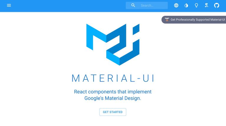
With close to a whopping 45K stars on Github, Material-UI ranks among the most popular React UI component libraries. The components rely on React, but use Google’s Material Design. For those of you who need filling in, material design takes inspiration from the physical world and textures while keeping the actual UI elements to a minimum.
A wide range of helpful components are available, like app bars, auto complete, badges, buttons, cards, dialog boxes, icons, menus, sliders and more. Helpfully, Material-UI also offers React themes and templates, so you can have a custom color theme for your app.
React Bootstrap

Next on our list of React UI component libraries is React Bootstrap, a UI kit that retains it’s Bootstrap core. In order to give you more control over the form and function of each component, it replaces Bootstrap’s JavaScript with React. Each component is built to be easily accessible, important for front-end framework building.
And since React Bootstrap doesn’t deviate much from its Bootstrap origins, developers can choose from the thousands of Bootstrap themes readily available. It’s earned 14500+ stars on Github.
React Virtualized
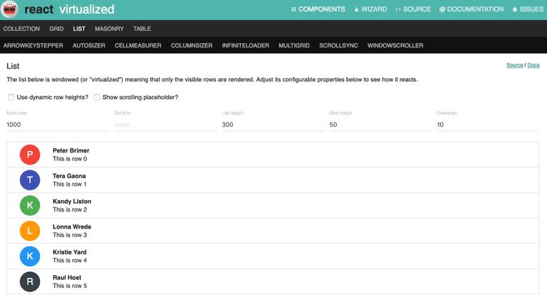
Building a frontend that’s data heavy? React Virtualized may be the library you need to dip into. It includes numerous components for efficiently rendering large lists, tables and grids. For example, you’ll find masonry, columns, autosizers, direction sorters, window scrollers and more. Further, you can customize the tables by configuring the row heights, and display placeholders in the cells.
Also, React Virtualized has very few dependencies and supports standard browsers, including recent mobile browsers for iOS and Android. It has 14,000+ stars on Github.
Argon Design System React

This library offers a free design system for Bootstrap 4, React, and Reactstrap. It comes with 100 modern and gorgeous elements that are implemented in a fully-functional code, so you can switch from a page to the actual website effortlessly.
The Argon Design System offers pre-built example pages and a handful of variations for all the components such as colors, styles, hover, and focus.
Take a sneak peek at the entire set of components, featuring basic elements, typography, navbars, alerts, images, icons, Javascript components, and more.
Blueprint

The React components in Blueprint are primarily for use on desktop applications. These components are particularly suitable for building complex and data-dense interfaces. From the component library, you can pick up bits of code for generating and displaying icons, for interacting with dates and times, for picking timezones and more.
What else is in this components library? A lot really – breadcrumbs, buttons, callouts, cards, divider, navbars, tabs, tags and much more. On Github, it clocks 13,000+ stars.
Semantic UI React

Semantic UI uses human-friendly HTML for it’s development framework, and has integrations with React, Angular, Meteor, Ember and many other frameworks. All jQuery functionality has been re-implemented in React.
It allows you to load any Semantic UI CSS theme on top of your Semantic UI React app. What’s more, you’ll also have complete access to the markup, which means there’s flexibility in customizing components. It’s star count on Github is near 9,000.
React Toolbox

Another React UI components library that you can use to implement Google’s material design principles in your project is React Toolbox. React Toolbox relies on CSS modules for this purpose. Though you can use any module bundler, it integrates neatly with webpack workflow. Thoughtfully, the team at React Toolbox provides visitors with an in-browser editor where you can experiment with the components in real-time.
While working with React Toolbox, you can choose to import components in bundles or raw components. The difference is, for the former, the components come with all necessary dependencies and themes injected for you. This means that the CSS for each dependency will be available in your final CSS automatically. On the contrary, with raw components, no CSS is included. This means you’ll have to provide a theme via properties to the component to be properly styled. React Toolbox is reaching the 8,500 mark on Github.
React Desktop

Our next components library, React Desktop uses macOS, Sierra and Windows 10 components with the aim of bringing a native desktop experience to the web.
This collection is a JavaScript library built on top of Facebook’s React library and it’s compatible with any JavaScript based project. This tool crosses the 8,000 star rating on Github.
Onsen UI

In case you’re into creating cross platform mobile apps, you’ll be interested in this offering on our list of React UI component libraries. Onsen UI is a mobile app development framework that uses HTML5 and JavaScript and provides integration with Angular, Vue.js and React. All the components are auto-styled based on the platform, and so it supports both iOS and Android using the same source code.
Onsen UI is compatible with many popular frameworks. An interactive tutorial helps you get a good start with this tool. The component library employs pure CSS with no JavaScript behavior. For some extra details, custom elements help out. The star count on Github exceeds 7,000.
Evergreen

Evergreen contains a set of React components that’s suitable for enterprise-grade web applications. Since it uses React Primitive, it’s highly flexible. At the same time, it works just as easily right out of the box.
It includes a wide range of components and tools starting from basic layouts, typography, colors and icons to function-based components such as dropdowns, toggles, file uploads and feedback indicators. After installing the Evergreen package, you can pick and choose the components you want to import. It scores a 7,000+ star rating on Github.
Reactstrap

For simple React Bootstrap 4 components, check out Reactstrap. It comes with two primary distribution versions. One, a basic version that excludes optional dependencies. This gives you more flexibility in configuring required dependencies.
The second version is the full version that includes all the optional dependencies. This one is recommended for smaller applications. Reactstrap is yet another collection in the React UI components library that crosses the 7,000 star mark on Github.
Rebass
Rebass contains only eight foundational components, all in a super-small file. The components are extensible and themable, and built for responsive web design.
The components use styled-system and serve as a great starting point for extending into custom UI components for your app. The ThemeProvider can also help you with this. The star count on Github is nearing 5,000.
Grommet

Grommet has a wide library of components in its kit and counts big names like Netflix and Boeing among its users. Whether your app is for phones or for wider screens displays, you’ll be able to design layouts. Accessibility is via keyboard or screen reader.
Theming tools help with the customization for color, type and layout. This React UI components library rates a star count exceeding 4,000 on Github.
Elemental UI
Elemental UI provides a number of basic functional components for standalone use or in any combination, whether in default style or after theming. Some of the components include forms, buttons, cards and modals.
The project is under development, but manages a 4,000+ star rating on Github.
RSUITE

RSUITE contains a range of component libraries for enterprise system products. It supports all major browsers and platforms as well as server-side rendering.
If you’re at home with Less development, customizing the components should not pose any problem. The components in this library include icons, loaders, dividers, tooltips and more, and RSUITE has close to 2,500 stars on Github.
Belle

Among the most interesting React UI component libraries, Belle offers a truly wide range of components. You can customize these components at two levels – the base level for all components collectively, as well as each component individually.
The components come with support for mobiles and ARIA support. The way to go about using Belle is to first set up a simple app with React, and then import any Belle component and begin using it right away. This component library has more than 2,300 stars on Github.
React-md

One more React UI components library that you should consider if you want to implement material design in your project is React-md. It gives you a choice of React components that work with Sass. For this purpose, there’s a separation of styles in Sass in lieu of inline styling. This makes it easier for you to customize components in line with existing styles.
Colors and typography can be customized and the detailed documentation will help you get past the basics. On Github, React-md counts close to 2,000 stars.
PrimeReact

This list of React UI component libraries would not be complete without PrimeReact. It provides components to cover almost all basic interface requirements such as input options, menus, data presentation, messages and more.
It pays attention to mobile experience, too, with touch-optimized responsive design elements. There are a number of templates and themes that allow you to customize and choose between flat and material design. This component library is nearing 800 stars on Github.
KendoReact

Unlike the foregoing React UI component libraries, KendoReact is a premium set of components, with licenses starting at $799. It boasts an impressive client list that includes Microsoft, NASA and Sony. And you too can use it to create fast and feature-rich apps with impressive UI.
The component set is built specifically for React development. This ensures zero dependencies and all the components are fully optimized for React. Plus, if you’ve got an existing component library, you can simply add to it from KendoReact without having to rewrite the whole library.

Top comments (22)
as
dd
gfgfdgdf
sss
fdsf
dd
sss
sss
asdsad
sss
sssssdsad
Ant Design of React would be a great addition to the list. :)
and Chakra UI too :)
Thank You For Sharing!
Read More: Top 10 Most Popular React Component Libraries and Frameworks in 2023
sdsd
uuu
iiiiii
k[l[l;
juu
uu
Syncfusion library missing here syncfusion.com/react-ui-components