
Original Post: https://ajonp.com/courses/angularmaterial/angular-material-forms-from-firestore/
Angular Material Forms from Firestore
🌎 Demo: https://ajonp-lesson-12.firebaseapp.com/books/FirstBook/edit
This lesson will cover how to create all of the Angular Material Form Components, the data behind many of them will be coming from Cloud Firestore.
Setup
We will start this lesson from where we left off on Angular Navigation Firestore
Source from Prior lesson
Clone
git clone https://github.com/AJONPLLC/lesson11-angular-navigation-firestore.git lesson12-angular-material-forms-firestore
Remove Origin, just always easier up front if you want to add this to your own repo (or again you can fork and just clone.)
git remote rm origin
Install Dependencies
Make sure you are in the correct directory cd lesson12-angular-material-forms-firestore.
npm install
Book Edit Module
Create
Using the Angular CLI create the module with routing and corresponding component.
ng g m modules/books/book-edit --routing && ng g c modules/books/book-edit
Router updates
books-routing.module.ts
Add new lazy loaded path so that our main books-routing knows where to send requests for edit.
...
  {
    path: ':bookId/edit',
    loadChildren: './book-edit/book-edit.module#BookEditModule'
  }
  ...
book-edit-routing.module.ts
Now that we are in the book-edit module make sure it has a path to the book-edit Component.
...
const routes: Routes = [
  {
    path: '',
    component: BookEditComponent
  }
];
...
Serve the edit path
Startup the server
ng serve
Now that our router is all setup we should start to see the book-edit.component.html. Because we don't have a way to navigate to this path yet just type it in the url bar manually localhost:4200/books/FirstBook/edit.
You should see
book-edit works!
Update Book Edit
Structure
To give our form some structure we can now add Flex Layout and Material Card centered at 75% to give a nice look to our form.
book-edit.component.html
<div fxLayout="column" fxLayoutAlign="space-around center">
  <mat-card style="width: 75%; margin-bottom: 100px;">
    <mat-card-content>
    </mat-card-content>
    <mat-card-actions> <button mat-button>Ok</button> </mat-card-actions>
  </mat-card>
</div>
Because these are new Elements we need to import them into our Book Edit module.
book-edit.module.ts
import { FlexLayoutModule } from '@angular/flex-layout';
import {MatCardModule} from '@angular/material';

...

@NgModule({
  declarations: [BookEditComponent],
  imports: [
    CommonModule,
    BookEditRoutingModule,
    FlexLayoutModule,
    MatCardModule,
  ]
})
...
Getting Firestore Data for Book Edit
Because we are now navigating to an area that uses Angular router and part of the path contains a specified paramter id :bookId/edit we can get this bookId from the currently Activated Route. In order to do this we need to use dependency injection and provide this in our constructor. To then fetch that data from our FirestoreService we can then inject this service as well.
  subs: Subscription[] = [];
  book$: Observable<Book>;
  constructor(private router: ActivatedRoute, private fs: FirestoreService) {}

  ngOnInit() {
    // Get bookId for book document selection from Firestore
    this.subs.push(
      this.router.paramMap.subscribe(params => {
        const bookId = params.get('bookId');
        this.book$ = this.fs.getBook(bookId);
      })
    );
By calling the firestore getBook function and passing in the current parameter bookId we now have an Observable reference to the Firestore data.
firestore.service.ts
getBook(bookId: string): Observable<Book> {
  // Start Using AngularFirebase Service!!
  return this.afb.doc$<Book>(`books/${bookId}`);
}
This is a cool wrapper that Jeff over at fireship.io created.
Feel free to copy this service and use it as a nice wrapper for all of your projects, I won't include the two calls as we move forward
angularfirebase.service.ts
  doc$<T>(ref: DocPredicate<T>): Observable<T> {
    return this.doc(ref)
      .snapshotChanges()
      .pipe(
        map(
          (
            doc: Action<
              DocumentSnapshotDoesNotExist | DocumentSnapshotExists<T>
            >
          ) => {
            return doc.payload.data() as T;
          }
        )
      );
  }
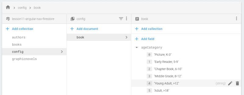
Example of Book Data in Firestore Console:

In the snippet above we are also pushing our RxJs Subscription into an array so that we can then loop through any subscriptions during the destroy method and unsubscribe. This is a pattern I often use when I cannot use pipe(take(1)) or | async.
  ngOnDestroy() {
    this.subs.forEach(sub => {
      sub.unsubscribe();
    });
  }
Using Firestore Data Inside of Template
We can not use our new book$ Observable in our template to show any of the current data. We can update our card to show only when the book data is available, otherwise show a Material Spinner. You can read more on how the NgIf directive works in the Angular docs if you are unfamiliar.
  <mat-card *ngIf="(book$ | async); let book; else: spin" style="width: 75%; margin-bottom: 100px;">
  <mat-card-title>{{book.title}}</mat-card-title>
  ...
<ng-template #spin><mat-spinner></mat-spinner></ng-template>
Current title:

Adding Form Input
Just a warning here, if you want to see detailed Angular Reactive Form usage this will be done in the next lesson.
Now that we know our Observable is working successfully we can now change the card title out and start switching our card into several form inputs.
For this we will need to include FormsModule, ReactiveFormsModule, MatFormFieldModule, and MatInputModule into our Book Edit Module.
book-edit.module.ts
  imports: [
    CommonModule,
    BookEditRoutingModule,
    FlexLayoutModule,
    MatCardModule,
    FormsModule,
    ReactiveFormsModule,
    MatFormFieldModule,
    MatInputModule,
Title Input

The entire Material Card should now look like below, the new div surrounding the card is just to allow each section to flow in its own row of the column. If you have not used Flex Layout check out the details.
book-edit.component.html
  <mat-card
    *ngIf="(book$ | async); let book; else: spin"
    style="width: 75%; margin-bottom: 100px;"
  >
    <mat-card-content>
      <div fxLayout="column" fxLayoutAlign="space-around stretch">
        <section>
          <mat-form-field style="width: 100%">
            <input matInput placeholder="Title" [(ngModel)]="book.title" />
          </mat-form-field>
        </section>
      </div>
    </mat-card-content>
    <mat-card-actions> <button mat-button>Ok</button> </mat-card-actions>
  </mat-card>
Above we have our first two components
-Form Field which you can think of as a wrapper to all of our components allowing for styling of the other form fields.
-Input the key with this is the directive matInput, this will allow you to use a native <input> or <textarea> correctly styled within <mat-form-field>.
If you see any issues at this point, make sure you have imported all the modules into
book-edit.module.ts
For an extra you can checkout the textarea example too.
  <section>
    <mat-form-field style="width: 100%">
      <textarea
        matInput
        placeholder="Description"
        [(ngModel)]="book.description"
        rows="5"
      ></textarea>
    </mat-form-field>
  </section>
Slide Toggle

-Slide Toggle is a very simple comoponent that is either on or off (binary).
book-edit.module.ts
  imports: [
    ...
       MatSlideToggleModule,
For our requirement we are going to use this to determine whether a book is Fiction or non-fiction.
We will set the default fictionSelected = true; so that Fiction is set first.
book-edit.component.ts
export class BookEditComponent implements OnInit, OnDestroy {
  subs: Subscription[] = [];
  book$: Observable<Book>;
  fictionSelected = true;
book-edit.component.html
<section>
  <mat-slide-toggle
    [checked]="fictionSelected"
    (change)="fictionChange($event)"
    #ficToggle
  >
    <p *ngIf="ficToggle.checked; else nonFic">Fiction</p>
  </mat-slide-toggle>
</section>
You can see that our input directive checked (denoted by []), will now take the value of fictionSelected and every time the toggle is changed we will use the output directive change (denoted by ()) to trigger function fictionChange passing in the current components instance of the event $event. You can read more about DOM event payloads.
book-edit.component.ts
  fictionChange(e) {
    this.fictionSelected = e.checked;
    this.genreControl.reset();
  }
Autocomplete
- Autocomplete is just another input type in our case for text. However it also has a Panel that is associated to provide a list of options. For our use case it will list out two different lists based on our Slide Toggle. So we will either filter the Genere Fiction list of values, or a Non-Fiction list of values.
book-edit.module.ts
  imports: [
    ...
       MatAutocompleteModule,
These two lists will be contained in a new collection at the base of our Firestore Database called config. Within our config collection we will create a document called book, which will hold many of our different configurations. For these two specifically they will be arrays that are on the book object.

First we will create our Observable to the Config Book object.
book-edit.component.ts
  bookConfig$: Observable<ConfigBook>;
  ...
    // Set Book Config
    this.bookConfig$ = this.fs.getConfigBook();
Create the ConfigBook Interface for our type.
ng g i core/models/config-book
config-book.ts
export interface ConfigBook {
  ageCategory?: Array<string>;
  fiction?: Array<string>;
  nonFiction?: Array<string>;
}
Then we can will grab the first set of values emitted from Firestore and send those out as a BehaviorSubject with type ConfigBook. Our toggle has set this.fictionSelected so we can determine what list should be emitted in this.genereList$.
book-edit.component.ts
export class BookEditComponent implements OnInit, OnDestroy {
  ...
  genreControl = new FormControl();
  ...
    // Set default Genere
    this.bookConfig$.pipe(take(1)).subscribe(bookConfig => {
      this.subs.push(
        this.genreControl.valueChanges.pipe(startWith('')).subscribe(value => {
          const filterValue = value ? value.toLowerCase() : '';
          if (this.fictionSelected) {
            this.genreList$.next(
              bookConfig.fiction.filter(option =>
                option.toLowerCase().includes(filterValue)
              )
            );
          } else {
            this.genreList$.next(
              bookConfig.nonFiction.filter(option =>
                option.toLowerCase().includes(filterValue)
              )
            );
          }
        })
      );
    });
You will also notice above the we have subscribed to any of the valueChanges that are happening on our new genreControl. Below you will see that formControl input directive is passed our class parameter genreControl which is an instance of FormControl. We will dive into all of the @angular/forms in more detail in the next lesson. For our sake here just know that this allows us to check all of the changing values as you type. When we start to type it uses the arrays that we have passed in from Firestore and filters them based on the string we are inputing using either bookConfig.fiction.filter or bookConfig.nonFiction.filter.
  <section>
    <mat-form-field style="width: 100%">
      <input
        name="genre"
        type="text"
        matInput
        [formControl]="genreControl"
        [matAutocomplete]="auto"
        placeholder="Genre"
        aria-label="Genre"
      />
    </mat-form-field>
    <mat-autocomplete #auto="matAutocomplete">
      <mat-option
        *ngFor="let genre of (genreList$ | async)"
        [value]="genre"
      >
        {{ genre }}
      </mat-option>
    </mat-autocomplete>
  </section>
Above we are listening to the updates from genreList$ BehaviorSubject to create our <mat-option> list of values. Our input has an input directive [matAutocomplete]="auto" to attach this <mat-autocomplete> by assigning the instance variable #auto to the input using matAutocomplete.
Checkbox

Take a deep breath there was a lot going on with the Autocomplete, the rest get a lot easier 😺
-
Checkbox is again providing the same functionality as the native
<input type="checkbox">enhanced with Material Design.
book-edit.module.ts
  imports: [
    ...
       MatCheckboxModule,

For us this contains some more of the configuration items from our book, because we already have an Observable created in bookConfig$ we can just tell Angular to listen for this and assign it to our local template variable bookConfig. We then are just assigning these to the directive NgModel. This is a two way binding, for our example doesn't mean much, but again we will drive these things home further in the next lesson.
<section *ngIf="(bookConfig$ | async); let bookConfig">
  <h3>Options</h3>
  <div fxLayout="column">
    <mat-checkbox [(ngModel)]="bookConfig.options.hasAudio">
      Audio
    </mat-checkbox>
    <mat-checkbox [(ngModel)]="bookConfig.options.hasPhotos">
      Photos
    </mat-checkbox>
    <mat-checkbox [(ngModel)]="bookConfig.options.hasVideos">
      Videos
    </mat-checkbox>
  </div>
</section>
Datepicker

- Datepicker The datepicker allows users to enter a date either through text input, or by choosing a date from the calendar. It is made up of several components and directives that work together.
Special note here you need
MatNativeDateModulein addition to theMatDatepickerModule.
book-edit.module.ts
  imports: [
    ...
       MatDatepickerModule,
       MatNativeDateModule
This is just creating the pre canned datepicker. We don't have any data that will will bring in currently to update this field. We will cover this in the next lesson.
book-edit.component.html
  <section>
    <mat-form-field>
      <input
        matInput
        [matDatepicker]="picker"
        placeholder="Publish Date"
      />
      <mat-datepicker-toggle
        matSuffix
        [for]="picker"
      ></mat-datepicker-toggle>
      <mat-datepicker #picker></mat-datepicker>
    </mat-form-field>
  </section>
Select

-
Select you can use either the Material Select, or the native select within the
<mat-form-field>. The native control has several performance advantages...but I really like the style of using the Material Design.
book-edit.module.ts
  imports: [
    ...
       MatSelectModule,
It would probably be better to unwrap our
bookConfig$once in our template, but I wanted to keep each of these as seperate units.
For our book component we are once again going to get all of the age categories from our Config Book in Firestore and use those values for our select.
book-edit.component.html
  <section>
    <mat-form-field style="width: 100%">
      <mat-select placeholder="Age Category">
        <mat-option
          *ngFor="let ageCategory of (bookConfig$ | async)?.ageCategory"
          [value]="ageCategory"
        >
          {{ ageCategory }}
        </mat-option>
      </mat-select>
    </mat-form-field>
  </section>
Slider

-
Slider
<mat-slider>allows for the selection of a value from a range via mouse, touch, or keyboard, similar to<input type="range">.
book-edit.module.ts
  imports: [
    ...
       MatSliderModule,
We once again will not be doing anything with this value, but I did want to show you how to default the value on creation. Later we will tie this directly to the Firestore value for our book.
book-edit.component.ts
bookRating = 3;
book-edit.component.html
  <section>
    <h3>Rating</h3>
    <mat-slider
      min="1"
      max="5"
      step="0.5"
      value="1.5"
      [(ngModel)]="bookRating"
    ></mat-slider>
  </section>
Radio button

-
Radio button
<mat-radio-button>provides the same functionality as a native<input type="radio">enhanced with Material Design styling and animations.
book-edit.module.ts
  imports: [
    ...
       MatRadioModule,
For us this will again in the future refer directly to a status on our Book, we could create these from a Firestore config, but I don't see us changing these options very often. If you want you could do the same loop as we did with the select option and add the config. In the next lesson we will add that config and show how to do a validation of sorts.
book-edit-component.html
  <section>
    <h3>Status</h3>
    <mat-radio-group [(ngModel)]="bookStatus" fxLayout="column">
      <mat-radio-button value="Draft">Draft</mat-radio-button>
      <mat-radio-button value="Published">Published</mat-radio-button>
    </mat-radio-group>
  </section>
Wrap Up
Here we have created all of the Angular Material Form Components, many of them with data being pulled from Firestore. Next is to make our form more Reactive.


Latest comments (0)