
After several years of work from a tremendous team of contributors in an amazing open source community, we finally reached the milestone we all were waiting for, to launch on Product Hunt!
In the beginning
EOS icons started as a small set of icons made for some of openSUSE products to cover very specific UIs in a very specific industry: Linux and the open source.
There was no doubt from the beginning that we would release these icons under an MIT license, after all, it was open and for the open.
We chose to follow the icon design guidelines created by Google for Material Icons. These guidelines are a masterpiece, and they were the strong foundation we needed to build a strong and scalable icon set.
Surely you think, they are just icons! Where is all the fuzz?
Let me point out some differentiators that make EOS icons the right choice if you look for Enterprise-grade UIs:
- Pixel perfect: Our icons are built using strictly detailed design processes where not even 1 pixel is off the grid.
Reviewed the same way we review our code: EOS icons are reviewed pixel by pixel. We make sure we don't add any unnecessary exceptions to our rules before approving a new icon into the repository.
User Experience, our top priority: We make sure there is no duplication of graphical concepts. EOS icons is not just a pretty graphics stock. User Experience is at the core of our processes: our icons solve specific needs, we want products using EOS icons to deliver consistent experiences to their users. You will not find EOS icons to be another library of icons where you type "screen" and you get 10000 different screen designs (we are not flaticons, and we do not intend to compete with them). We ensure that your applications use icons in a consistent manner. Your users' experiences matter to us!
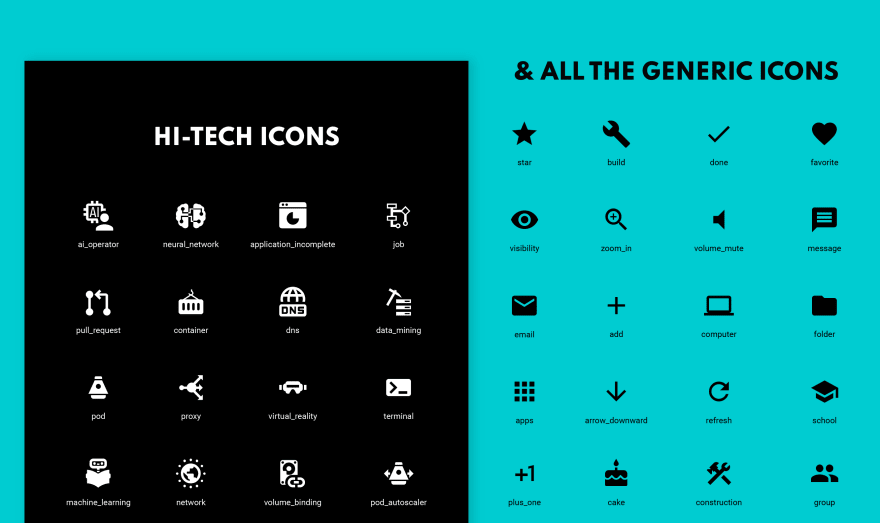
Hi-tech icons: You will find all of the standard icons for hamburger menus, home, arrows, etc, but the main difference in EOS icons is that we focus on creating icons for particular IT industries: Artificial Intelligence/Machine learning, Containers and Virtualization software, Infrastructure, Software development, SaaS, among others.
Hours and hours of development behind it
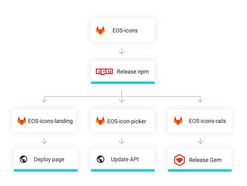
EOS icons has a lot of engineering behind, too. Our process is fully automated, from tests to DevOps, to delivery.
Gitlab played a huge role here. A lot of people ask "why are you using Gitlab and not Github?". The quick answer is: Gitlab is made for DevOps. There is no better standalone tool (free) out there than Gitlab for CI/CD. EOS icons depends on several microservices and repositories for each of our different distributions, and from one centralized repository EOS icons is able to test, release multiple formats, update services, everything self-contained in independent repositories, but all beautifully connected thanks to Gitlab's multi-project pipelines.
A stack that took us years of work and that today enables us to scale the icon set so rapidly that we are able to add hundreds of icons per release, and to have release cycles that others can only dream of!
Reaching maturity to launch on Product Hunt
I didn't introduce myself. How rude!. My name is Cynthia, and I founded EOS icons. I act as a product manager within the EOS UX/UI Solutions community (not usual in open source to have someone managing a roadmap but I'll talk more about that in another post).
We always knew that the goal was to be in Product Hunt. At the same time, I wanted to make sure we were ready. Product Hunt has become of high importance for many products as it is a door to thousands of potential users, but as such, it is important to have a good plan in place.
There are several approaches to launching a product publicly. Some people will tell you "Just do it, you won't ever be ready". I agree with this statement, only partially. Why? Because, although "you won't ever be ready" means that you will always have new ideas and features to add and really you shouldn't wait to complete them all, or you might miss your train, you also need to be able to compete with what you're offering.
Before reaching the current state, EOS icons went from being a set of only 60 icons to having 1400+; we had 3 websites' UIs very different to the one you see today. We matured substantially. We learned so much from our early adopters. We rebranded entirely and we found our identity. This was really important in the process of creating a trusted brand.
Presenting a level of maturity certainly makes EOS icons more appealing to our users.
Lessons learned
We launched "quietly" multiple times. Promoting on a smaller scale on Twitter, internal mailing lists, reaching out to open source projects, etc. Early adopters help you polish your roadmap, never underestimate the power of reaching out and validating your idea in every stage.
Ask for feedback, and ask loudly. We noticed that most users would choose to simply not use our icons rather than spend time reaching out to provide feedback. Instead, we reached out to them, we asked the questions, as simply as possible, time is valuable for our users, we know it.
Links
Visit EOS icons: https://eos-icons.com/
Give us some love or share some feedback on Product Hunt: https://www.producthunt.com/posts/eos-icons
Follow us on Twitter: https://twitter.com/eosdesignsystem
Tags in this post
ligature icons, open source icons, animated icons, ai icons, artificial intelligence icons, virtualization icon, cloud computing icon, virtual reality icon, kubernetes icons, software icons

Latest comments (0)