
CSS clip-path property is one of the most underrated CSS properties. Actually, it is a magical tool if you know how to use it. There are different types of arguments that you can use as clip-path property such as image url, svg path, circle, ellipse or polygon. I'll talk more about the polygon property in this article as you can mask your background with multiple points that forms a closed shape with this property.
It may be better to start with a basic shape to understand better how this property works. Here is the CSS code for a typical rectangle.
polygon(0% 0%, 100% 0%, 100% 100%, 0% 100%);
As you see, you put x and y coordinates of each points to enclose the region. It is an x-y coordinate system where (0,0) is in the top left. x values are increasing in right direction and y values are increasing in bottom direction.
You can either use percentages or static values like px, em, rem but it is better to use percentages to make it responsible. You can use different number of points according to your needs, so you can obtain a triangle, rectangle or any type of polygon.
It may be a little difficult to come up with the coordinates when the shape you want to achieve is a little complicated. So, it is better to use a tool for this. You can check CSS clip path generator for creating your shapes easily.
👉 https://10015.io/tools/css-clip-path-generator
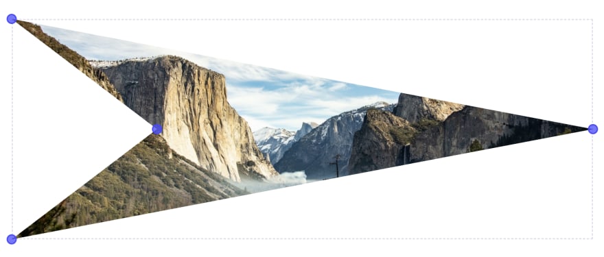
Here is an arrow head shape that you can make with this tool easily.
You can visit 10015.io for more tools.

Oldest comments (0)