Svelte and Tailwindcss Chip component
Chip and alert component built with svelte and tailwindcss
Installation
$npm i -D @fouita/chip
Usage
You can use this component as a simple chip (label) or as an alert.

<script>
    import Chip from '@fouita/chip'
</script>

<div class="flex items-center">
    <Chip class="m-5" >Simple chip</Chip>
</div>
Changing size & color
To change size you can use tailwind size scale xs, sm, md, lg, xl, same goes for colors red, blue, yellow, orange, indigo, pink, purple, gray, green, teal.
You can use outline to change the background with lighter color and make the text darker

<div class="flex items-end">

    <Chip color=red >   Hello! </Chip>
    <Chip outline size=sm color=indigo> Hello! </Chip>
    <Chip size=md color=teal>   Hello! </Chip>
    <Chip outline size=lg color=pink>   Hello! </Chip>

</div>
Change rounding
You can use change the rounding of the Chip component by using the rounded prop and tailwindcss rounded options none, sm, md, lg, full

<div key=k1 class="flex items-end">

    <Chip color=red rounded=none >  Hello! </Chip>
    <Chip outline color=indigo rounded=sm>  Hello! </Chip>
    <Chip color=teal rounded=md>    Hello! </Chip>
    <Chip outline  color=pink rounded=lg>   Hello! </Chip>
    <Chip color=yellow rounded=full>    Hello! </Chip>

</div>
Closing a Chip
To close a Chip you need to pass onDelete prop with close method, like the follwoing. You can also choose the fade duration (in ms) when closing by adding tr_duration={N} , N=200 by default

<script>
    import Chip from '@fouita/chip'
    let show_chip = true
    function removeChip(){
        show_chip = false
    }
</script>

<div key=k1 class="flex items-end p-5">

    {#if show_chip}
        <Chip color=red rounded=none onDelete={removeChip} tr_duration={500}>
            Hello!
        </Chip>
    {/if}

</div>
Add avatar or custom icon
To add an avatar we can use @fouita/avatar , see more on how to use fouita avatar
<script>
    import Avatar from '@fouita/avatar'
    import Chip from '@fouita/chip'
    import {HeartIcon} from 'svelte-feather-icons'
</script>

<div class="flex flex-wrap p-6">
    <Chip outline size=sm rounded=lg color=purple>
        <div slot=avatar>
            <Avatar size=6 rounded src="https://randomuser.me/api/portraits/women/68.jpg" class="ml-0 my-0 text-xs rounded-lg" />
        </div>
        Hello!
    </Chip>

    <Chip color=red size=sm rounded=full>
        <div slot=avatar>
            <HeartIcon class='w-4 h-4 mr-2' />
        </div>
        Hello!
    </Chip>
</div>
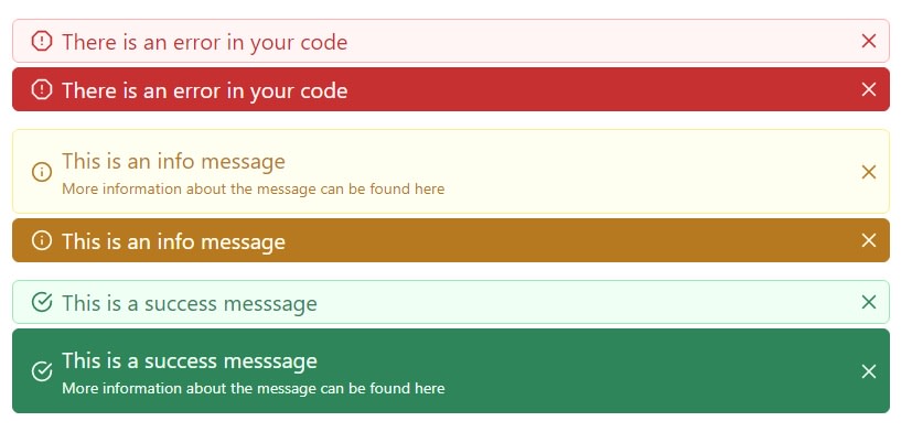
Alerts examples
To use the chip as alerts, here is an example on how you can achieve that!
<script>
  import Chip from "@fouita/chip";
  import {
    AlertOctagonIcon,
    InfoIcon,
    CheckCircleIcon
  } from "svelte-feather-icons";

  let alerts = {
    error1: true,
    error2: true,
    info1: true,
    info2: true,
    success1: true,
    success2: true
  };

  function remove(key) {
    alerts[key] = false;
  }
</script>

<div>
  {#if alerts['error1']}
    <Chip
      outline
      rounded=md
      color=red
      size=xl
      onDelete={() => remove('error1')}
    >
      <div slot=avatar>
        <AlertOctagonIcon class="w-5 h-5 mx-2" />
      </div>
      There is an error in your code
    </Chip>
  {/if}

  {#if alerts['error2']}
    <Chip
      rounded=md
      color=red
      size=xl
      onDelete={() => remove('error2')}
    >
      <div slot=avatar>
        <AlertOctagonIcon class="w-5 h-5 mx-2" />
      </div>
      There is an error in your code
    </Chip>
  {/if}

  <div class="mt-4"></div>
  {#if alerts['info1']}
    <Chip
      outline
      rounded=md
      color=yellow
      size=xl
      onDelete={() => remove('info1')}
    >
      <div slot=avatar>
        <InfoIcon class="w-5 h-5 mx-2" />
      </div>
      <div class="py-2">
        This is an info message
        <div class="text-sm font-base">
          More information about the message can be found
          <a href="/#">here</a>
        </div>
      </div>
    </Chip>
  {/if}

  {#if alerts['info2']}
    <Chip
      rounded=md
      color=yellow
      size=xl
      onDelete={() => remove('info2')}
    >
      <div slot=avatar>
        <InfoIcon class="w-5 h-5 mx-2" />
      </div>
      This is an info message
    </Chip>
  {/if}

  <div class="mt-4"></div>
  {#if alerts['success1']}
    <Chip
      outline
      rounded=md
      color=green
      size=xl
      onDelete={() => remove('success1')}
    >
      <div slot=avatar>
        <CheckCircleIcon class="w-5 h-5 mx-2" />
      </div>
      This is a success messsage
    </Chip>
  {/if}

  {#if alerts['success2']}
    <Chip
      rounded=md
      color=green
      size=xl
      onDelete={() => remove('success2')}
    >
      <div slot=avatar>
        <CheckCircleIcon class="w-5 h-5 mx-2" />
      </div>
      <div class="py-2">
        This is a success messsage
        <div class="text-sm font-base">
          More information about the message can be found
          <a href="/#">here</a>
        </div>
      </div>
    </Chip>
  {/if}

</div>

Top comments (0)