The Idea
The idea is to choose a topic that you were having difficulty with and you think others might find it a little difficult too. Take a look at this tweet by @erinfranmc

Hmm, I used to have problems with that too and I figured out the way. Sounds like a valid topic to begin with.
What’s up with the confusion
So basically, in React, we use Flex boxes to align our component and the properties: justifyContent and alignItems are utterly confusing and you hardly get them on the first try. Just like plugging USB on the first try.
So, I’m going to tell you how I learned these two properties and will try to make sure that after reading this blog post you too will be able to get the right alignment on your very first try. Let’s start.
The Concept of Axis
This is the core concept that we are going to wrap our head around. The Axis.
There are generally two axis in particular:
Main Axis
Cross Axis
Main Axis is the horizontal line around the View or say Screen (let’s take Main Axis => Horizontal as default for now).
Cross Axis will be perpendicular to Main Axis and is vertical line around the View or say Screen in our case (let’s take Cross Axis => Vertical as default for now).
Let’s see how it looks:-

We will we visualizing our view sliding on these two lines.
The Default Case:
We will be using combination of flexDirection, alignItems, and justifyContent to achieve the right layout.
Here’s what the React docs says:
Adding flexDirection to a component's style determines the Main Axis of its layout. Should the children be organized horizontally (row) or vertically (column)?
The default flexDirection is ‘column’ i.e., when you don’t assign any property to a view.
For remembering purpose, we are going to consider flexDirection: ‘row’ first (horizontally) and will see how justifyContent and alignItems behaves under this.
Remember, these things are documented already but the goal here is to not get confused.
1. flexDirection: ‘row’:-
By giving this property, we are making sure that children are going to be assigned HORIZONTALLY.
Okay? Then what about justifyContent and alignItems? They are still confusing right?
That’s what I’m about to tell that How I cleared the confusion and figured it out.
Please try to remember the order in which the properties are listed and follow along.
1. Justify Content:-
This is the first thing we are going to learn. The power of justifyContent is:-
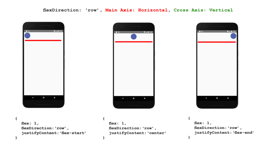
justifyContent lets you move your View along Main Axis i.e., Horizontally.
See how the ball appears to slide horizontally i.e., on Main Axis
Simple, right? Now let’s move to the next thing.
2. Align Items:-
You can remember it as the opposite of justifyContent . In justifyContent we were moving View along Main Axis.
So, the power of alignItems will be:-
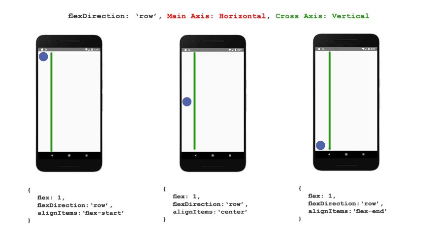
alignItems lets you move your View along Cross Axis i.e., Vertically.
Cross Axis is always perpendicular to the Main Axis. Try to remember the position of *Main Axis only and the Cross will already come to its 90 degree.*
See how the ball appears to slide vertically i.e., on Cross Axis
Simple, right? Before moving onto flexDirection: ‘column’ I want you to recall the order in which we learnt things. Believe me, that matters.
flexDirection: ‘row’ (horizontal).
justifyContent (move View along Main Axis which is horizonal).
alignItems (move View along Cross Axis).
2. flexDirection: ‘column’:-
Remember how we learnt the order in previous section? We are going to do the same thing here and if you got the previous section right then this will go smooth too.
Assume flexDirection: ‘column’ as vice-versa of flexDirection: ‘row’ property and apply everything you learnt so far.
Main Axis becomes Vertical. (vice versa of row flex direction)
Cross Axis becomes Horizontal. (vice versa of row flex direction)
Main Axis and Cross Axis changes position upon changing the flex direction. Other properties (justifyContent and alignItems) will still work same.
1. Justify Content:-
Remember the power of justifyContent?
It lets you move your view along Main Axis.
That thing still works but now the Main Axis is Vertical and sliding the View will look like this:-

1. Align Items:-
Align Items was moving view along Cross Axis before so it should still behave same, right?
Yes, it’s the same as before but now Cross Axis is Horizontal and sliding the View will look like this:-

See how simple and clear it is.
Let’s go even further:-
Now, when we know the basics, let’s cover the other two flex Directions which are not commonly used.
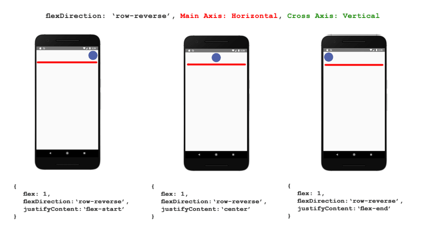
1. flexDirection: ‘row-reverse’:-
Works almost similar to flexDirection: ‘row’ and the axis are still same. You just have to reverse the order of flex-start and flex-end.
Remember, the basic idea here is:-
Reverse the order of start and end.
As the name suggests, it’s reverse of row.
Let’s see how it works.
1. Justify Content:-

2. Align Items:-

1. flexDirection: ‘column-reverse’:-
Nothing surprising here. Just remember the basic idea:
Reverse the order of start and end.
1. Justify Content:-

2. Align Items:-

Conclusion:-
- Just remember the concept of Main Axis and Cross Axis.
- Under flexDirection: 'row', Main Axis is Horizontal and the Cross Axis is Vertical i.e., perpendicular to Main Axis.
- Justify Content slides the view on Main Axis, always.
- Align Items slides the view on Cross Axis, always.
flexDirection: 'column' reverses the direction of Main Axis and Cross Axis.
Justify Content and Align Items still works same as before.
The basic idea of reverse flex direction is that you have to reverse the order of Start and End and everything else works as usual.
Remembering things in an order helped me clear the confusion and I was able to get the right alignment at the very first try.
Although inserting USB correctly in the first try is still a problem for me and maybe some things can’t really be helped.
Hope that was helpful.
Shad


Top comments (4)
At last, good stuff.
Thanks for appreciating.
It is ancient knowledge that you'd understand the universe and everything in it before being able to align items with css.
Cool post thanks, I'll mark it for later!
Thank you