
Intended Audience
If you're looking to improve your skills as a Pythoneer/Pythonista, or as a Data Scientist, congratulations! This article is for you!
This article is not for complete beginners to either Python or data analysis.
What Is Data Visualization?
Data visualization is the process of representing data visually in order to identify important patterns in the data that can be used as the basis for decision-making or inference. Visually representing data can reveal trends and patterns that would be nigh-impossible to perceive ordinarily.
Data visualization is a precursor to many important decision-making processes in the Data Science, Business Intelligence and Artificial Intelligence fields. It's usefulness cannot be over-emphasized. Undoubtedly, data visualization is one of the most important skillsets in the 21st century.
In this article, you will learn various data visualization techniques using Python, specifically using the NumPy, Matplotlib and Pandas libraries.
Data Visualization Using NumPy and Matplotlib
NumPy, which stands for Numerical Python, is arguably the most popular library for numerical computing in the world. Its applications include data engineering, statistics, business analysis, computational modeling and machine learning, across an ever-widening range of industries such as Engineering, Education, Health and Politics. What makes NumPy so popular is its ease of use and comfortable learning curve. While not strictly a data visualization library, we will use NumPy to generate some test data that our Matplotlib methods will act on.
Matplotlib is another library that is popular as a go-to for data visualization. It offers a nice interface that we will leverage to create graphical presentations of our test data.
I will assume that you already have Anaconda installed (head over to https://anaconda.com/distr and grab a copy if you don't).
The Line Plot
The line plot is the first plot that we are going to learn in this article. The line plot is the easiest of all the Matplotlib plots.
The line plot is normally used to plot the relationship between two numerical sets of values that have a one-to-one relationship between them. A good example is the relationship between Humidity and Time of Day in a region. Let us create test datasets and visualize this relationship in our data.
To create a uniform distribution of values for Humidity, we will use the linspace method of the NumPy library.
import numpy as np
from matplotlib import pyplot as plt
# another way to import pyplot is:
# import matplotlib.pyplot as plt

humidity = np.linspace(0, 100, 24) # generate 24 uniformly-distributed numbers from 0 to 100
Running print(humidity) should give you:
[  0.           4.34782609   8.69565217  13.04347826  17.39130435
  21.73913043  26.08695652  30.43478261  34.7826087   39.13043478
  43.47826087  47.82608696  52.17391304  56.52173913  60.86956522
  65.2173913   69.56521739  73.91304348  78.26086957  82.60869565
  86.95652174  91.30434783  95.65217391 100.        ]
Now we will create our Time-of-Day column:
import numpy as np
from matplotlib import pyplot as plt

humidity = np.linspace(0,100,24)
hours = np.arange(1,25) # generate 24 numbers from 1 (inclusive) to 25 (exclusive): this gives us our 24 hours
We can now plot our line plot using the plot method of pyplot:
import numpy as np
from matplotlib import pyplot as plt

humidity = np.linspace(0,100,24)
hours = np.arange(1,25)

plt.pyplot(humidity, hours) #plot a linear graph with humidity on the x-axis and hours on the y-axis

At this point you must be grinning to yourself. Pretty cool, eh?
Now, let's see what information we can extract from this plot. After all, inference is the end-goal of all data visualization.
The first thing you will notice about our plot is that it lacks labels: it does not tell us which dataset is Humidity or Hours. We will soon remedy this.
The second thing you will notice is that the line of our plot is 'straight' and runs unbroken from the lower-left vertex ([0,0]) to the upper-right vertex ([100, 24]). This tells us that the relationship between our datasets is linear, one-to-one and directly-proportional. An increase in the value at an instance in one dataset corresponds to an increase in the other. While this does not resemble real-life weather information, it is sufficient as an introduction to the line plot.
Labeling Our Data and Resizing Our Graph
Our line plot works, but it is more useful to label the axes of our plot. This way, we (and other people that we work with) will always know what data our visualization represents.
We can label our plot using the xlabel and ylabel methods.
import numpy as np
from matplotlib import pyplot as plt

humidity = np.linspace(0,100,24)
hours = np.arange(1,25)

plt.xlabel("Hours")
plt.ylabel("Humidity")
plt.plot(hours, humidity)

We now have a plot with Hours on the x-axis and Humidity on the y-axis.
Resizing Our Plot
We can resize our plot using the rcParams property of pyplot.
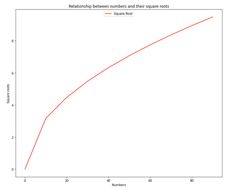
For this exercise, we will generate new data. We will plot the relationship between numbers and their square roots.
import numpy as np
from matplotlib import pyplot as plt
import math
# the math module provides specialized math functions
# like the sqrt function that we will use

numbers = np.arange(0, 100, 10)
# generate 10 numbers from 0 to 100
squareroots = [math.sqrt(number) for number in numbers]
# generate a list of square roots using the
# list-comprehension syntax

plt.xlabel("Numbers")
plt.ylabel("Square roots")
plt.title("Relationship between numbers and their square roots")

plt.rcParams['figure.figsize'] = [12,10]
# set the size of the plot on the x- and y-axis

plt.plot(numbers, squareroots)

The plot is noticeably larger. We have also set a title using the title method.
Making Our Plot More Readable Using Legends and Colors
We can improve the readability of our plot using legends and colors. Legends are a great way to provide important information about our data in a way that it can be understood at a glance!
A color for the line of our line plot can be specified by simply passing shorthand notation for the color name to the plot function.
We can pass 'r' for red, 'g' for green, and so on.
plt.plot(numbers, squareroots, 'r')
To create a legend for our plot, all we need to do is give our plot a label (this is not the same as labeling our axes) and set the location for our legend.
import numpy as np
from matplotlib import pyplot as plt
import math

numbers = np.arange(0, 100, 10)
print(numbers)
squareroots = [math.sqrt(number) for number in numbers]

plt.xlabel("Numbers")
plt.ylabel("Square roots")
plt.title("Relationship between numbers and their square roots")

plt.rcParams['figure.figsize'] = [12,10]

plt.plot(numbers, squareroots, 'r', label="Square Root")
plt.legend(loc="upper center") # set the location (or locus) of our legend
`
The Scatter Plot
A Scatter plot is used to plot the relationship between two numeric columns in the form of scattered points. It is normally used when for each value in the x-axis, there exists multiple values in the y-axis. This kind of relationship is called many-to-one.
A prime example is the relationship between the ages of children in a school and their heights. We are going to read the data from a CSV file using the read_csv method of the `pandas' library.
First, head over to https://raw.githubusercontent.com/hadley/r4ds/master/data/heights.csv to download the CSV file. Save the file in the same directory as your Jupyter notebook.
`
`
import numpy as np
from matplotlib import pyplot as plt
import math
import pandas as pd

data = pd.read_csv("heights-ages.csv") # use the name you saved your CSV file with here

plt.scatter(data['age'], data['height'])
`
`
import numpy as np
from matplotlib import pyplot as plt
import math
import pandas as pd

data = pd.read_csv("heights-ages.csv") # use the name you saved your CSV file with here

plt.scatter(data['age'], data['height'])
`

We can make our plot more readable my setting the color, labeling the axes and setting a legend. This will make it easier for us to infer information from our dataset.
`
import numpy as np
from matplotlib import pyplot as plt
import math
import pandas as pd

data = pd.read_csv("heights-ages.csv") # use the name you saved your CSV file with here

plt.scatter(data['age'], data['height'])
`

From this, we can infer that:
- The average age of our 'students' is somewhere between 25 and 40. In fact, the average age is 38. We can see this by running:
`
import numpy as np
from matplotlib import pyplot as plt
import math
import pandas as pd

data = pd.read_csv("heights-ages.csv")

ages = np.array(data['age'])
print(np.median(ages))
`
- The average height lies between 62.5 inches and 70.0 inches. This is, in fact, 66.45 inches, as we can confirm by running:
`
#...
heights = np.array(data['height'])
print(np.median(heights))
`
These are just examples of the kinds of information a scatter plot can give us.
The Bar Plot (Finally)
The bar plot is used to plot the relationship between unique values in two categorical column, often grouped by an aggregate function such as sum, mean or median.
We are going to reuse the CSV file from our scatter plot.
`
from matplotlib import pyplot as plt
import pandas as pd

data = pd.read_csv("./heights-ages.csv")

plt.xlabel("Sex")
plt.ylabel("Earnings")

plt.title("Plot of sex against income of inhabitants of planet Venus")

plt.bar(data['sex'], data['earn'])
`
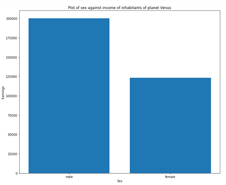
The bar plot shows us clearly that there is a great disparity between the incomes of men and women on planet Venus!
Cheers and thank you for reading! I do hope you enjoyed reading as much as I did writing this. I'd be delighted to answer any questions you have on this or any other topic.
Thank you.

Top comments (0)