How to compose a highly modular React application with reusable components from 5 different libraries.
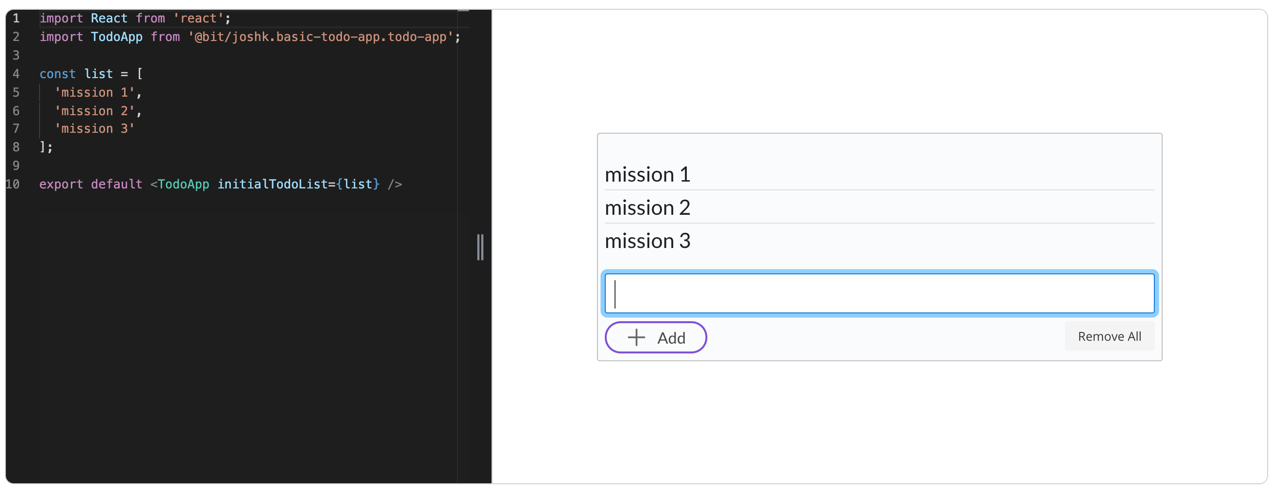
 The final todo app composition with Bit
Modular programming has been around since the 60s, and the term itself was set at 1968 by Larry Constantine and extended ever since.
Today, in the technological world of component-based libraries like React and with tools like Bit, application modularity can be taken to a whole new level.
We will compose a simple React Todo application using reusable components from 5 popular libraries like Material-UI, Grommet and Semantic-UI. Thanks to Bit, we can quickly isolate and compose these components into an app.
When done, not only we will compose a highly-modular app from reusable components, but we will have a collection of components we can reuse to build more apps. The entire app is shared as a reusable component, which can be extended and composed with other components to build larger apps.
This is very exciting, as it’s a live implementation of full-blown modular application composition with a Lego-like experience.
This is the result of the todo list app:

And here’s the app’s GitHub repo:
 JoshK2
/
basic-todo-app-using-bit
JoshK2
/
basic-todo-app-using-bit
A highly-modular React todo application composed of reusable components from 5 different collections. Full-blown software modularity.
Highly-modular React Todo application built of reusable Bit components 

A basic React todo aplication composed of bit componnets shared from 5 different popular React UI libraries inlcuding Grommet, Semantic-UI React, Primereact and Lodash.
All the reusable components used to build this app are availabe in this collection The final todo application is also available as a reusbale bit component, which can be extended and composed with other components to build larger applications.
Motivation
Demonstrating software modularity in the age of components with React and Bit.
Tutorial
See the full tutorial- build your own modular application with reusable components.
Build a Super Modular Todo App with React and Bit Components.
Wich components I used?
Semantic UI React
semantic-ui-react list component
semantic-ui-react icon component
semantic-ui-react css link component
PrimeReact
primereact inputtextarea component
primereact button component
primereact css link component
Grommet
grommet-icons
3 Components
For creating the app I decided to divide the App’s code into 3 components:
TodoItem component, text with remove option.
AddItem component, input text area with add button and remove all button.
TodoApp component, this is the main code of the app that includes the TodoItem and the AddItem, so there will be a List with simple code to manage all the components options like remove, remove all and add.
Components 1+2 are modularly composed of components isolated and shared from different libraries- using Bit which helps us isolate, share and manage reusable components to build modular applications.
TodoItem
This component receives a simple text and id for removing the right todo item from the main list as props, and uses a remove icon from the semantic-ui-react component collection.
To install the component, firsy configure bit.dev as a scoped registry (one time action) and then install the component using Yarn:
npm config set '@bit:registry' [https://node.bit.dev](https://node.bit.dev)

yarn add @bit/semantic-org.semantic-ui-react.icon
This is the code of the component, after adding some helping-code to show the remove icon and send remove as an event to the main component when remove is clicked.
Here’s the final TodoItem component with live editing and playground in Bit.
AddItem
This component shows an input text area with auto resize and two buttons, one to add an item to the list, and the second to remove all items from the list. The remove all button work with props to show or hide this button.
So for this, I use input text area and button from primereact, a button from grommet, and icon from grommet-icons.
Install it:
yarn add @bit/primefaces.primereact.inputtextarea
yarn add @bit/primefaces.primereact.button
yarn add @bit/primefaces.primereact.internal.stylelinks
yarn add @bit/grommet.grommet.button
yarn add @bit/grommet.grommet-icons.add
This is the code of the component after adding some helping code to use the Add button and the Remove All button.
AddItem component with live editing and playground in Bit.
TodoApp
This component is the main component that uses the TodoItem and the AddItem components. The component has a list of item and allow to send an initial list as a prop, and receives all the event from the other components to manage the list. Like the add item, the remove item and the remove all item.
So I use List component from semantic-ui-react, and a unique id function from lodash to avoid key error in map function.
Install it:
yarn add @bit/semantic-org.semantic-ui-react.list
yarn add @bit/semantic-org.semantic-ui-react.internal.style-links
yarn add @bit/lodash.lodash.unique-id
This is the main code of the app, it receives and manages all the events that come from AddItem and TodoItem components.
Then all that’s left is to export the components with Bit- and the final TodoApp is now a modular and reusable component, check out the live demo!
All the reusable components we built are available in this collection, including the final todo app
Check the GitHub repo to see all the project’s code:
JoshK2
/
basic-todo-app-using-bit
A highly-modular React todo application composed of reusable components from 5 different collections. Full-blown software modularity.
Highly-modular React Todo application built of reusable Bit components
A basic React todo aplication composed of bit componnets shared from 5 different popular React UI libraries inlcuding Grommet, Semantic-UI React, Primereact and Lodash.
All the reusable components used to build this app are availabe in this collection The final todo application is also available as a reusbale bit component, which can be extended and composed with other components to build larger applications.
Motivation
Demonstrating software modularity in the age of components with React and Bit.
Tutorial
See the full tutorial- build your own modular application with reusable components.
Build a Super Modular Todo App with React and Bit Components.
Wich components I used?
Semantic UI React
semantic-ui-react list component
semantic-ui-react icon component
semantic-ui-react css link component
PrimeReact
primereact inputtextarea component
primereact button component
primereact css link component
Grommet
grommet-icons
Conclusion
In this post, we’ve seen a very real example of modular software composition with reusable React components and Bit.
When we base our software design on modularity of smaller focused components, we build a better application which is easier to develop, maintain, test and extend. Today, building modular apps becomes more practical- and more fun- than ever before in history.
The same can be done not only with React and not only with frontEnd components. In my next posts, I’ll play with a modular composition for a verity of different technologies and architectures. Thanks for reading and feel free to ask anything! Cheers 🚀

Latest comments (1)
Awesome work!