Back in fall of 2016, I spoke for the first time about accessibility. While planning my presentation and looking for a relevant case study, I stumbled upon something that was quite relevant for the time - the presidential candidates’ donation sites. Considering Section 508 applies to government agencies, I figured that their sites would be super accessible. Boy, was I wrong.
The biggest issue on both Trump and Clinton’s sites were inaccessible forms. I did an evaluation of the forms of the candidates’ donation sites and if I remember correctly (it was almost 2 years ago), both had issues with all forms having missing form labels. While I don’t know what the development cycle is for candidate sites, I would assume the strategy is something like “get the site online as quickly as possible so we can start receiving donations.”
One of the most common accessibility issues I’ve seen is fields missing labels. The great news is it’s one of the simplest accessibility issues to fix.
The Empathetic Side of Forms
Before we go into how to solve this issue, I want to describe a scenario to you. Imagine you are without vision and care deeply about a certain candidate's campaign. You are highly dependent on a screen reader to help you navigate a site. You go to your preferred candidate’s donation site, but then you’re stumped. There are a bunch of fields, but nothing is telling you which field is which. You don’t know where to put your credit card information or where to put your billing address. What do you do? Do you take a guess and then deal with all the validation errors when you get it wrong? Or do you give up?
I imagine that I’d try if I was very passionate about that candidate, but considering how difficult the site was making it donate my own hard earned money, I’d probably give up at that point. I doubt I am the only person who would give up, at least that's what research indicates.

There is significant research that shows us that making things confusing for another user causes them to have a higher bounce rate. I am currently reading Donald Miller's book, Building a StoryBrand, and yesterday I was reading about how confusing users, creating noise and having an unclear message causes a user to go to a brand's competitors that have a more clear message. From what he describes, the amount of energy that it takes to navigate confusion causes calorie burn, and we do not want to waste precious calories. The way he describes it is about surviving and thriving, you should definitely pick up his book and read for yourself.
While this is a book on marketing messaging and not accessibility, I couldn't help but relate that to this case study I did 2 years ago. How does inaccessibility of forms directly relate to "noise," which causes your visually impaired users to leave? This leads me to the business side of it all.
The Business Side of Forms
Let’s reflect on the above scenario for a second, but from the business side of it. How much money did we miss out on by not including something like form labels on our donation form? According to the National Federation of the Blind, in 2015, 7,297,100 or 2.3% of the American population reported having a visual disability. Over 7 million people - think about that. That’s a lot of money potential.
While I believe the reason to create accessible forms is that you don’t want to create a frustrating experience for your users, I know that it’s not really convincing to tell your boss or your clients “Hey we just need to be nicer and more empathetic!” But lost dollars might raise some eyebrows.

Let's start to think about our call to actions and how many of those actions are forms. Newsletter signups, surveys, credit card information--all of these are forms that can ultimately impact our bottom line. There could be a tremendous cost if we do not address these users. This is not an "edge case" (insert eye roll emoji here). This is actually a costly endeavor.
Quickest way to create accessible forms: provide form labels
There is more about forms to make them even more accessible, which I will cover in other blog posts. But if I can summarize form accessibility, I would say Labels, labels, labels!
Something that I see frequently is designers and developers putting the placeholder attribute as a substitute for the label. See the screenshot and markup below for the wrong way.

<input placeholder="Search" type="text">
<input name="Submit" type="submit">
A lot of designs withhold a label and use the placeholder (what’s inside the input) as a visual cue or implication of the label. However, without a physical label in the markup, a visually impaired user cannot identify what the field input is. The placeholder text was created to be that, a placeholder. Using it as a label does not give assistive technology the context to know that the placeholder has a different meaning now.
Not only must there be a label, but the label must be associated with the field. If you have a label that isn't "attached" to the field it's associated with, it defeats the purpose. If it is imperative to a design to not have a label, you can visually hide it which I will talk about in another blog post.
In order to associate a label with a field, you must have an id attribute on the input and use that value for the for attribute on the label. See below.
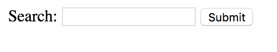
<label for="search-field">Search:</label>
<input placeholder="Search" type="text" id="search-field">
<input name="Submit" type="submit">
There are also people who say you can add an aria-label to the input in order to label it, and that is true. However, I always prefer semantic HTML over aria-labels. If you can solve a problem with HTML5, why would you do something else? Below is how dev.to does it and it accomplishes the same goal:
<input type="text" placeholder="search" aria-label="search">
This is the simplest way to make sure that your forms are accessible. There are more topics to talk about like accessible form validation, ensuring required fields are both visually and semantically labeled as such, etc. However, this simple tip will greatly improve your forms, just by simply telling users clearly which field is which.
Stay tuned for more information about accessible forms. Feel free to reach out to me on Twitter if you have questions about this blog post.

Latest comments (5)
Work caught up with me! So sorry!
I agree that it should be a standard to incorporate best practices. The way I learned this was an accessibility error was mostly through accessibility testing. Missing form labels is always an error. I think if this is the type of thing that will flag on accessibility testing, it should absolutely be put in best practice documentation.
I've found w3 to be a very credible resource on these types of things - and they have some documentation on it! (w3.org/WAI/tutorials/forms/labels/)
Also, I use Wave for most of my first rounds of testing, which is usually where I find form label errors. wave.webaim.org/extension/
Hope this answers your question! Let me know if it hasn't! Thank you for following up :)
Another common use of labels is to encase the input in a label.
I have omitted styling/classes to focus on the structure.
This way, the browser associates the label to the input without having to use IDs. I wonder if this also presents accessibility issues?
Edit: Also, I wonder if it works with current accessibility tools for the label to be a sibling of the input without using IDs.
IDs are supposed to be unique. SPAs like to reuse chunks of HTML across different views. So by default you cannot be guaranteed your usage of ID will be unique. So the tendency for me is to avoid them.
So siblings without association can be problematic, because you'll get an error that the label is orphaned. They recognize that it's there, but it doesn't "associate" the way it wants to. I think if you're concerned about IDs repeating (a very valid concern, we shouldn't be doing that), you might be better off using the aria-label method! I would also look into aria-labeledby as well for this. I am planning some aria blog posts as well, because there are SO MANY THINGS about them haah!
This is a really interesting question. Using a
<label>with an<input>is not really an accessibility issue, it's just how it is supposed to work. That doesn't mean that will make developers use it that way, and for years accessibility proponents have been trying to convince developers to link up theforandidattributes so that they were more than just related by proximity.However, in 1999 there was no
placeholderattribute so people couldn't easily, and wrongly, replace labels with placeholder.There is no doubt that
<label>s should be used and associated with their relevant<input>s and I'm just glad there are articles like this that try to teach people why.I'm wondering if it's because there are ways around it (ways I personally disagree with).
I'm about to sign on to the day job, but I am going to think on this and comment later. Thank you for giving me some food for thought!