
This week was all about the user experience. Started off on Monday with a hard discussion regarding the user experience and lack of flow through our app. We all stepped back and took off our developer hats and put on our user hats to finally step back and discuss how a user actually goes through the app. We brought a friend to do go through the app and talk their way through how they were using the app. This was the eye opening we all needed to help us refocus our efforts for the rest of the week.
I had a couple big winds this week. First is the profile page. With the help of Alex, it received a couple big updates. Fully responsive, a new pricing guide and a slick payment interaction
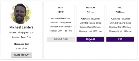
When you select a payment option it adds a nice animation and once the payment has been accepted it switches your plan in bot the guide and on the left on the profile card.
| iPad | iPhone Large | iPhone Small |
|---|---|---|
 |
 |
 |
The second big win this week was making the main dashboard fully responsive. This required manipulating multiple components. Styles needed to be adjusted using Styled Components as well as Material UI styles.

Getting the dashboard fully responsive was a little challenging. Being able to get all three cards to adjust appropriately as you shrink the window down wasn't as easy as I had anticipated. At one point the cards were getting smaller but snapping to a smaller size and not being fluid. After some tweaking of styling across 4 components I was able to make all the cards fluid on the dashboard.
This week our team worked really well together. We took Monday off from coding to make sure we had our priorities straight in regards to the user experience. During that discussion we got to ambitious for the final two weeks and we had to refocus on what we could complete with the time we had left.
We took everything we learned from our user test on Monday and put those items into Trello. The discussion then moved on to refining some of the design decisions to help make them more uniform across the app. An example was our button styles and placements. Having multiple people build the app without a clear design guide we ended up with many different button styles and layouts.
Throughout the week each item we discussed on Monday started to come together. On Thursday we did another user test which better results but not perfect. Some bugs have popped up and some styles still need to be adjusted but we can see the finish line.
Next week will be a grind to get the last remaining items finalized and a video made for the app.
Profile
https://trello.com/c/HKgNRO2k/317-profile-pages-responsiveness-and-pricing-design
https://trello.com/c/1kpAa58k/336-loading-animation-should-just-be-on-the-payment-section-and-not-the-pricing
https://github.com/training-bot/labs11-trainingBot-FE/pull/108
Number of assigned displayed on training series
https://github.com/training-bot/labs11-trainingBot-FE/pull/102
Favicon & Loader
https://github.com/training-bot/labs11-trainingBot-FE/pull/99
Button design updates
https://trello.com/c/ZDf5cS4F/309-replace-all-buttons-with-text-buttons
https://github.com/training-bot/labs11-trainingBot-FE/pull/88
Pricing on profile start
https://trello.com/c/KgVd5ahx/302-pricing-info-on-user-profile-in-subscriptions-section
https://github.com/training-bot/labs11-trainingBot-FE/pull/88

Latest comments (0)