
There are a lot of device screen sizes right now. While it's mostly a good thing to give users options, we, as developer (and designer) often suffers (lol) because we need to support those different screen sizes.
There is a popular choice in the 12 grid system in the web development world. But in the app development world, 12 grid responsive system also not that popular (wonder why).
The example of this is the iphone and ipad app. There are quite a lot "ipad" apps out there when downloaded, only displays the layout in the cropped "iphone" view, which is sucks.
Enter the Simply Responsive Design.
Simply Responsive Design is a term I coined (what a creative name right?) myself. This design system derives / inspired from Material Design mostly, and I build it in the context of me, as a flutter developer.
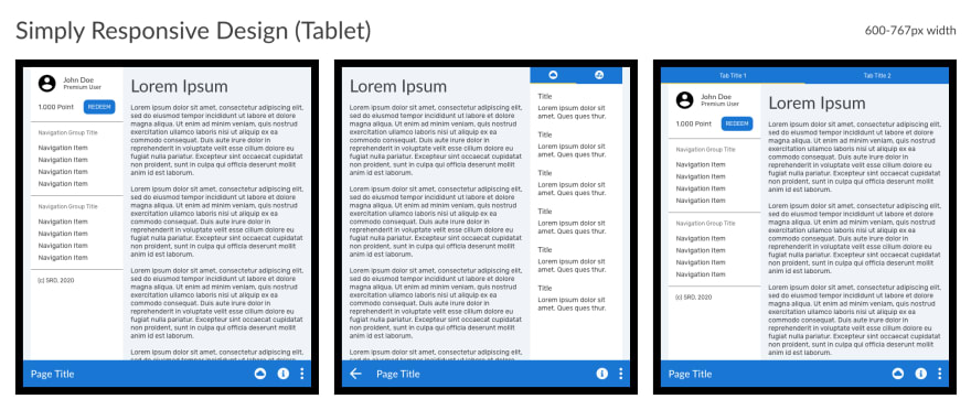
Unlike the 12 grid system, a Simply Responsive Design (or SRD), only assumes there are 3 maximum columns on the screen, along with fixed top and bottom bar / app bar. This simplification has both advantage and disadvantage. Basically, SRD trades flexibility for development speed.
SRD has 3 kind of screen sizes in mind:
Mobile (< 600px width)

Tablet (600 - 767px width)
Desktop (>= 768px width)

As you can see, the UI (or widgets in flutter) placements, are kinda predictable across screen sizes. This makes your development speed faster and easy, if in the beginning of a project, you already make a custom scaffold to abstract out the logic. This way, it will be much easier for subsequent codes to be responsive out of the box.
/// Prototype of SRD as an abstracted out flutter widget
return SimplyResponsiveScaffold(
  title: 'MyTitle'
  leftContents: <Widget>[],
  centerContents: <Widget>[],
  rightContents: <Widget>[],
);
With that widget, no matter what screen size your app is running on, The SimplyResponsiveScaffold will automatically determines where your left, or center, or right should be placed based on the screen size.
(This also make your app works automatically when rotated)
=====
That's it for the introduction part of Simply Responsive Design. In the future articles, I'm going add in-depth explanation of UI elements interactions SRD. I also plan to write a custom flutter library to make it easier to implement SRD.
Thank you and see you in the next article!

Oldest comments (0)