
Why join the dark side (。▽皿▽) ?
Adding dark mode to websites/web-apps are trending now. Here are some of it's benefits:
- Dark mode is easy on eyes for some users
- You can add various themes along with dark mode (for example, Sepia). This makes your app more interesting.
- Your app looks infinitely better with dark mode.
- Users may save some battery using dark mode.
It's really easy (will take a day or so for small-sized website or app).
Demo
here is demo: Codesandbox
CSS Variables
If you are living under rock, CSS variables are like JavaScript variables. We can define CSS variables at one place in stylesheet and can use those variables all over stylesheets instead of hard coded values. These are the building blocks of model css architecture.
body {
    --myFavColor: #BADA55; // variable defination
}

.myDiv {
    background-color: var(--myFavColor); //usage
}
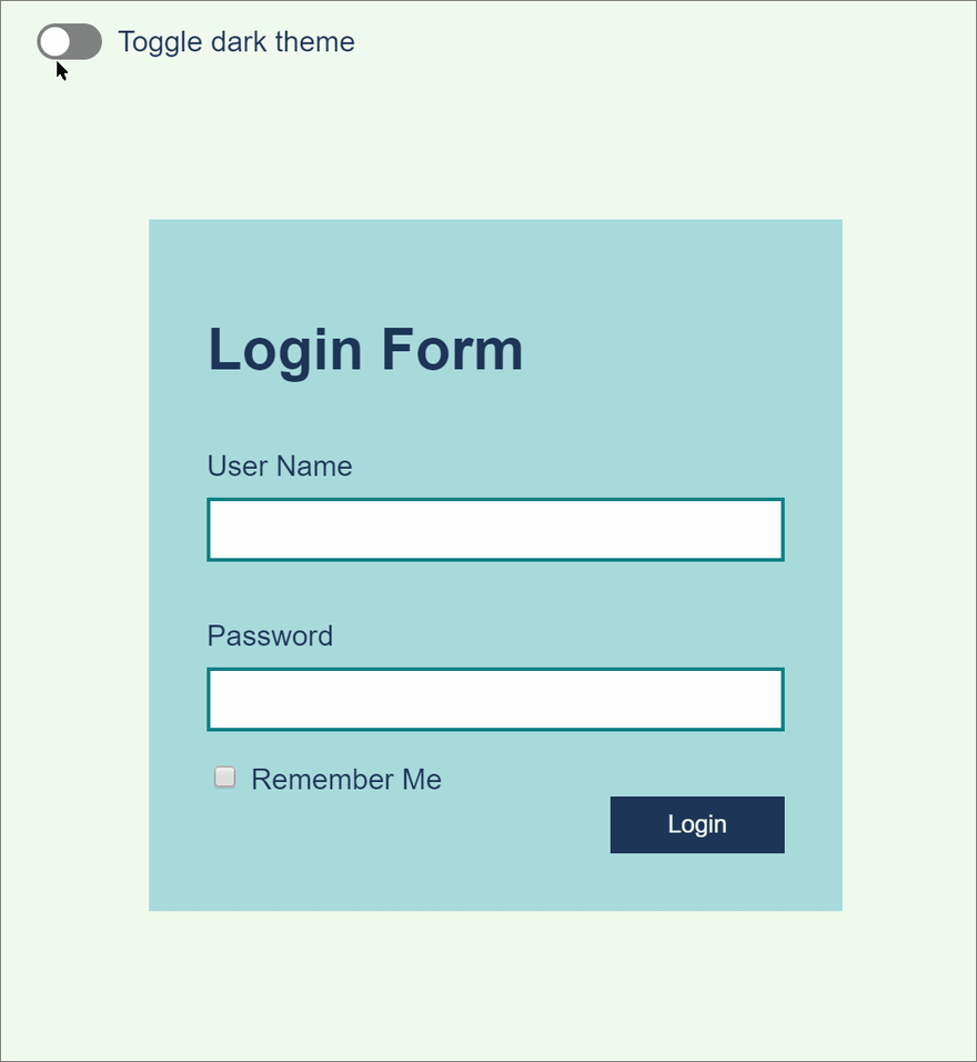
You need to have a basic html page. I will use a simple html login form and some basic styling.
<body>
      <form action="" class="myForm">
        <h1>Login Form</h1>
        <div class="field">
          <label for="username">User Name</label>
          <input type="text" id="username" name="useraname" />
        </div>
        <div class="field">
          <label for="password">Password</label>
          <input type="password" id="password" name="password" />
        </div>

        <label> <input type="checkbox" name="rememberme" /> Remember Me </label>
        <div class="button-container">
          <button class="button" type="submit">Login</button>
        </div>
      </form>
    <script src="src/index.js"></script>
</body>
Note that all the styling is done through CSS classes, no inline styles is used.
Step #1: Add light CSS class with some CSS variable definitions
Add a light class. This will be a default light theme for our app.
.light {
  --background: #f1faee;
  --background-alt: #a8dadc;
  --foreground: #1d3557;
  --accent: #0e8185;
}
We can use these variables in our stylesheet, instead of hardcoded values.
body {
  padding: 0;
  margin: 0;
  font-family: sans-serif;
  display: flex;
  justify-content: center;
  align-items: center;
  height: 100vh;
  color: var(--foreground);
  background-color: var(--background);
}

.myForm {
  padding: 2rem;
  background-color: var(--background-alt);
  width: 24rem;
}
.myForm .field {
  padding: 1rem 0;
}
.myForm .field label {
  display: block;
  margin-bottom: 0.5rem;
}
.myForm .field input {
  border: 2px solid var(--accent);
  padding: 0.5rem;
  width: 100%;
}

.button-container {
  text-align: right;
}

.button {
  color: var(--background);
  background-color: var(--foreground);
  padding: 0.5rem 2rem;
  border: 0;
}
Optional: We may also want to add some CSS variables that are independent of any theme. Usually they are defined in html tag.
/* these variables are theme-independent */
html {
  --purewhite: #ffffff;
  --pureblack: #000000;
}
Step #2: Add light class to your body tag
<body class="light">
    <!-- html here -- >
</body>
Step #3: Add dark CSS class with exact variable definitions as of light class, but with different colours that are suitable for dark mode
.dark {
  --background: #1d3557;
  --background-alt: #457b9d;
  --foreground: #f1faee;
  --accent: #84a59d;
}
Once again, we have to add all of the variables that are there is light class.
Colours will usually be inverted (e.g. light text on dark background) as opposed to light class.
Step #4: Add a button to switch between themes
We have to add an action, which will replace the light class of body tag with dark class (and vice versa).
classList.toggle() method toggles a CSS class in given element's classes.
<button id="theme-toggle">Toggle Dark Theme</button>

//javascript
document.getElementById("theme-toggle").addEventListener("click", function() {
  document.body.classList.toggle("light");
  document.body.classList.toggle("dark");
});
Optional: You can add more themes like Sepia and use something like dropdown as theme switcher. You may also want to save/restore theme choice to/from local storage for persistence.
See the completed demo here: Codesandbox
That's it!
You just added a dark mode to your website/app.

Top comments (0)