


Hello Guys! Welcome to Coding Torque. In this blog, I'm going to explain to you how to make a Developer Profile Card using HTML and CSS. This will be a step-by-step guide. Let's get started 🚀.
Step 1: Import Google Fonts
Import the fonts using Google Fonts API. Below is the code for the Poppins Font. Paste the below code in the <head> tag.
<link rel="preconnect" href="https://fonts.googleapis.com">
<link rel="preconnect" href="https://fonts.gstatic.com" crossorigin>
<link href="https://fonts.googleapis.com/css2?family=Poppins&display=swap" rel="stylesheet">
Step 2 : HTML Code
<!DOCTYPE html>
<html lang="en">

<head>
    <!-- Required meta tags -->
    <meta charset="utf-8">
    <meta name="viewport" content="width=device-width, initial-scale=1">

    <!-- Font Awesome Icons  -->
    <link rel="stylesheet" href="https://cdnjs.cloudflare.com/ajax/libs/font-awesome/5.15.1/css/all.min.css"
        integrity="sha512-+4zCK9k+qNFUR5X+cKL9EIR+ZOhtIloNl9GIKS57V1MyNsYpYcUrUeQc9vNfzsWfV28IaLL3i96P9sdNyeRssA=="
        crossorigin="anonymous" />

    <title>Neomorphic profile card using html and css - @code.scientist x @codingtorque</title>

</head>

<body>
    <div class="profile_card">
        <div class="user_img">
            <img src="../imgs/coding-torque-logo.png" height="100" width="100" alt="profile">
        </div>
        <div class="user_details">
            <h5>Piyush Patil</h5>
            <span>Web Developer</span>
            <p>Develop's Dynamic Websites and Design Web Templates.</p>
            <a href="#">Hire Me</a>
        </div>
        <hr>
        <ul class="social-media-icons">
            <li>
                <a href="#" style="background: linear-gradient(45deg, #2980b9, #2c3e50);"><i
                        class="fab fa-facebook"></i></a>
                <p>13.8k</p>
                <span>Followers</span>
            </li>
            <li>
                <a href="#" style="background: linear-gradient(45deg, #00c9ff, #92fe9d);"><i
                        class="fab fa-twitter"></i></a>
                <p>15.8k</p>
                <span>Followers</span>
            </li>
            <li>
                <a href="#" style="background: linear-gradient(45deg, #833ab4,#fd1d1d, #fcb045);"><i
                        class="fab fa-instagram"></i></a>
                <p>30k</p>
                <span>Followers</span>
            </li>
        </ul>
    </div>
</body>

</html>
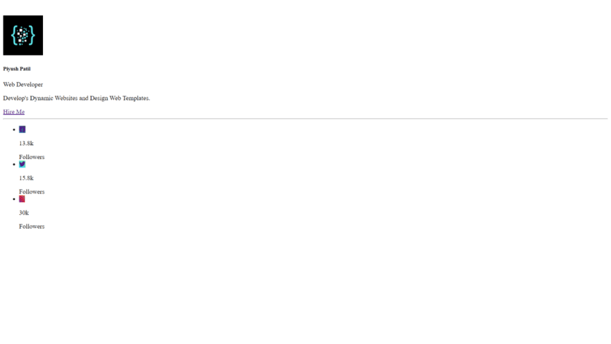
Output Till Now
Step 3: CSS Code
@import url("https://fonts.googleapis.com/css2?family=Baloo 2&family=Roboto:wght@300&display=swap");

* {
    margin: 0;
    padding: 0;
    box-sizing: border-box;
    font-family: "Roboto", cursive;
}

body {
    display: flex;
    align-items: center;
    justify-content: center;
    margin-top: 10rem;
    background-color: rgba(0, 0, 0, 0.9);
}

.profile_card {
    width: 310px;
    color: white;
    display: flex;
    align-items: center;
    justify-content: center;
    flex-direction: column;
    padding: 35px 40px;
    border-radius: 20px;
    position: relative;
    background: black;
    box-shadow: 0px 0px 40px -8px gray;
}

.user_img {
    position: absolute;
    top: -60px;
    display: flex;
    align-items: center;
    justify-content: center;
}

.user_img::before {
    content: "";
    position: absolute;
    height: calc(100% + 10px);
    width: calc(100% + 10px);
    border-radius: 50%;
    background: linear-gradient(45deg, deeppink, deepskyblue);
    box-shadow: 0px 0px 18px -6px #fff200;
    animation: animate 1s linear infinite;
}

@keyframes animate {
    from {
        transform: rotate(0deg);
    }

    to {
        transform: rotate(360deg);
    }
}

.user_img img {
    border-radius: 50%;
    z-index: 1;
}

.user_details {
    display: flex;
    flex-direction: column;
    align-items: center;
    justify-content: center;
    margin: 12px 14px;
}

.user_details h5 {
    font-size: 22px;
    letter-spacing: 2px;
    margin: 12px 0px;
    font-weight: 600;
}

.user_details span {
    text-transform: uppercase;
    font-weight: 700;
    letter-spacing: 2px;
    color: gray;
    font-size: 12px;
}

.user_details p {
    margin: 12px 12px;
    font-size: 14px;
    font-weight: 500;
    text-align: center;
    letter-spacing: 1px;
    color: gray;
}

.user_details a {
    text-decoration: none;
    background: linear-gradient(45deg, #ff00cc, #333399);
    color: white;
    padding: 10px 30px;
    margin: 14px 0;
    border-radius: 20px;
    font-weight: 700;
    letter-spacing: 2px;
    font-size: 14px;
    box-shadow: 0px 6px 22px -6px gray;
    transition: 0.3s ease-in-out;
}

.user_details a:hover {
    background: transparent;
}

hr {
    width: 100%;
    border: 1px solid darkgray;
    background: darkgray;
    margin-bottom: 20px;
}

.social-media-icons {
    display: flex;
    align-items: center;
    justify-content: center;
}

.social-media-icons li {
    list-style: none;
    display: flex;
    flex-direction: column;
    align-items: center;
    justify-content: center;
    margin: 0px 12px;
}

.social-media-icons li a {
    height: 60px;
    width: 60px;
    font-size: 20px;
    color: white;
    display: flex;
    justify-content: center;
    align-items: center;
    text-decoration: none;
    border-radius: 50%;
    margin: 10px 0;
}

.social-media-icons li p {
    font-size: 20px;
    margin: 11px 0;
    font-weight: 700;
}

.social-media-icons li span {
    font-size: 15px;
    color: gray;
    font-weight: 700;
}
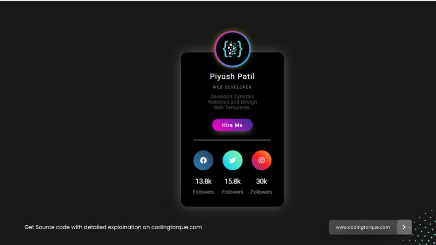
Output Till Now


Top comments (0)