
On most webpages, keyboard and screen reader users must navigate a long list of links and elements before arriving at the main content. This can be particularly difficult for users with some form of motor disabilities. We can improve this situation by providing a "skip to main content" navigation link.
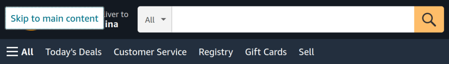
If you are not sure what it is or have never seen one, it is probably because it is almost always hidden until it receives focus. Below is an example from Amazon.com. If you open the homepage and hit Tab, it will show a green link with the text "Skip to main content" that appears above the logo. If you hit Enter, it will take you to the section below.
Creating the "skip to main content" link
We want to put the "skip to main content" link (skip link) at the top of the page, so that it is announced to screen readers early, and that is it is the first item that keyboard users navigate to (typically by pressing the Tab key). Otherwise, users may waste time navigating through extraneous links.
Many designers worry about the aesthetic impact of visible skip navigation links. This is why it has become common to hide it initially. This is fine to do, but you must be careful that you do not use a technique that hides it from keyboard users e.g. using display:none.
I will show you the most common method, which is to hide the link initially, and bring it into view above the home logo when it is focused. Like so:
The HTML is short. We want a link with a href that points to a target ID within the page. We will name our target ID as maincontent. Then, wherever your main content is, you add an id attribute with the value of the target ID. This is outlined below.
<body>
    <header>
        <a class="skiplink" href="#maincontent">Skip to main content</a>
        <!-- Main navigation goes here-->
    </header>

    <main id="maincontent">
        <!-- Content goes here-->
    </main>
</body>
We want to hide our skip link initially. The simplest solution is to position the link off-screen. Below I position the link in the top left corner of the page, and move it off the screen to the top with transform: translateY(-100%). A negative Y translation moves things up.
.skiplink {
  position: absolute;
  left: 0;
  top: 0;
  transform: translateY(-100%);
  transition: transform 0.3s;
}

.skiplink:focus {
  transform: translateY(0%);
}
I find that this hiding technique works best with different layouts. There are a couple of variations on this technique, you can read the article CSS in Action: Invisible Content Just for Screen Reader Users for more info.
You will notice that I added a transition also. This is so that when we bring the link on-screen, it will happen a tiny bit slower than normal to assist the user in spotting it.
To make the skip link visible, we use focus pseudo-class that is triggered when a user tabs to the element. We reset the initial Y translation, so that link will appear in the top left corner of the screen.
WebAIM (Institute for Disability Research, Policy, and Practice) recommends this approach to address confusing sighted users too.
I have seen some examples make the link very small and restore the size on focus. The only explanation I found for this is "for special cases where a user has deactivated absolute positioning". I don't know why and how someone would do this exactly!
.skiplink {
  position: absolute;
  left: 0;
  top: 0;
  transform: translateY(-100%);
  transition: transform 0.3s;

  /*additional properties if absolute positioning is deactivated */
  width:1px;
  height:1px;
  overflow:hidden;
}

.skiplink:focus {
  transform: translateY(0%);

  /*additional properties if absolute positioning is deactivated */
  width:auto;
  height:auto;
}
The only downside is that it makes the transition look a bit funny when the link loses focus, otherwise the result is the same. It is up to you to include this or not!
Here is a codepen with a reasonably realistic layout to demonstrate it in action.
Short and sweet!
Multiple skip links are usually unnecessary
What if a page has many sections or deeply nested navigational links?
Should developers provide a skip navigation link to each of these sections or to skip over each level of the navigation?
WebAim says "In most cases, a single skip link is sufficient."
Further reading
- Webaim.org - "Skip Navigation" Links
- Web Content Accessibility Guidelines (WCAG) 2 - Section 2.4.1 (Bypass Blocks - Level A) refers to skip navigation links, it states "A mechanism is available to bypass blocks of content that are repeated on multiple Web pages."
Thank you for reading! Feel free to subscribe to my RSS feed, and share this article with others on social media. 💌
You can show your appreciation by buying me a coffee on ko-fi. 🙂

Top comments (4)
I solved the issue by removing the root cause - main content is in the main part of the website. If there is nothing that is not a main content, there is nothing to skip :)
😄 That is another way Pawel! I guess it can work for a small website, but not many websites can get away without main navigation.
I never said it has no main navigation. :)
It just does not have any fullscreen images, etc. - Content is king