You've created a new web app, launched successfully and acquired new users. Now what? You wonder are there bugs I'm missing? Are users enjoying the app? What features do they want added?
This is a great time to add a feedback widget to your app. In Part 1, we'll show how to create a widget in react with NextJs, react-popper, and Tailwind
Setting up our project
Step 1: Create a new NextJs app
Note: If you already have a react app you can skip to step 2
create-next-app -e with-tailwindcss feedback-widget
Open up the new app in your code editor, open up the pages/index.js file and delete out the contents. You should end up with:
import Head from "next/head";

export default function Home() {
  return (
    <div className="flex flex-col items-center justify-center min-h-screen py-2">
      <Head>
        <title>React Feedback Widget Example</title>
        <link rel="icon" href="/favicon.ico" />
      </Head>
      Hello!
    </div>
  );
}
Step 2: Create feedback button
For this tutorial, we'll create a floating action button to trigger the feedback popup. This button will "float" at the bottom right of your page and will always be visible for the visitor/user to leave feedback.
Note: You can create any type of button that fits your project.
import Head from "next/head";

export default function Home() {
  return (
    <div className="flex flex-col items-center justify-center min-h-screen py-2">
      <Head>
        <title>React Feedback Widget Example</title>
        <link rel="icon" href="/favicon.ico" />
      </Head>
      <button
        className="absolute bottom-4 right-4 p-2 rounded-l-lg rounded-t-lg bg-blue-700 hover:bg-blue-600 shadow-md hover:shadow-lg text-white"
        type="button"
      >
        Feedback?
      </button>
    </div>
  );
}
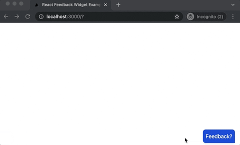
We should now have something that looks like this:

Next, we are ready to create the feedback widget.
Step 3: Install react-popper
i react-popper @popperjs/core
After installing, we'll need to import both usePopper and useState at the top of our component.
import { useState } from 'react';
import { usePopper } from 'react-popper';
Next, we'll set the popper reference and element. Full Code:
import { useState } from "react";
import { usePopper } from "react-popper";
import Head from "next/head";

export default function Home() {
  const [referenceElement, setReferenceElement] = useState(null);
  const [popperElement, setPopperElement] = useState(null);
   const { styles, attributes } = usePopper(referenceElement, popperElement, {
    modifiers: [{ name: "offset", options: { offset: [10, 10] } }],
  });
  return (
    <div className="flex flex-col items-center justify-center min-h-screen py-2">
      <Head>
        <title>React Feedback Widget Example</title>
        <link rel="icon" href="/favicon.ico" />
      </Head>
      <button
        ref={setReferenceElement}
        className="absolute bottom-4 right-4 p-2 rounded-l-lg rounded-t-lg bg-blue-700 hover:bg-blue-600 shadow-md hover:shadow-lg text-white"
        type="button"
      >
        Feedback?
      </button>

      <div ref={setPopperElement}
style={styles.popper}
 {...attributes.popper}>
        Feedback Widget
    </div>
  );
}
We should now have both the button and popper element visible:

Now let's add some styles to the popper.
Step 4: Adding styles to the widget
Right now your widget doesn't have any styleing. We'll add some styling to make it look more like a widget.
Add the classname below to the popper element:
className="bg-white p-2 rounded-md shadow-lg"
Feel free to add different styling to make it your own!
Step 5: Adding a feedback form to the widget
Now that we've created the widget, we'll need to create a form for the user to submit feedback. We want a text area where users can type their feedback, a label for the text area, and a submit button.
...
 <div
        className="bg-white p-2 rounded-md shadow-lg"
        ref={setPopperElement}
        style={styles.popper}
        {...attributes.popper}
      >
        <form>
          <label for="feedback">How can we improve?</label>
          <div className="flex flex-col space-y-2">
            <textarea
              id="feedback"
              className="p-2 h-24 w-64 border border-gray-400 rounded-md"
              type="textarea"
            ></textarea>
            <button
              className="p-2 ml-auto rounded-lg bg-blue-700 hover:bg-blue-600 shadow-md hover:shadow-lg text-white"
              type="submit"
            >
              Send Feedback
            </button>
          </div>
        </form>
      </div>
...
Now our widget should look like this:

Step 6: Showing and hiding the widget
So we have our widget but now need to hide it on button click. We'll use useState for this:
const [showWidget, setShowWidget] = useState(false)
The feedback button will need a click handler to show and hide the widget:
...
 <button
        onClick={() => setShowWidget(!showWidget)}
        ref={setReferenceElement}
        className="absolute bottom-4 right-4 p-2 rounded-l-lg rounded-t-lg bg-blue-700 hover:bg-blue-600 shadow-md hover:shadow-lg text-white"
        type="button"
      >
        Feedback?
      </button>
...
Now we'll need to conditionally show the widget when showWidget = true
      {showWidget && (
        <div
          className="bg-white p-2 rounded-md shadow-lg"
          ref={setPopperElement}
          style={styles.popper}
          {...attributes.popper}
        >
          <form>
            <label for="feedback">How can we improve?</label>
            <div className="flex flex-col space-y-2">
              <textarea
                id="feedback"
                className="p-2 h-24 w-64 border border-gray-400 rounded-md"
                type="textarea"
              ></textarea>
              <button
                className="p-2 ml-auto rounded-lg bg-blue-700 hover:bg-blue-600 shadow-md hover:shadow-lg text-white"
                type="submit"
              >
                Send Feedback
              </button>
            </div>
          </form>
        </div>
      )}
Now we have a "functioning" feedback widget built with react, react-popper, and tailwind!
Of course you'll need to create a backend to collect feedback and save it to your database. Don't have time for that? Use SerVoice and start collecting feedback within minutes.
Full Code:
import { useState } from "react";
import { usePopper } from "react-popper";
import Head from "next/head";

export default function Home() {
  const [showWidget, setShowWidget] = useState(false);
  const [referenceElement, setReferenceElement] = useState(null);
  const [popperElement, setPopperElement] = useState(null);
  const { styles, attributes } = usePopper(referenceElement, popperElement, {
    modifiers: [{ name: "offset", options: { offset: [10, 10] } }],
  });
  return (
    <div className="flex flex-col items-center justify-center min-h-screen py-2">
      <Head>
        <title>React Feedback Widget Example</title>
        <link rel="icon" href="/favicon.ico" />
      </Head>
      <button
        onClick={() => setShowWidget(!showWidget)}
        ref={setReferenceElement}
        className="absolute bottom-4 right-4 p-2 rounded-l-lg rounded-t-lg bg-blue-700 hover:bg-blue-600 shadow-md hover:shadow-lg text-white"
        type="button"
      >
        Feedback?
      </button>
      {showWidget && (
        <div
          className="bg-white p-2 rounded-md shadow-lg"
          ref={setPopperElement}
          style={styles.popper}
          {...attributes.popper}
        >
          <form>
            <label for="feedback">How can we improve?</label>
            <div className="flex flex-col space-y-2">
              <textarea
                id="feedback"
                className="p-2 h-24 w-64 border border-gray-400 rounded-md"
                type="textarea"
              ></textarea>
              <button
                className="p-2 ml-auto rounded-lg bg-blue-700 hover:bg-blue-600 shadow-md hover:shadow-lg text-white"
                type="submit"
              >
                Send Feedback
              </button>
            </div>
          </form>
        </div>
      )}
    </div>
  );
}

Oldest comments (4)
Hi, would love to explore your backend of this project with you.
Hi David, great article. I made a product that bootstrap your feedback widget without worrying about backend. Here is a link: happyreact.com/
It's 100% styling agnostic, so you can make experience matching your brand. It has integration next.js, docusaurus, Nuxt and much more. I could be biased but for me, it's the easiest way to build feedback widget.
hola
dd