
Why I dropped story points, estimations and burn-up charts
Hint: close to the end, section “Fast, Good, Cheap solution”, you get access to a tool that solves the described challenge. First among many to come. Enjoy!
Let’s talk about two common concerns in a project, especially in large complex ones:
- How are we doing?
- When will it be done?
Let’s commence by focusing on the second question, as it may translate into a problematic or challenging situation.
One standard answer is burn-up charts. A visualization of a team’s work process, displaying the scope of a project, and the completed work. Here is an example from Broadcom’s Rally Software:

Based on historical progress and assuming nothing will change, the chart extrapolates our growth’ trend until it meets the total scope’s line. The estimated projected date becomes Aug 21st.
Oops! Our target date is Aug 1st.
Risk 1 — Promises are like babies: easy to make, hard to deliver.
A stakeholder might not be immersed in the daily, weekly activities and context of a large project. So when this chart shows up on a project’s dashboard, the first immediate understanding may be the project has identified the release date. And given the presenter is the project’s representative, the next thought maybe he/she is confident and committing to this target date. Otherwise, why would he/she provide this information?
Risk 2 — Are we confident our future performance will be similar to our historical delivery? 100%?
While we might have a high-level understanding of the remaining backlog, we have to remember that we usually discover the item’s actual size once we are rooted in its execution. On this note, I’ve enjoyed Basecamp’s Shape Up chapter, “Work is like a hill.”
Every piece of work has two phases. First there’s the uphill phase of
figuring out what our approach is and what we’re going to do. Then,
once we can see all the work involved, there’s the downhill phase of
execution.

Future performance is full of uncertainties. Uncertainty manifests itself as a multitude of possible outcomes. Some of the events and factors that could trigger these outcomes include:
- the scope could be more complicated than we know, carry yet undiscovered dependencies contributors’ focus and performance might deteriorate as times goes by adding more contributors to one team will make its communication more complicated, ergo its performance gets affected adding another group will complexify the project’s communication, ergo its delivery will slow down we might be entering summer in some of our workforces’ location. Vacation leaves will undoubtedly impact our capacity external factors such as our customer’s iteratively feedback might push us to rework some screens, logic, or having to increase or change the scope.
How can science help us improve our forecast?

Douglas Hubbard’s How to Measure Anything explains observations help us reduce uncertainty providing both a range and a probability of that range occurring.
The book presents different estimation techniques. In one example, we pour a number (e.g., 534) of small glass balls in a transparent bowl and ask a person in an office to guess how many. He/she might say 250. Then you ask another 100 peers. When analyzing the data, the correct result (534) is found within a specific range (500–600) that matches the answer provided by the majority.
Based on that example, we could say the above chart represents only one possible scenario among many. We need to consider other variations and deviations. Besides, we could provide a forecast, including the range of the most commonly found results across all variations/simulations. That would better represent what is most probable to happen with a higher confidence interval.
The commonly available burn-up charts are great to explain the past. We saw Rally’s screenshot first. Here is JIRA and VersionOne’s version.
JIRA’s burn-up chart
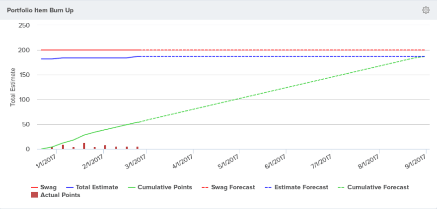
VersionOne’s burn-up chart
What-IF
As stated before, a range is a better way to express what is probable. The less information we have, the broader our range might be, which indicates a lower confidence interval.
So how do we include these what-if variations into the burn-up chart?
In simple terms, we need to include our best and worst scenarios. Now, let’s imagine we are writing the requirements for one of these agile software tools from scratch.
First, let’s calculate our forecast, the single line we see in the above charts. We first calculate the average of our historical velocity. Now we add such value to each future iteration and draw a line across each new data point.
Please consider only the last three iterations to calculate the average. It is rare for a team to have a consistent velocity or performance across long periods. If the team was rocking it the first few iterations of the project, but the last few it was not, then you are better off forecasting using the current or recent performance.
We have achieved the same features as the charts presented above. I always feel itchy anytime I use an average in forecasts.
“If Bill Gates walks into a bar, then on average every person in the
bar is a millionaire.”
Let’s now enhance it by adding High and Low forecast lines. First, we calculate the deviation in the last three iterations. We add such value to our forecasted value to get the High bound and subtract it to get the Low bound. Then draw the lines, and now the chart should display a cone shape between the two lines. It should look like this:
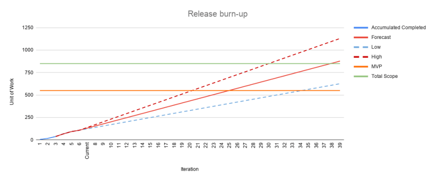
Great! The software I’m using at work does not provide it. So now what?
VersionOne burn-up chart offers a single possible end date using linear forecasting based on the average OR the best iteration OR the worst OR the most often. Not exactly what we are looking for.
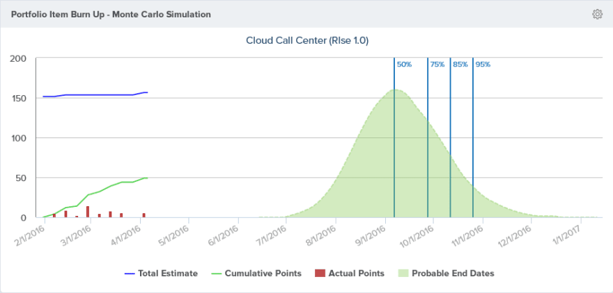
It does offer the“Portfolio Item Burn Up Monte Carlo Simulation” which displays different confidence levels and its corresponding possible delivery dates.
I have only used JIRA for defect tracking. From the documentation, I could not find an enhanced burn-up chart that would offer what we are looking for. Nevertheless, Atlassian Marketplace provides a plethora of plugins that certainly included and exceeded our requirements. Here is one that looks interesting judging by the screenshots:

Agile Reports and Gadgets
Fast, Good, Cheap solution
Here is a straight forward way to achieve the same result without spending a dime.
Step 1- Clone/Copy this google sheet
Step 2 — Update your MVP and Total Scope in terms of points or stories or whatever you choose as your unit of work.
Step 3- Enter the historical performance of your team using the same unit of work as in step two..
The template takes care of everything, calculating the forecast cone and creating the release burn-up chart for you.
Now you can set better expectations with a higher degree of confidence. So looking at the chart, we could say:
Based on the last three iterations’ performance, it is most probable that we will achieve our MVP between sprints twenty and thirty-four.
I’m not going to lie to you; this will raise eyebrows. Your Stakeholders want precision. A spread of fourteen iterations might be interpreted as a lack of confidence. Some will quickly highlight the forecast line that crosses MVP in iteration twenty-five. While tempting to use that prediction, we know it represents only one among many probable futures.
A forecast is a moving target, and it can be accurate in the short term. If we are looking far in the future, the uncertainty grows, and so does its range of probable results. The good news is, as we keep updating our progress, the forecast will be recalculated, and the cone will start closing down.
Conclusion: While I have witnessed teams succeeding using points, estimations, and out of the box burn-up charts, it usually carried risks of unintended delivery date commitments, under and overestimations, teams feeling the pressure of a strict single sided forecast, stakeholders getting frustrated and other pain points. Today we saw how to improve the forecast so we can set proper expectations for our stakeholders. Let’s call that step one.
Disclaimer: I originally thought everything I had to say — why I dropped story points, estimations, and burn-up charts — would fit into a single article. I thought I could summarize the problem and the solution. I was so wrong. So I’ve decided to do agile writting and deliver why standard agile tools burn-up chart have failed me and what can be done — with or without money — to improve it while leveraging the data points these provide.
What’s coming in the rest of this series?
- Do you remember the story about asking 100 peers to help us estimate the bowls’ content? In a future article, we will leverage the Montecarlo algorithm to run thousands of simulations to improve our confidence level on our probability.
- A model is as good as its input. Are points and velocity the best unit of measurement? Is there a better one? For a single team? How about for a large complex project with 10+ teams?
- A burn-up chart also requires all our entire backlog to be estimated. Do we have the time and knowledge to evaluate all of it? Are estimations accurate? Is there an alternative?
- Montecarlo, TAKT, Little’s law and much more
If you like this article, you can follow me on twitter as I continue to document my thoughts and findings.

Top comments (0)