
Here's a image carousel component which has a sliding effect as you switch across the toggler. I've coded this using my knowledge of TypeScript. Any suggestions or corrections are welcome in the comments section below.
Assuming you know to setup Typescript with React let's start with the Toggler component first.

But before that I need you to look at some initial stages.
Here's how my folders stack looks like ->

I have created separate components for sub-heading, heading and also I have the toggler component which I will import in the view-options component. The images folder from where I'll import the images to the constants.ts file in the utils folder. This avoids populating my code in the App.tsx file. Let's see how ->

In the App.tsx file we import the required modules and the App() function returns the <Container> which is a styled div. The <ViewOptions/> that's imported is displayed within the <Container>.
As you can see in the folder stack, I have a utils folder in which there are two .ts files.


We always want type strong definitions in TypeScript. So in the types.ts file when declaring the StyledComponentProps variable in another component, we will not use const props: any = { . If we decide to change the interface declaration for this component later on, we will be forced to update all the references which uses this interface. If you are not used to TypeScript this can seem quite hideous at first, but the benefit of always having strong type definitions will show over time. Especially when you update your type definitions.
In the constants.ts file we import the images from the images folder and define and array of objects VIEW_OPTIONS that has the label and corresponding imported image.
Now, let's start off with the Toggler component. In the index.tsx file under the toggler folder, firstly we import the required modules which includes the {StyledComponentProps} imported from the types.ts file and also specify the TogglerProps.
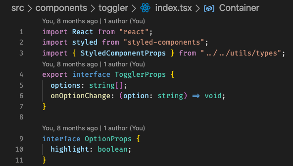
The OptionProps is for styling the option that is selected as shown within the #region styled-components where if true or hovered on there is a change in colour.
(Note: writing the styles within //#region styled-components and //#endregion makes it collapsable and the legible.)

We now define the Toggler function which has the TogglerProps and the StyledComponentProps. Instead of using this.state from class components, we can access the current state of the Toggler component instance, and initialise it, with one single function call using React.useState().
The useState will return 2 things, one is the state variable, and the other is the dispatcher to set this state which in our case is [selectedOption, setSelectedOption].
The handler toggleOption() is assigned with an arrow function which is called onClick of the option while mapping and finally export the Toggler component.
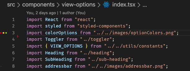
In the index.tsx file under the view-options folder we first import the required modules as shown below
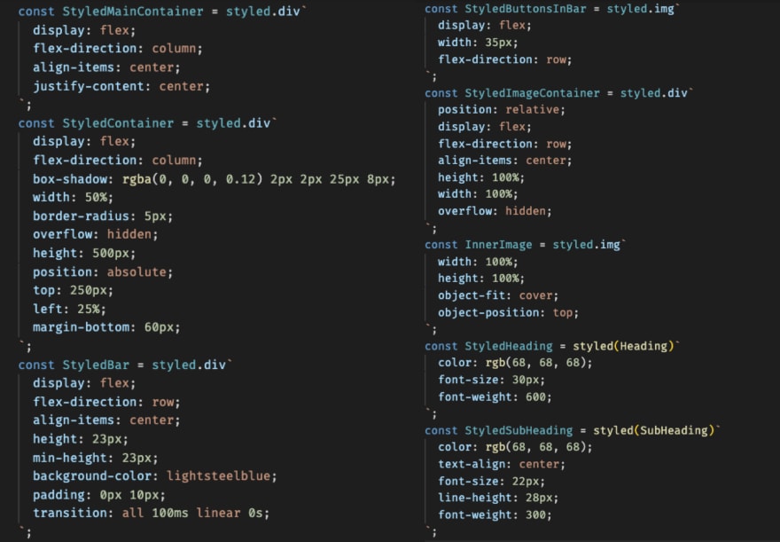
Defining the styles
In the ViewOptions() function we map the option label to the corresponding imageElement when a particular option is selected and define the behaviour of the imageElement.scrollIntoView.

After importing the ViewOptions in the App.tsx file it should work as expected.
Give it a try and explore more!
Any suggestions or corrections are welcome in the comments section below.
Happy Coding! 
Twitter : @SharanyaVaidya

Top comments (0)