自定义组件拥有变量,变量必须被装饰器装饰才可以成为状态变量,状态变量的改变会引起UI的渲染刷新。如果不使用状态变量,UI只能在初始化时渲染,后续将不会再刷新。 下图展示了State和View(UI)之间的关系。

View(UI):UI渲染,指将build方法内的UI描述和@Builder装饰的方法内的UI描述映射到界面。
State:状态,指驱动UI更新的数据。用户通过触发组件的事件方法,改变状态数据。状态数据的改变,引起UI的重新渲染。
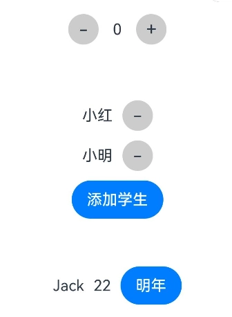
- 组件状态-@State @State装饰的变量,或称为状态变量,一旦变量拥有了状态属性,就可以触发其直接绑定UI组件的刷新。当状态改变时,UI会发生对应的渲染改变。
简单类型变量
@Entry
@Component
struct TestPage {
  @State
  count: number = 0

  build() {
    Column({ space: 50 }) {
      Row() {
        Text('-')
          .textButton()
          .onClick(() => {
            this.count--
          })
        Text(this.count.toString())
          .padding(15)
        Text('+')
          .textButton()
          .onClick(() => {
            this.count++
          })
      }
    }
    .width('100%')
    .height('100%')
    .margin({ top: 50 })
  }
}

@Extend(Text)
function textButton() {
  .fontSize(20)
  .backgroundColor('#CCCCCC')
  .width(32)
  .aspectRatio(1)
  .borderRadius(16)
  .textAlign(TextAlign.Center)
}
对象类型变量
@Entry
@Component
struct TestPage {
  @State
  students: string[] = ['小红', '小明']

  build() {
      Column({ space: 10 }) {
        ForEach(this.students, (item: string, i) => {
          Row({ space: 10 }){
            Text(item)
            Text('-')
              .textButton()
              .onClick(() => {
                // 从索引x处,删除x条
                this.students.splice(i, 1)
              })
          }
        })
        Button('添加学生')
          .onClick(() => {
            // 追加
            this.students.push('小芳')
          })
      }
    }
    .width('100%')
    .height('100%')
    .margin({ top: 50 })
  }
}

@Extend(Text)
function textButton() {
  .fontSize(20)
  .backgroundColor('#CCCCCC')
  .width(32)
  .aspectRatio(1)
  .borderRadius(16)
  .textAlign(TextAlign.Center)
}
数组类型变量
interface Person {
  name: string
  age: number
}

@Entry
@Component
struct TestPage {
  @State
  person: Person = { name: 'Jack', age: 18 }

  build() {
    Column({ space: 50 }) {
      Row({ space: 10 }){
        Text(this.person.name)
        Text(this.person.age.toString())
        Button('明年')
          .onClick(() => {
            this.person.age ++
          })
      }
    }
    .width('100%')
    .height('100%')
    .margin({ top: 50 })
  }
}
2. 组件状态-@prop
@prop装饰的变量可以和父组件建立单向的同步关系。@prop装饰的变量是可变的,但是变化不会同步回其父组件。
1)自定义组件
在ArkUI中,UI显示的内容均为组件,由框架直接提供的称为系统组件,由开发者定义的称为自定义组件。
可组合:允许开发者组合使用系统组件、及其属性和方法。
可重用:自定义组件可以被其他组件重用,并作为不同的实例在不同的父组件或容器中使用。
数据驱动UI更新:通过状态变量的改变,来驱动UI的刷新。
@Component
struct MyComponent {
  build() {
    // 组件结构
  }
}
尝试:提取 counter 组件
@Entry
@Component
struct TestPage {

  build() {
    Column({ space: 50 }) {
      CounterComp()
      CounterComp()
    }
    .width('100%')
    .height('100%')
    .margin({ top: 50 })
  }
}

@Component
struct CounterComp {
  @State count: number = 0

  build() {
    Row() {
      Text('-')
        .textButton()
        .onClick(() => {
          this.count--
        })
      Text(this.count.toString())
        .padding(15)
      Text('+')
        .textButton()
        .onClick(() => {
          this.count++
        })
    }
  }
}

@Extend(Text)
function textButton() {
  .fontSize(20)
  .backgroundColor('#CCCCCC')
  .width(32)
  .aspectRatio(1)
  .borderRadius(16)
  .textAlign(TextAlign.Center)
}
2)父子单向同步
@Entry
@Component
struct TestPage {
  @State count: number = 0

  build() {
    Column({ space: 50 }) {
      // Prop 父传值给子
      CounterComp({ count: this.count })
      CounterComp({ count: this.count })
    }
    .width('100%')
    .height('100%')
    .margin({ top: 50 })
  }
}

@Component
struct CounterComp {
  @Prop @Require count: number

  build() {
    Row() {
      Text('-')
        .textButton()
        .onClick(() => {
          this.count--
        })
      Text(this.count.toString())
        .padding(15)
      Text('+')
        .textButton()
        .onClick(() => {
          this.count++
        })
    }
  }
}

@Extend(Text)
function textButton() {
  .fontSize(20)
  .backgroundColor('#CCCCCC')
  .width(32)
  .aspectRatio(1)
  .borderRadius(16)
  .textAlign(TextAlign.Center)
}
注意:
虽然 @prop 修饰的状态不会同步到父,但是字组件UI是会影响的
可以加上 @Require 代表必传,可省略初始值
- 组件状态-@link 子组件中被@Link装饰的变量与其父组件中对应的数据源建立双向数据绑定。
@Entry
@Component
struct TestPage {
  @State count: number = 0

  build() {
    Column({ space: 50 }) {
      // Link 父同步子,子同步父
      CounterComp({ count: this.count })
      CounterComp({ count: this.count })
    }
    .width('100%')
    .height('100%')
    .margin({ top: 50 })
  }
}

@Component
struct CounterComp {
  @Link count: number

  build() {
    Row() {
      Text('-')
        .textButton()
        .onClick(() => {
          this.count--
        })
      Text(this.count.toString())
        .padding(15)
      Text('+')
        .textButton()
        .onClick(() => {
          this.count++
        })
    }
  }
}

@Extend(Text)
function textButton() {
  .fontSize(20)
  .backgroundColor('#CCCCCC')
  .width(32)
  .aspectRatio(1)
  .borderRadius(16)
  .textAlign(TextAlign.Center)
}

Top comments (0)