What is Seaborn?
Depending on your background, you may know Seaborn as a style that can be applied to Matplotlib, along with such styles as Seaborn Dark and Seaborn Light. But Seaborn is also an entire package, albeit one that is built on top of matplotlib. It is full of shortcuts and easy ways to produce sleek looking plots without much extra code., like easily producing a linear regression plot over a scatter plot. Seaborn has many uses, so let’s take a look at what it can do.
Plot Types:
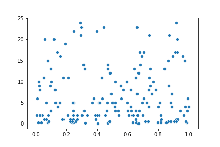
To start with, You can create standard plot types like lines and scatter plots with lineplot() and scatterplot() respectively. These come with a default style similar the seaboard style setting for matplotlib:
In addition, Seaborn also has functions for plotting a linear regression line based on an x and y. There are 2 ways to do this, regplot() and lmplot. These are very similar, but one of the main differences is that regplot() accepts x and y as two separate variables, which can be in variety of list or carry types. lmplot() on the other hand, requires a data parameter and the x and y are the names of the appropriate fields in the data object.
The main difference between these two plots is the figure shape is slightly different. This is because regplot() is an axes level function, while lmplot() uses a FacetGrid interface. You can see how in both versions the regression line is overlaid on the scatter plot, so you can get an idea of the accuracy of the line. Additionally, both plots also show the 95% confidence interval for the regression. Another way to show regression is with jointplot() and give it the parameter kind=‘reg’.
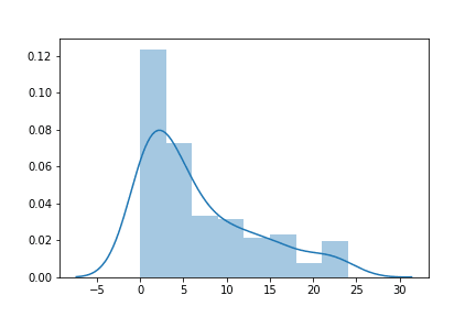
jointplot() is actually a type of distribution plot, but before we get to that let’s start with distplot(), which is used for univariate(single variable) distributions. A basic distplot() will give you a histogram with an overlaid KDE line:
But you can disable the line by using kde=False, or disable the histogram and just have a KDE with hist=False. For a simple KDE plot, you can also just use kdeplot(). Previously I mentioned jointplot() as it was used for regression. Typically, however, jointplot() is used for bivariate(two variable) distributions. To start with, a basic jointplot() will produce a scatter plot:
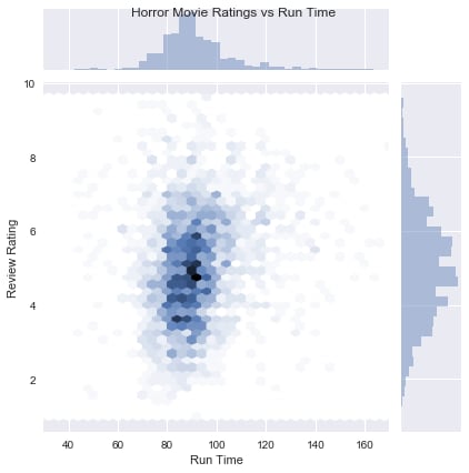
The first difference you’ll notice from a regular scatter plot is the histograms along the top and side, since this kind of plot is intended to show the distribution of points. The kind parameter is another thing that sets the jointplot() apart. In addition to the reg setting mentioned before, kind has several settings for different ways of showing a distribution. hex will create a hex bin plot, which is like a histogram for two variables:
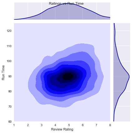
Each hexagon is darker or lighter depending on how many point fall into that area, somewhat like a top-down view of the bars in a histogram. The other notable setting for kind is kde. Much like how a KDE line creates a smooth, linear approximation of a histogram, a bivariate KDE creates a smoothed representation of the point distribution. Seaborn represents this as a contour plot, with darker areas showing the concentration of points.
These are some pretty interesting features, and they can be achieved with relatively little effort. Seaborn can be a powerful tool, and this is only a brief overview of some of the more common features, so there is much more to discover about Seaborn.


Top comments (0)