
Welcome to Day 2 of learning CSS.
As i have told earlier, this series is inspired by this awesome youtube series in freecodecamp channel.
We will start with Typography on day-2. Open your code editor and create a new 2.1-Typography folder and two files index.html and sandbox.css inside it.
 New folder
Next, in index.html put the basic html.
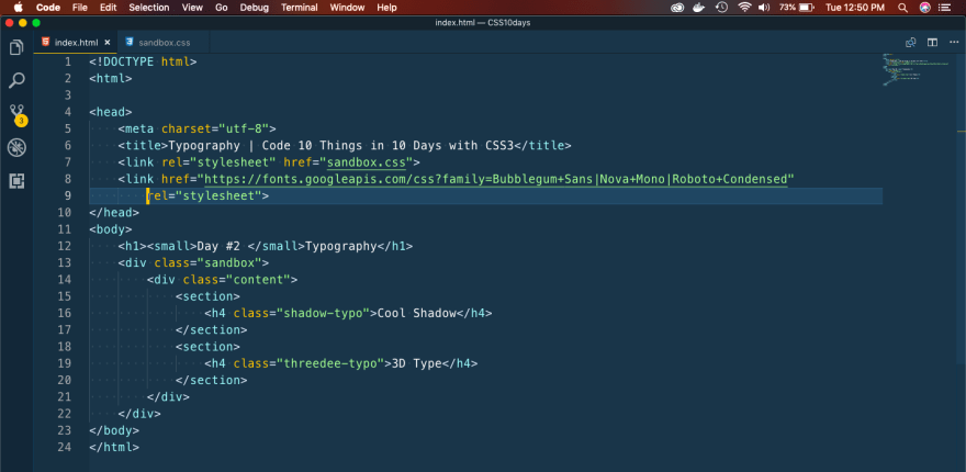 index.html
Now in sandbox.css, we will add code for the Cool Shadow first. We are just using a cursive font from google font and a text-shadow property for the cool effect.
 sandbox.css
Now, when you open the index.html in a web-browser, we can see the cool shadow effect.
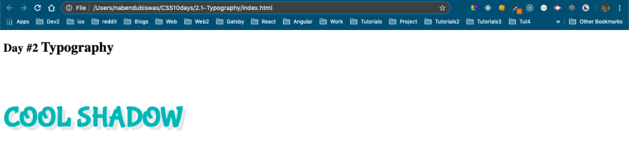 Cool Shadow
Now, we will create the cool 3D button. Head over to sandbox.css and add the below style.
 3D button
This, will show our cool 3D button.
 Cool 3D
Next, we will learn how to clip images. Open your code editor and create a new 2.2-ClippingImages folder and two files index.html and sandbox.css inside it.
In the index.html put the basic bare-bones.
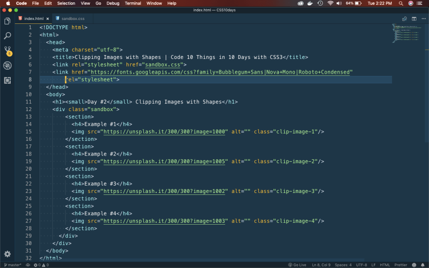 index.html
It will show four images from unsplash.
 basics
It’s time to use clip-path property of CSS, to make the first image a perfect circle. Add below code for first image in sandbox.css
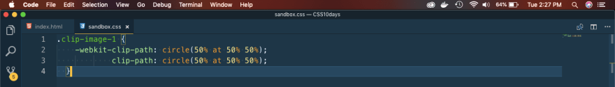 clip-image-1
So, our first image will become perfect circle.
 result
Next, we will head over to the awesome clip maker site https://bennettfeely.com/clippy/
Here, you can use any of the provide clips. We will be using the comment one first.
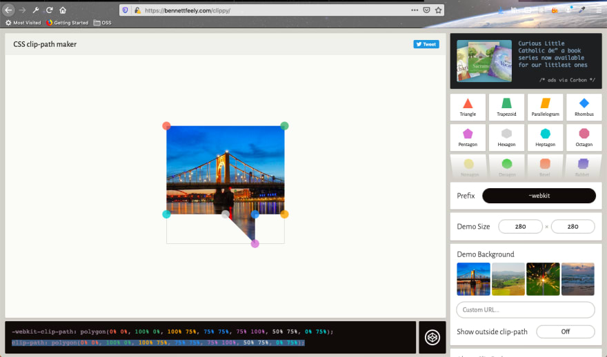 clippy
Just, copy the code and put it for clip-image-2 in sandbox.css
 clip-image-2
And you will get the beautiful comment image.
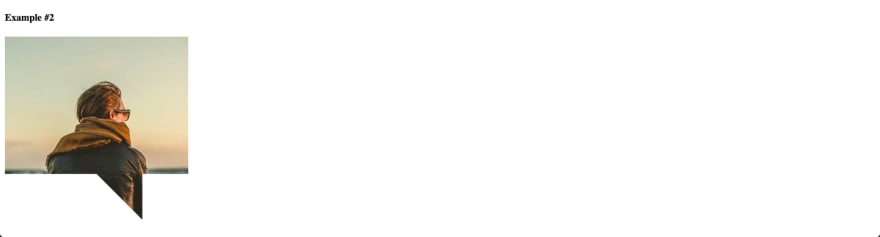 Comment image
Again head over to clippy and copy the code for a cross.
.clip-image-3{
-webkit-clip-path: polygon(20% 0%, 0% 20%, 30% 50%, 0% 80%, 20% 100%, 50% 70%, 80% 100%, 100% 80%, 70% 50%, 100% 20%, 80% 0%, 50% 30%);
clip-path: polygon(20% 0%, 0% 20%, 30% 50%, 0% 80%, 20% 100%, 50% 70%, 80% 100%, 100% 80%, 70% 50%, 100% 20%, 80% 0%, 50% 30%);

}
It will transform the image to a cross.
 Cross
Cross
Head again to clippy and edit the provided left arrow. You can drag any point.
.clip-image-4{
-webkit-clip-path: polygon(40% 0%, 39% 34%, 100% 20%, 100% 80%, 38% 68%, 40% 100%, 0% 50%);
clip-path: polygon(40% 0%, 39% 34%, 100% 20%, 100% 80%, 38% 68%, 40% 100%, 0% 50%);
}
It will show the left arrow.
 custom left arrow
Next, we will create a beautiful registration form. Again in your code editor and create a new 2.3-RegistrationForm folder and two files index.html and sandbox.css inside it.
In the index.html put the basic bare-bones.
 Registration FOrm
This will show a basic form in the browser.
 Basic form
Next, we will add some basic styles to the form to show a background gradient.
 Basic Styles
It will now show our form as below.
 Basic form
Next, we will add code for input boxes in sandbox.css
 sandbox.css
It will now show our form as below.
 index.html
Next, we will style the Submit button. We will create a stripe effect fro the button.
 Button
Let’s add some hover effect also.
.register-wrapper form input[type="submit"]:hover {
    background-size: 40px 40px;
}
And now our button looks like below.
 Our Button
Next, we will add style for our title and the box wrapping this form.
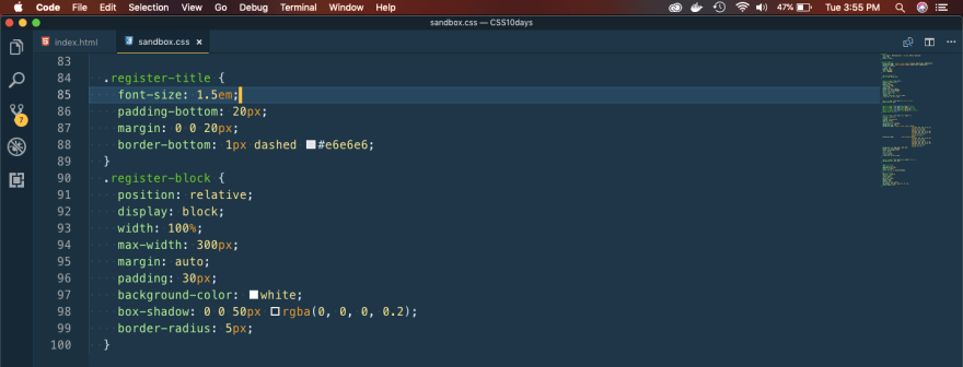 title
title
Our Form is almost complete and looks like below.
 Almost done
Next, we will create a tile effect which, will happen when we hover over the form.
 tile style
It will show the below.
 Tile effect
This completes day 2 of the course.
You can find the code for the same here.

Top comments (0)