
Most of the time, we developers struggle with CSS and take the help of some CSS framework like bootstrap or foundation. Nothing wrong in using them, but then you start to struggle in CSS and when some CSS bug or issue comes, we tend to go to that person in our team who is good in CSS.
To master CSS, the best was is to use it. So, this tutorial contains some practical examples which you can learn and directly use in your projects. This series is inspired by this awesome youtube series in freecodecamp channel.
We will be using this simple html markup and will style it. So, go ahead and open your favorite editor and create a file index.html in it, with below content.
<!DOCTYPE html>
<html>
<head>
  <meta charset="utf-8">
  <title>CSS3 Fancy Buttons | Code 10 Things in 10 Days with CSS3</title>
  <link rel="stylesheet" href="sandbox.css">
  <link href="https://fonts.googleapis.com/css?family=Bubblegum+Sans|Nova+Mono|Roboto+Condensed" rel="stylesheet">
</head>

<body>
  <h1><small>Day #1</small> CSS3 Fancy Buttons</h1>
  <div class="sandbox">
    <h2>Sandbox <small>This is where you play</small></h2>
    <div class="content">
      <p><strong>Instructions:</strong> Use CSS3 to create visually attractive buttons of all different shapes, sizes
        and effects!</p>
      <section>
        <h4>Facebook Style</h4>
        <button type="button" name="button" class="facebook-style-btn facebook-style-dark">Button Dark</button>
        <button type="button" name="button" class="facebook-style-btn facebook-style-light">Button Light</button>
      </section>

      <section>
        <h4>3D Buttons</h4>
        <button type="button" name="button" class="btn-3d-1">3D Button 1</button>
        <button type="button" name="button" class="btn-3d-2">Circle!</button>
      </section>

      <section>
        <h4>Gradient Bordered Buttons</h4>
        <button type="button" name="button" class="gradient-button-1">Gradient button 1</button>
        <button type="button" name="button" class="gradient-button-2">Gradient button 2</button>
      </section>

      <section>
        <h4>Animated Buttons</h4>
        <button type="button" name="button" class="animated-button-1">Animated button 1</button>
        <button type="button" name="button" class="animated-button-2">Animated button 2</button>
      </section>

      <section>
        <h4>Toggle Switch UI Buttons</h4>
        <label for="toggle1" class="toggle-1">
          <input type="checkbox" id="toggle1" class="toggle-1__input" />
          <span class="toggle-1__button"></span>
        </label>

        <label for="toggle2" class="toggle-2">
          <input type="checkbox" id="toggle2" class="toggle-2__input" />
          <span class="toggle-2__button">Click me to activate</span>
        </label>
      </section>
    </div>
  </div>
</body>
</html>
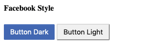
Next create an empty sandbox.css in the same directory. Let’s style the facebook style buttons first.
.facebook-style-btn{
    border-radius: 2px;
    font-size: 0.9rem;
    padding: 6px 12px;
}
And now our index.html looks like below in browser.
 facebook style buttons
Next we will add more styles to the first button.
.facebook-style-dark{
    box-shadow: inset 0 1px 0 0 #4d73bf;
    background: #4267b2;
    border: solid 1px #4267b2;
    color: white;
    text-shadow: 0 1px 0 #3359a5;
}

.facebook-style-dark:hover{
    background: #2b54a7;
}

.facebook-style-dark:active{
    background: #1d4698;
    border-color: #1d4698;
}
Now, our dark button looks like below and have a hover and active state also.
 facebook dark button
Now, let’s also add styles for the facebook light button.
.facebook-style-light{
    background: #f6f7f9;
    border: 1px solid #ced0d4;
    color: #4b4f56;
}

.facebook-style-light:hover{
    background: #e9ebee;
}

.facebook-style-light:active{
    background: #d8dade;
    border-color: #d8dade;
}
And our light button looks like.
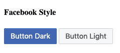 Facebook light
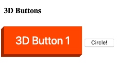
Now, we will style some cool 3d buttons. Will update the css as below.
.btn-3d-1 {
    position: relative;
    background: orangered;
    border: none;
    color: white;
    padding: 15px 24px;
    font-size: 1.4rem;
    box-shadow: -6px 6px 0 hsl(16, 100%, 30%);
    outline: none;
  }

    .btn-3d-1:hover {
      background: hsl(16, 100%, 45%);
    }

    .btn-3d-1:active {
      background: hsl(16, 100%, 40%);
      top: 3px;
      left: -3px;
      box-shadow: -3px 3px 0 hsl(16, 100%, 30%);
    }
Once we click on it the will sort of move down. This is because we have made the position:relative and on active, we have set top to 3px and left to -3px. It will move because of that.
 3D button
Now, there is one thing missing in the above 3D button and that is , the edges of shadows are not matching with the button. We will do the same by creating a small triangle and moving, it to that spot. We will use the ::before and ::after to create those two triangle.
.btn-3d-1::before {
        position: absolute;
        display: block;
        content: "";
        height: 0;
        width: 0;
        border: solid 6px transparent;
        border-right: solid 6px hsl(16, 100%, 30%);
        border-left-width: 0px;
        background: none;
        top: 0px;
        left: -6px;
      }

      .btn-3d-1::after {
        position: absolute;
        display: block;
        content: "";
        height: 0;
        width: 0;
        border: solid 6px transparent;
        border-top: solid 6px hsl(16, 100%, 30%);
        border-bottom-width: 0px;
        background: none;
        right: 0;
        bottom: -6px;
      }

        .btn-3d-1:active::before {
          border: solid 3px transparent;
          border-right: solid 3px hsl(16, 100%, 30%);
          border-left-width: 0px;
          left: -3px;
        }

        .btn-3d-1:active::after {
          border: solid 3px transparent;
          border-top: solid 3px hsl(16, 100%, 30%);
          border-bottom-width: 0px;
          bottom: -3px;
        }
We will now see the proper button, with edges connected.
 3D button final
Next, we will start the second 3D button, which will be a round button with push capabilities. Add the below code to our CSS.
.btn-3d-2 {
    position: relative;

    background: #ecd300; /* For browsers that do not support gradients */
    background: radial-gradient(hsl(54, 100%, 50%), hsl(54, 100%, 40%)); /* Standard syntax */

    font-size: 1.4rem;
    text-shadow: 0 -1px 0 #c3af07;
    color: white;
    border: solid 1px hsl(54, 100%, 20%);
    border-radius: 100%;
    height: 120px;
    width: 120px;
    z-index: 4;
    outline: none;

    box-shadow: inset 0 1px 0 hsl(54, 100%, 50%),
                    0 2px 0 hsl(54, 100%, 20%),
                    0 3px 0 hsl(54, 100%, 18%),
                    0 4px 0 hsl(54, 100%, 16%),
                    0 5px 0 hsl(54, 100%, 14%),
                    0 6px 0 hsl(54, 100%, 12%),
                    0 7px 0 hsl(54, 100%, 10%),
                    0 8px 0 hsl(54, 100%, 8%),
                    0 9px 0 hsl(54, 100%, 6%);
}
Now, the button looks like.
 CIrcle 3D
Now, we will add hover effect and active effect to our 3D circle.
.btn-3d-2:hover {
    background: #ecd300;
    background: radial-gradient(hsl(54, 100%, 45%), hsl(54, 100%, 35%));
}

.btn-3d-2:active {
    background: #ecd300;
    background: radial-gradient(hsl(54, 100%, 43%), hsl(54, 100%, 33%));
    top: 2px;
    box-shadow: inset 0 1px 0 hsl(54, 100%, 50%),
                0 2px 0 hsl(54, 100%, 20%),
                0 3px 0 hsl(54, 100%, 18%),
                0 4px 0 hsl(54, 100%, 16%),
                0 5px 0 hsl(54, 100%, 14%),
                0 6px 0 hsl(54, 100%, 12%),
                0 7px 0 hsl(54, 100%, 10%);
}
Now, when you click on the circle button, the top 2px will come to play and in box-shadow, we have reduced two layers. So, it will show the pressed state.
Now, we will move to Gradient bordered buttons. We will start with the CSS for button 1.
.gradient-button-1 {
    position: relative;
    z-index: 1;
    display: inline-block;
    padding: 20px 40px;
    font-size: 1.4rem;
    box-sizing: border-box;
    background-color: #e7eef1;
    border: 10px solid transparent;
**    border-image: linear-gradient(to top right, orangered, yellow);
    border-image-slice: 1;**
    color: orangered;
  }

  .gradient-button-1:hover {
    background-image: linear-gradient(to top right, orangered, yellow);
    color: white;
  }
Here, one of the important properties are the highlighted one. They are the property which makes the outline border in the button.
 Gradient button
On hover we fill the button with the hover property.
 Gradient button hover
Now, we will make the gradient button 2. It will be completely same as button 1.
.gradient-button-2 {
    position: relative;
    z-index: 1;
    display: inline-block;
    padding: 20px 40px;
    font-size: 1.4rem;
    box-sizing: border-box;
    background-color: #e7eef1;
    border: 4px solid transparent;
**    border-image: linear-gradient(to right, orangered, transparent);
    border-image-slice: 1;**
    color: orangered;

  }
  .gradient-button-2:hover {
    background-size: 100%;
    background-image: linear-gradient(to right, orangered, transparent);
    **border-right-style: none;**
    color: white;
  }
And the button looks like below. The difference comes from the to right in border-image.
 Gradient button 2
Also, on hovering we have set border-right-style: none, which results in below.
 Gradient button 2 hover
Now, we will start with our animation buttons. Let’s start with button 1. In this we will be using a pattern image and when, we hover over the button, the pattern will move.
.animated-button-1 {
    position: relative;
    display: inline-block;
    padding: 20px 40px;
    font-size: 1.4rem;
    background-color: #00b3b4;

    background-image: url(pattern.png);
    background-size: 40px 40px;
    border: 1px solid #555;
    color: white;
    transition: all 0.3s ease;
  }

  .animated-button-1:hover {
    animation: loading-button-animation 2s linear infinite;
  }

  @keyframes loading-button-animation {
    from {
      background-position: 0 0;
    }
    to {
      background-position: 40px 0;
    }
  }
For the pattern to move, we are using the @keyframes from animation and moving the background.
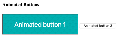 Animation button 1
Now, we will do the animation button 2. We will be doing this animation without any keyframe animation.
.animated-button-2 {
    position: relative;
    display: inline-block;
    padding: 20px 40px;
    font-size: 1.4rem;
    background-color: #00b3b4;
    background-size: 20px 20px;
    border: 1px solid #555;
    color: white;
    transition: all 0.3s ease;
  }
  .animated-button-2:after {
    position: absolute;
    top: 50%;
    right: 0.6em;
    transform: translate(0, -50%);
    content: "»";
    **opacity: 0;**
    transition: all 0.3s ease;
  }
  .animated-button-2:hover {
    padding: 20px 60px 20px 20px;
  }
  .animated-button-2:hover:after {
    right: 1.2em;
    **opacity: 1;**
  }
But, with the help of opacity of an after element “»” set to 0.
 Before hovering
And when we hover over the button, we shift some padding and make the opacity: 1 for element “»”.
 Animated arrow
We will next make our toggle UI buttons. But if we look at our html, it is actually checkbox and we are transforming it to look like a button.
<label for="toggle1" class="toggle-1">
          <input type="checkbox" id="toggle1" class="toggle-1__input" />
          <span class="toggle-1__button"></span>
        </label>
The CSS for the toggle button is below.
.toggle-1 {
    font-family: Helvetica, Arial, sans-serif;
    display: inline-block;
    vertical-align: top;
    margin: 0 15px 0 0;
  }
  .toggle-1__input {
    display: none;
  }
  .toggle-1__button {
    position: relative;
    display: inline-block;
    font-size: 14px;
    line-height: 20px;
    text-transform: uppercase;
    background-color: #f2395a;
    border:1px solid #f2395a;
    color: #ffffff;
    width: 80px;
    height: 30px;
    transition: all 0.3s ease;
    cursor: pointer;
  }
  .toggle-1__button:before {
    position: absolute;
    top: 6px;
    left: 40px;
    right: auto;
    display: inline-block;
    height: 20px;
    padding: 0 3px;
    background-color: #ffffff;
    color: #f2395a;
    content: "off";
    transition: all 0.3s ease;
  }
  .toggle-1__input:checked + .toggle-1__button {
    background-color: #00b3b4;
    border:1px solid #00b3b4;
  }
  .toggle-1__input:checked + .toggle-1__button:before {
    left: 5px;
    content: "on";
    color: #00b3b4;
  }
As evident from the above everything including the on and off are created from CSS.
 Toggle Off
 Toggle on
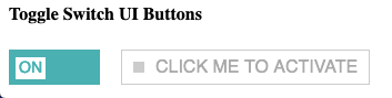
Last, we will create the toggle button 2. It will also be a checkbox.
<label for="toggle2" class="toggle-2">
          <input type="checkbox" id="toggle2" class="toggle-2__input" />
          <span class="toggle-2__button">Click me to activate</span>
        </label>
The CSS for toggle button 2 will be below.
.toggle-2 {
    font-family: Helvetica, Arial, sans-serif;
    font-size: 1rem;
    display: inline-block;
    vertical-align: top;
    margin: 0 15px 0 0;
  }
  .toggle-2__input {
    display: none;
  }
  .toggle-2__button {
    position: relative;
    display: inline-block;
    line-height: 20px;
    text-transform: uppercase;
    background-color: #ffffff;
    color: #aaaaaa;
    border: 1px solid #cccccc;
    padding: 5px 10px 5px 30px;
    transition: all 0.3s ease;
    cursor: pointer;
  }
  .toggle-2__button:before {
    position: absolute;
    top: 10px;
    left: 10px;
    right: auto;
    display: inline-block;
    width: 10px;
    height: 10px;
    background-color: #cccccc;
    content: "";
    transition: all 0.3s ease;
  }
  .toggle-2__input:checked + .toggle-2__button {
    background-color: #00b3b4;
    border-color: #00b3b4;
    color: #ffffff;
  }
  .toggle-2__input:checked + .toggle-2__button:before {
    background-color: #ffffff;
  }
Here, we have a nice clickable button.
 Clickable toggle button
On click of the button will change background.
 Toggle button 2 changed.
This concludes Day-1 in which we learned to create different type of buttons. You can find the code for the above in this github link.

Top comments (1)
Will definitely try once i get time.