
Hello, readers welcome back to another article. Hope you all are doing great. So in this article, we will see how we can delete any item from a list view just like in the Gmail app.
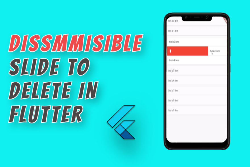
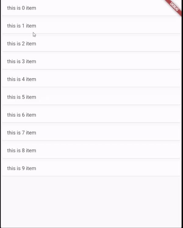
First, let's quickly create a list view with 10 items. Now to make the list items delete on sliding left or right just wrap them in a widget called Dismissible. And there is onDismissed function which is called when the item is removed from the list. write your logic to delete the data from a database or local storage on items deleted from the list.
Constructor of Dismissible
Dismissible({
  required Key key,
  required Widget child,
  Widget? background,
  Widget? secondaryBackground,
  Future<bool?> Function(DismissDirection)? confirmDismiss,
  void Function()? onResize,
  void Function(DismissUpdateDetails)? onUpdate,
  void Function(DismissDirection)? onDismissed,
  DismissDirection direction = DismissDirection.horizontal,
  Duration? resizeDuration = const Duration(milliseconds: 300),
  Map<DismissDirection, double> dismissThresholds = const <DismissDirection, double>{},
  Duration movementDuration = const Duration(milliseconds: 200),
  double crossAxisEndOffset = 0.0,
  DragStartBehavior dragStartBehavior = DragStartBehavior.start,
  HitTestBehavior behavior = HitTestBehavior.opaque,
})
Now let's see what more we can do with this widget. Let us explore each attribute of the dismissible widget one by one. In the dismissible widget, the keyis the required attribute because it uses a key of each item in the list to manage and update the UI after any item is dismissed.
Child: You can guess from the name this is the child widget of this widget.
Background and Secondary background
The background is the widget that will be seen when the list item is being dismissed. For example, if you want to delete the data then you can show a container with red color like this.
Dismissible(
            key: Key(index.toString()),
            background: Container(color: Colors.red),
            onDismissed: (direction) {},
            child: Card(
              child: ListTile(
                title: Text("this is $index item"),
              ),
            ),
          );

Similarly, the secondary background is the other background that will be shown on the item being dismissed. If you dismiss the item to the right then you can see the background but when you dismiss the item to left you can see the secondary background. For secondary background to work background should not be null.

And to make it look more beautiful you can also add an icon to the container like this.
background: Container(
              color: Colors.red,
              padding: const EdgeInsets.symmetric(horizontal: 20),
              child: const Icon(
                Icons.delete,
                color: Colors.white,
              ),
              alignment: Alignment.centerLeft,
            ),
secondaryBackground: Container(
              color: Colors.green,
              padding: const EdgeInsets.symmetric(horizontal: 20),
              child: const Icon(
                Icons.archive,
                color: Colors.white,
              ),
              alignment: Alignment.centerRight,
            ),

direction
Direction is the direction in which you want the widget to be dismissed. Horizontal or vertical.
ondismissed
This function is called when you dismiss any item from the list. You can use this function to modify the data. For example, if the user removed any item from the list then you can delete that from the database in this function. This function has one parameter of direction which tells in which direction the user had dismissed the item based on that you can perform the actions.
onDismissed: (direction) {
              if (direction == DismissDirection.startToEnd) {
                print("Item deleted");
                //your code to delete item from database or local storage
              } else if (direction == DismissDirection.endToStart) {
                print("item archived");
                //your code to move item to archive
              }
            },
confirmdismis
Confirm dismiss is the function that will be called when the item is dismissed. It is used to confirm the action. This function also has dismissed direction parameter to check in which direction the user had dismissed the widget. For example, we can check if the direction right then shows a dialog to the user to delete an item, and if the direction is left then show a dialog to archive the item like in the Gmail app.
confirmDismiss: (direction) async {
              if (direction == DismissDirection.startToEnd) {
                bool dismiss = false;
                await showDialog(
                    context: context,
                    builder: (context) {
                      return AlertDialog(
                        title: const Text("Are you sure you want to delete the item"),
                        actions: [
                          TextButton(
                              onPressed: () {
                                dismiss = true;
                                Navigator.pop(context);
                              },
                              child: const Text("Yes")),
                          TextButton(
                              onPressed: () {
                                dismiss = false;
                                Navigator.pop(context);
                              },
                              child: const Text("No")),
                        ],
                      );
                    });
                return dismiss;
              } else if (direction == DismissDirection.endToStart) {
                //similar for archiving item
                //show dailog to confirm archive item on sliding on left side
              }
            },
DismissDirection.startToEnd is from right side to left side and DismissDirection.endToStart is from left side to right side dismiss.
onresize and resizeduration
So when you dismiss the widget the item size that you had dismissed is reduced slowly. Resize duration is the duration in which the item should be removed from the list after dismissal. and onresize function is called when the item is being shrunk.
Dismissible(
            key: Key(index.toString()),
            background: Container(
              color: Colors.red,
              padding: const EdgeInsets.symmetric(horizontal: 20),
              child: const Icon(
                Icons.delete,
                color: Colors.white,
              ),
              alignment: Alignment.centerLeft,
            ),
            secondaryBackground: Container(
              color: Colors.green,
              padding: const EdgeInsets.symmetric(horizontal: 20),
              child: const Icon(
                Icons.archive,
                color: Colors.white,
              ),
              alignment: Alignment.centerRight,
            ),
            onResize: () {
              print("resized");
            },
            resizeDuration: Duration(seconds: 5),
            child: Card(
              child: ListTile(
                title: Text("this is $index item"),
              ),
            ),
          );
By default, the resize duration is 300 milliseconds. And if you give null in resize duration then onresize function will not be called and items will not be shrunk from the list.
onResize: () {
              print("resized");
            },
resizeDuration: null,

onupdate
on update is a function that is called every time when you drag the widget. it has a parameter called details which give details like direction, previous reached and currently reached state of drage.
previous reached and reached are boolean value which tells if the drag has passed the threshold for an item to be dismissed or not. Like when you drag the item and if it reached center(assuming) then the current state will be true and the previous state will be false. You can understand better from the image below.

dismiss thresholds
As seen in the above image we can give the threshold at which the user leaves the hand and the item will be dismissed. DismissTreshold is a MAP of threshold for each dismiss direction. You can give different thresholds for different directions.
dismissThresholds: {
              DismissDirection.startToEnd: 0.5,
              DismissDirection.endToStart: 0.1
            },
movementDuration
This is the duration the widget takes to slide away from the screen.
Dismissible(
            key: Key(index.toString()),
            background: Container(
              color: Colors.red,
              padding: const EdgeInsets.symmetric(horizontal: 20),
              child: const Icon(
                Icons.delete,
                color: Colors.white,
              ),
              alignment: Alignment.centerLeft,
            ),
            secondaryBackground: Container(
              color: Colors.green,
              padding: const EdgeInsets.symmetric(horizontal: 20),
              child: const Icon(
                Icons.archive,
                color: Colors.white,
              ),
              alignment: Alignment.centerRight,
            ),
            movementDuration: Duration(seconds: 10),
            child: Card(
              child: ListTile(
                title: Text("this is $index item"),
              ),
            ),
          );

crossAxisEndOffset
This value defines the offset the widget should move in cross-axis while being dismissed. If dismissal direction is horizontal and the value of offset is positive it moves downward and if negative it moves upward.


dragStartBehavior(from documentation)
Determines the way that drag start behavior is handled.
If set to [DragStartBehavior.start], the drag gesture used to dismiss a dismissible will begin at the position where the drag gesture won the arena. If set to [DragStartBehavior.down] it will begin at the position where a down event is first detected.
In general, setting this to [DragStartBehavior.start] will make drag animation smoother, and setting it to [DragStartBehavior.down] will make drag behavior feel slightly more reactive.
By default, the drag start behavior is [DragStartBehavior.start].
behavior
How to behave during hit tests.This defaults to [HitTestBehavior.opaque].
This definition is from the documentation and I have no idea about what it is, if you know what is hit test behavior please let me know.
If you want to add more options like multiple actions on sliding the item then you can use this plugin also.
flutter_slidable
If you liked this article then you can follow me for more stuff like this and if you don't like anything then also feel free to tell me.

Oldest comments (0)