
Title: Description: On Day 10, I dived deep into CSS positioning — Absolute, Relative, Fixed, and Sticky — and finally understood how elements behave when placed in different coordinate systems. Here’s how my experiments turned out.
🧭 Day 10 — The Art of CSS Positioning
Today was all about mastering the magic behind element positioning in CSS.
You know that feeling when your elements just float weirdly, and you can’t figure out why? Yeah, that’s what I wanted to fix today.
Let’s break down what I learned 👇
🎯 Absolute Position — “The Floating Element Trick”
So, I started with three colorful boxes (Box 1, Box 2, and Box 3).

Then, I gave Box 1 the CSS rule:
position: absolute;
And boom! Box 1 lifted off the layout like it just got gravity removed.

The space it left behind got filled by Box 2, and Box 3 moved up too — just like a Tetris game in motion.

Then I tried the same with Box 2 and Box 3.
For Box 3, nothing really changed since all boxes were already “out of the normal flow.”

💡 Note:
When you use position: absolute;, the element is taken out of the document flow.
Also, only elements with a position value (like relative, absolute, fixed, or sticky) can use properties like top, right, bottom, left, and z-index.
If the position is static (default), those properties do nothing.
🧩 Relative Position — “Parent Matters!”
Next, I made a setup with three boxes again:
outer (the parent)
inner (the child)
text (the grandchild)
At first, I gave text the CSS:
position: absolute;
left: 50%;
It moved to the center — but not quite. It was taking 50% of the entire screen width, not its parent’s.

Then I gave its parent (inner) this:
position: relative;
And boom 💥— the magic happened!

Now,
left: 50%
referred to the parent’s width, not the screen.
That’s when it clicked — absolute positioning works relative to the nearest positioned ancestor.
💬 Reminder:
You can’t apply two position values at the same time (like
position: absolute; position: relative;
) — only one will take effect.
🧱 Fixed Position — “The Immovable Box”
Next, I created two full-screen divs stacked vertically and added a small box named “slide”.

When I gave it:
position: fixed;
top: 10px;
right: 10px;
```
Even when I scrolled down the page — guess what?
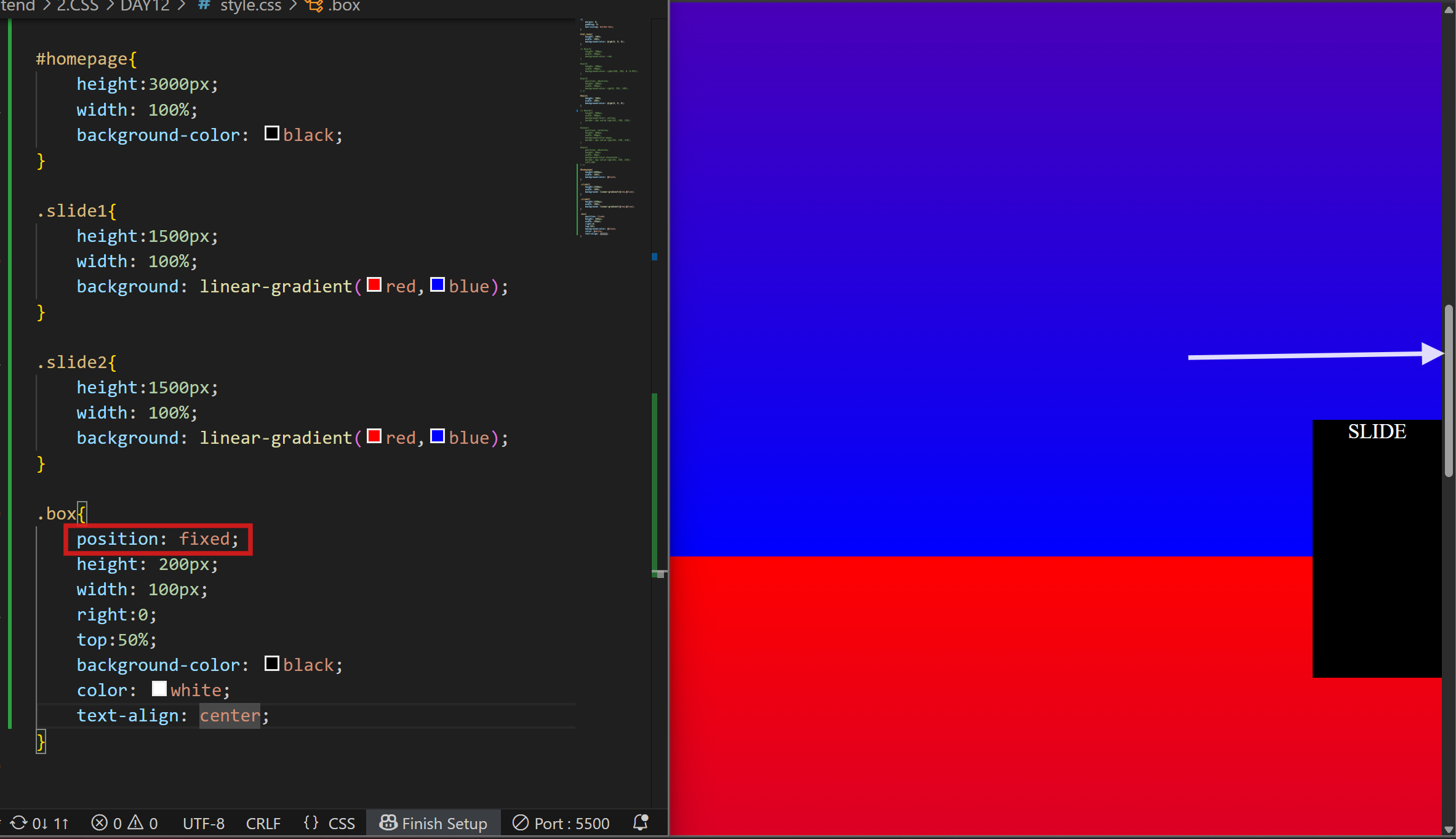
The box stayed fixed in place, just like a sticky note on your screen.
No matter how much you scroll, a fixed element doesn’t move.
It’s commonly used for navigation bars, floating buttons, or chat icons that stay visible while scrolling.
📌 Sticky Position — “The Hybrid Mode”
Finally, I tested position: sticky;.
Though I didn’t capture a screenshot for this one, it’s basically a mix of relative and fixed.
When scrolling, the element behaves like it’s relative until it reaches a certain point, then “sticks” there like a fixed element.
```
position: sticky;
top: 0;
```
Perfect for sticky headers or section titles that stay visible while scrolling through content.
📝 Final Thoughts
Today’s practice made one thing crystal clear:
CSS positioning isn’t about memorizing — it’s about understanding how elements interact with their surroundings.
Each property — absolute, relative, fixed, sticky — has its own superpower.
And once you understand them, you can place any element exactly where you want it.
Can’t wait to explore CSS Z-index and stacking context next. Stay tuned for Day 11 of my web dev journey!

Top comments (0)