
Hey everyone!
It's Hacktoberfest, and I'd like to share a case study from our recent internal UX/UI design hackathon!
How many times you came across quite a nice product, with huge potential, but it looked and felt just...meh?
I decided to see if I can fix some of these products one hackathon at a time.
Today we held our first internal hackathon for designers and product owners. The formula is as follows:
1) Pick industry
2) Browse Angel List, Betapage, App Store looking for startups that lack good design but has the potential to become something big
3) Ask the founders for consent to play with it
4) Pick one
5) Let creative people redesign a few screens and make it 10x better within one day.
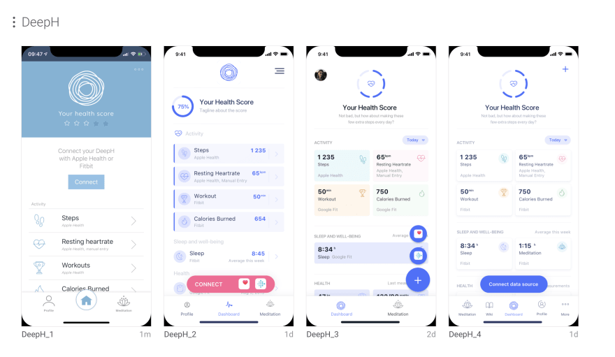
This time we picked the DeepH iOS app (Healthcare).
Happy reading!
Overview
DeepH app is a general utility health app that encourages a healthy lifestyle by tracking steps, workout, weight, height, meditation time, sleep. The user can sync external data sources (Fitbit, Apple Health, Google Fit) or add entries manually.
Objective
Medical applications often store/process sensitive user data. Some apps feature health insights based on blood pressure, weight, age, or other parameters/risk factors. Needless to say, when it comes to health, credibility and reliability are the most important values that build trust with users.
While most of them are not necessarily concerned with the technical solutions under the hood, they often assess credibility by how the app looks and feels like.
The redesign sprint has been scoped to identify and fix UX bottlenecks and take the user interface to a whole new level of a fully-fledged product.
Goals
- Acquire more users
- Build a relationship with existing users
- Convert free users into premium users
Process
The team consisted of a product owner and a UX/UI designer who worked together for 8 hours to redesign two screens of the application: the main dashboard and fitness data preview.
They collaborated remotely using Slack, Sketch, and Zeplin.
Started with two dashboard propositions, they picked one and polished it to establish a unified design system and elements styling.

Results
Main Dashboard
Grid helps memorize the position of an element and make the dashboard better organized
Key insights
- Swap the list for a two-column grid
Lists are pretty good for an ordered collection of elements, especially when the number of them is dynamic. In this case, the grid helps memorize the position of an element and make the dashboard better organized.
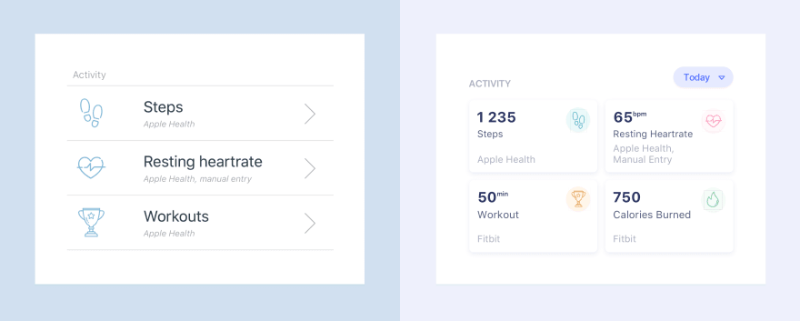
- Dashboard as data display
Users can now see all relevant data, such as a number of steps, resting heart rate, or workout time right in the dashboard. There's no need for the additional tap to check current metrics. On the other hand, the subtle shadows dropped on tiles encourage to tap and see the detailed metric break down and chart.
- More native elements
Obeying Apple design guidelines for bottom tab bar, navigation bar, buttons, labels, fonts, fonts, spacings, paddings makes the user feel familiar and comfortable.
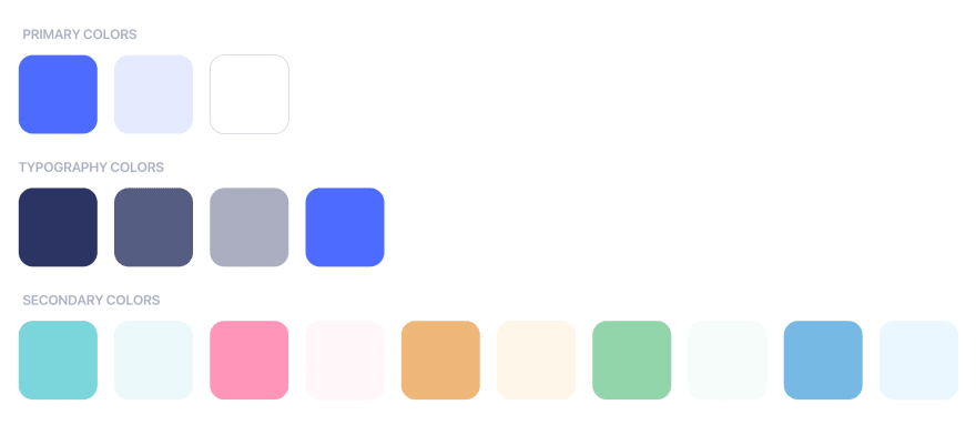
- Color palette
Dominant white color, complemented by blue details and subtle shadows, makes for a clean, sleek layout.
- Emotional, engaging copywriting
If someone does not hit the full health score, let's motivate him/her to be more active in a friendly way.
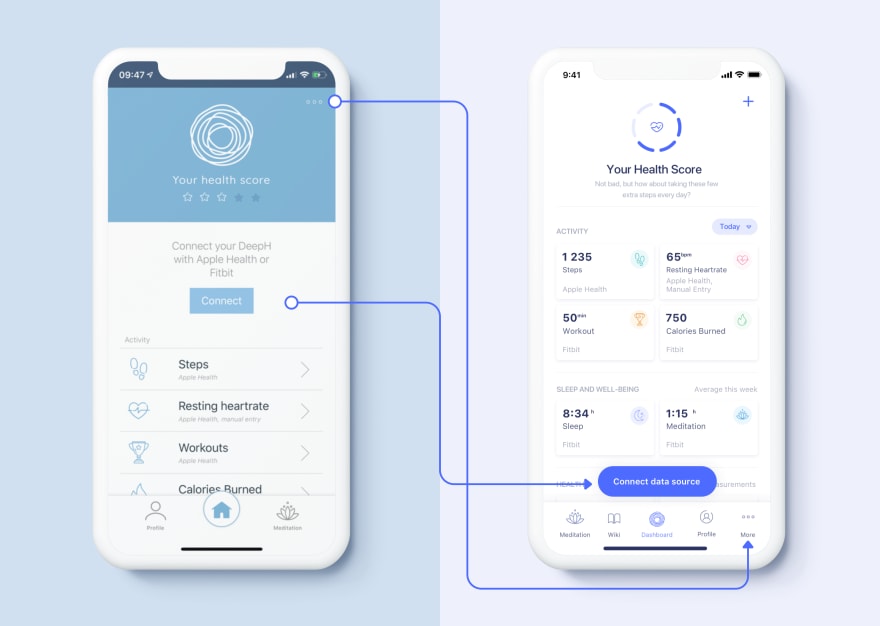
- Call To Action button to connect data sources
The floating bottom button is more accessible and won't be overlooked on scroll down. Keeping the button title device-agnostic help add more tracker integrations in the future
- Each fitness parameter has its own assigned color
Colors help associate and recognize a specific type of information.
Meditation data preview

While bar charts are better for comparison, line charts are better for evolution
Key insights
- Change bar chart to a line chart
While bar charts are better for comparison, line charts are better for evolution. Thus, line charts serve better for motivational purposes.

- Bold "plus" to add missing entry
Sometimes one can just forget to submit the score of the day. Therefore, the add button for missing entries should stand out.
- Engaging illustrations
"Did you know..." section should drive more attention as properly selected pieces of trivia can do magic to form habits to use the app regularly.
Thanks for reading!
Did you like the article and the redesigned views? Post your feedback in the comments section!
To see more of our designs visit out Dribbble profile,
or check our website to learn about our company.
😊

Top comments (0)