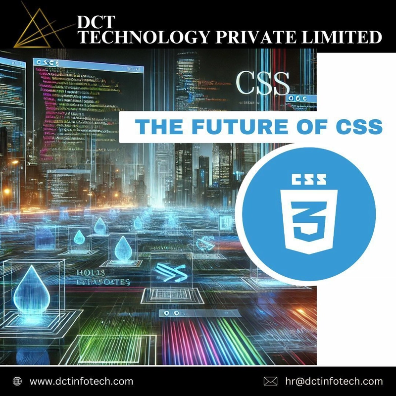 🚀 The Future of CSS: Container Queries and Beyond
Imagine a world where your components adapt to their container size, not just the viewport. That future is here — and it’s game-changing! 🎯
CSS is evolving fast, and Container Queries are leading the way, giving developers more control and flexibility than ever before. Let’s break it down! 👇
🔍 What Are Container Queries?
Container queries let you apply styles based on the size of an element's container, rather than the entire viewport. It’s like giving each component its own little universe!
🔹 Example:
.container {
container-type: inline-size;
}
@container (min-width: 600px) {
.card {
font-size: 1.5rem;
}
}
🔧 What does this mean?
Responsive components that adapt to their parent element
Reusable UI elements without writing custom media queries
Simpler, more maintainable code
💡 Why This Is a Big Deal
Before container queries, we relied on viewport-based media queries, making it tough to design flexible, component-driven layouts. Now, we can build truly dynamic, modular designs without hacks or complex JavaScript! 🚀
Imagine a product card that resizes and reorganizes itself based on its parent container — not the whole page. That’s CSS magic right there!
🌟 What’s Coming Next in CSS?
The future of CSS is brighter than ever:
1️⃣ Scoped Styles — Style components without worrying about global conflicts
2️⃣ CSS Nesting — Write cleaner, more organized styles
3️⃣ New Color Functions — More dynamic, accessible color handling
CSS is evolving to support modern development patterns, making life easier for developers and empowering designers to push creative boundaries.
🚀 Ready to Level Up Your CSS Game?
Now’s the time to experiment with Container Queries and embrace the future of web design.
💬 Have you tried container queries yet? Share your experiences (or frustrations) in the comments — let’s learn together!
📌 Follow DCT Technology for more web development & design insights!

Top comments (0)