Everything is a Box
When I started out in web development, this was one of the first concepts that really helped me understand what was going on.
Every div, image, and paragraph, etc.. are all boxes. Each of these boxes has the same attributes that can be altered to change how they are displayed.
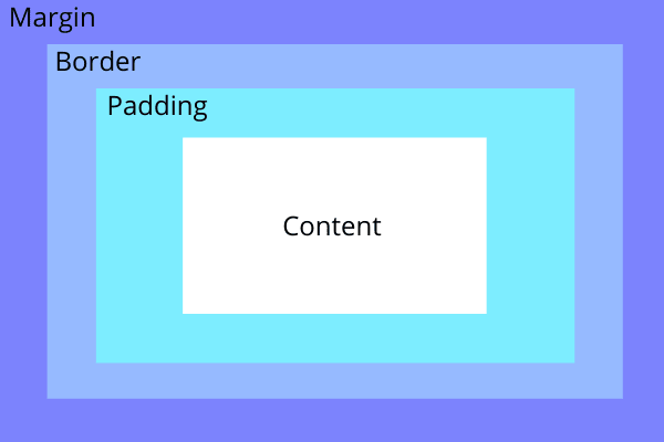
In order from outermost to innermost, these attributes are margin, border, padding, and lastly your content. Below is a graphic that demonstrates this.
Margin
Margin is very helpful to create space on the outside of a box. It is transparent and therefore meant to structure and space out your boxes without changing the inner content.
Border
Border is typically used to outline the padding and content. It doesn't have to be visible, but can be if given a color. Defining the radius will also round edges of the visible content.
Padding
Padding is also transparent and is used for spacing like margin. However, the important distinction between the two is that padding creates space directly around the content.
If for instance, the content was a picture, more padding would actually shrink the image. It does not expand the total size of the box, where as margin does.
Tips and Advice
If you are having a difficult time visualizing what is going on, That is perfectly normal!
The most helpful resource to help you learn, is the development tools that are built into every major browser.
How to use Google Chrome development tools:
Open chrome and find a website you want to inspect.
Now, either right click and choose the inspect option, or hit F12.
You should notice a side panel pop up to the right. Inspect the webpage content and you will see the box model layers surrounding the content.
Now comes the fun part where you get to break things! Inspect something and on the right panel, and change one of these box model attributes you just learned about! Ex. Change padding from 20px to 40px. Reload the page when needed.


Top comments (0)