Cluster Analysis R.
Clustering organizes things that are close together into groups.
- How do we define "close"?
- How do we group things?
- How do we visualize the grouping?
- How do we interpret the grouping?
Hierarchical clustering
Hierarchical clustering is a simple way of quickly examining and displaying multi-dimensional data. This technique is usually most useful in the early stages of analysis when you're trying to get an understanding of the data, e.g., finding some pattern or relationship between different factors or variables. As the name suggests hierarchical clustering creates a hierarchy of clusters.
In hierarchical clustering we use the agglomerative approach (bottom up approach). Here, we start with individual data points and we start lumping them together to form a cluster until eventually the whole data becomes one big cluster.
Agglomerative approach
1.Find two points in the data set which are closest together.
2.Merge them together to get a "super point"
3.Remove the initial data points and substitute them with the merged point.
4.Repeat process until you form a tree showing how close things are to each other.
This method requires;
A distance metric : How do you calculate the distance between two point?
Approach for merging points: How do you merge points that have been proven to be the closest point.
A. How do we define close? (Distance metric)
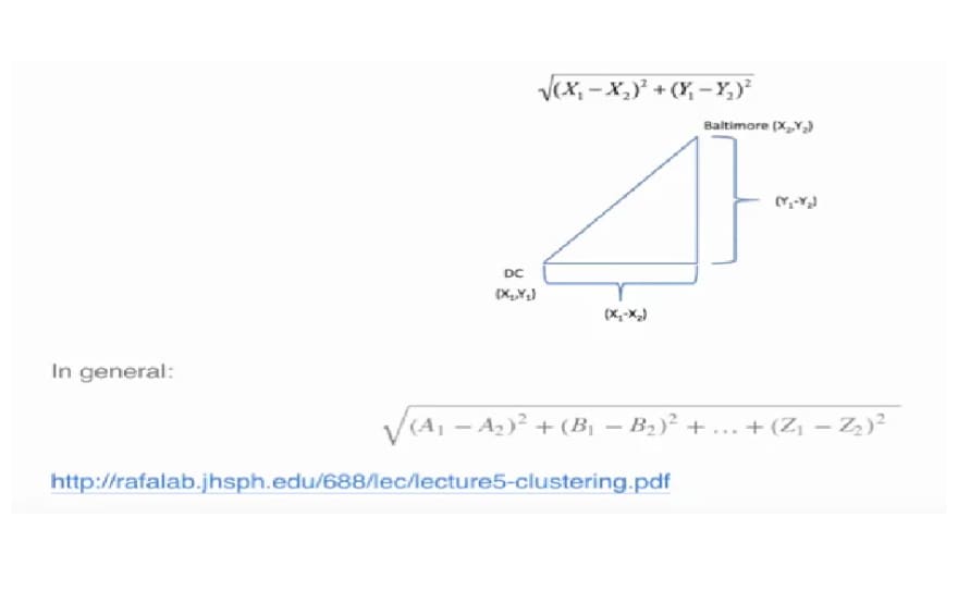
- Euclidean distance : Distance between two points in a straight line
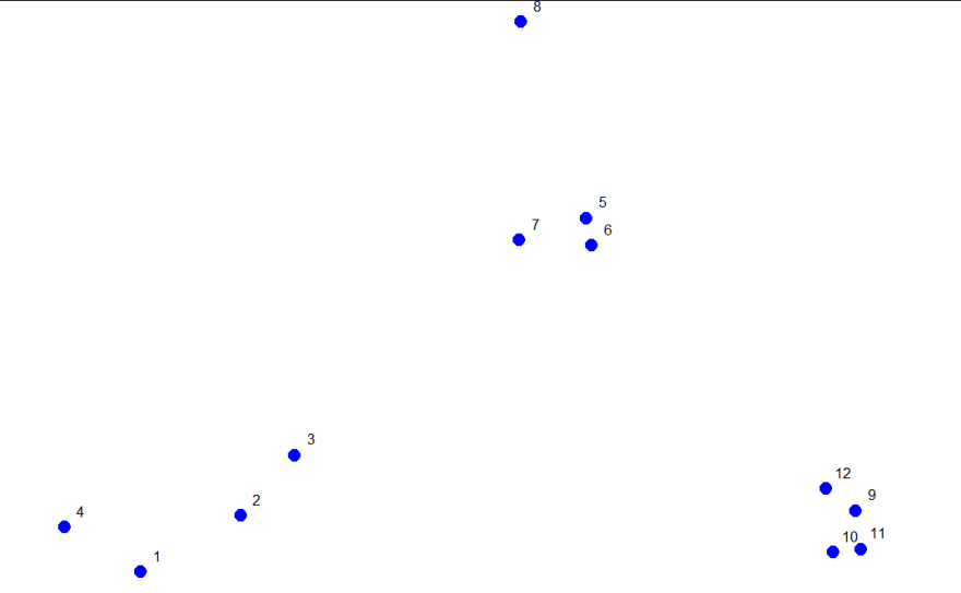
Example 1
consider these random points generated. We'll use them to demonstrate hierarchical clustering in this lesson. We'll do this in several steps, but first we have to clarify our terms and
concepts.
Hierarchical clustering is an agglomerative, or bottom-up, approach. In this method, "each observation starts in its own cluster, and pairs of clusters are merged as one moves up the hierarchy." This means that we'll find the closest two points and put them together in one cluster, then find the next closest pair in the updated picture, and so forth. We'll repeat this process
until we reach a reasonable stopping place.
Note the word "reasonable". There's a lot of flexibility in this field and how you perform your analysis depends on your problem. Again, Wikipedia tells us, "one can decide to stop clustering either when the clusters are too far apart to be merged (distance criterion) or when there is a sufficiently small number of
clusters (number criterion)."
STEP ONE
How do we define close? This is the most important step and there are several possibilities depending on the questions you're trying to answer and the data you have. Distance or similarity are usually the metrics used. In the above diagram its quite obvious that points 5,6 and 10,11 are the closest points to each other using the distance metric.
There are several ways to measure distance or similarity.
Euclidean distance and correlation similarity are continuous measures, while Manhattan distance is a binary measure. In this blog we'll briefly discuss the first and last of these. It's important that you use a measure of distance that fits your problem.
Euclidean distance
Given two points on a plane, (x1,y1) and (x2,y2), the Euclidean distance is the square root of the sums of the squares of the distances between the two x-coordinates (x1-x2) and the two y-coordinates (y1-y2). You probably recognize this as an application of the Pythagorean theorem which yields the length of the hypotenuse of a right triangle.
Euclidean distance is distance "as the crow flies". Many applications, however,can't realistically use crow-flying distance. Cars, for instance, have to follow roads.
Manhattan or City block distance :
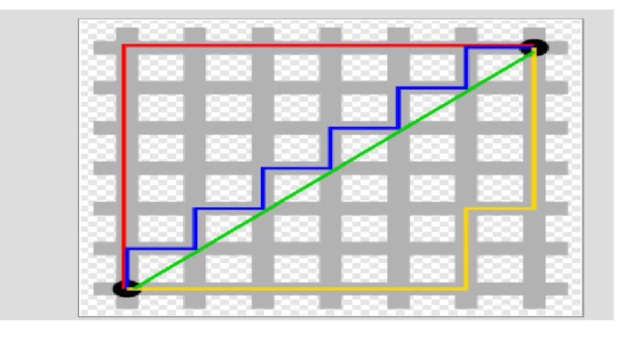
You want to travel from the point at the lower left to the one on the top right. The shortest distance is the Euclidean (the green line "as the crow flies"), but you're limited to the grid, so you have to follow a path similar to those shown in red, blue, or
yellow. These all have the same length (12) which is the number of small gray segments covered by their paths.
Manhattan distance is basically the sum of the absolute values of the distances between each coordinate, so the distance between the points (x1,y1) and (x2,y2) is |x1-x2|+|y1-y2|. As with Euclidean distance, this too generalizes to more than 2 dimensions
Using a dataFrame to demonstrate an agglomerative (bottom-up) technique of hierarchical clustering and create a dendrogram
This is a graph which shows how the 12 points in our dataset cluster together. Two clusters (initially, these are points) that are close are connected with a line, We'll use Euclidean distance as our metric of closeness

I ran a R command dist with the argument dataFrame to compute the distances between all pairs of these points. By default dist uses Euclidean distance as its metric.

You see that the output is a triangular matrix with rows numbered from 2 to 12 and columns numbered from 1 to 11. The minimum distance between two points is denoted by 0.0815 which represents points 5 and 6.

We can put these points in a single cluster and look for another close pair of points
Looking at the original picture we can see than points 10 and 11 are the next pair of points with the shortest distances between them hence we can put them in a cluster. By putting them together we slowly begin with the formation of our dendrogram.

We can keep going like this and pair up individual points, but fortunately, R provides a simple function which you can call which creates a dendrogram for you. It's called hclust().


R's plot labeled everything. The points we saw are at the bottom of the graph, 5 and 6 are connected, as are 10 and 11. Moreover, we see that the original 3 groupings of points are closest together as leaves on the picture
Using the R command abline to draw a horizontal blue line at 1.5 on this plot. This requires 2 arguments, h=1.5 and col="blue"

We see that this blue line intersects 3 vertical lines and this tells us that using the distance 1.5 gives us 3 clusters (1 through 4), (9 through 12), and (5 through 8). We call this a "cut" of our dendrogram. So basically the number of clusters in your data depends on where you draw the line! (We said there's a lot of flexibility here)
Notice that the two original groupings, 5 through 8,
and 9 through 12, are connected with a horizontal line near the top of the graph

COMPLETE LINKAGE
There are several ways to do this. I'll just mention two. The first is called complete linkage and it says that if you're trying to measure a distance between two clusters, take the greatest distance between the pairs of points in those two clusters. Such pairs usually contain one point from each cluster.
So if we were measuring the distance between the two clusters of points (1 through 4) and (5 through 8), using complete linkage as the metric we would use the distance between points 4 and 8 as the measure since this is the largest

The distance between the two clusters of points (9 through 12) and (5 through 8), using complete linkage as the metric, is the distance between points 11 and 8 since this is the largest distance between the pairs of those groups

The distance between the two clusters of points (9 through 12) and (1 through 4), using complete linkage as the metric, is the distance between points 11 and 4

AVERAGE LINKAGE
The second way to measure a distance between two clusters that I'll just mention is called average linkage. First you compute an "average" point in each cluster (think of it as the cluster's center of gravity). You do this by computing the mean (average) x and y coordinates of the points in the cluster. Then you compute the distances between each cluster average to compute the intercluster distance.

HEAT MAP
The last method of visualizing data we'll mention in this lesson concerns heat maps. A heat map is "a graphical representation of data where the individual values contained in a matrix are represented as colors. Heat maps originated in 2D displays of the
values in a data matrix. Larger values were represented by small dark gray or black squares (pixels) and smaller values by lighter squares.
The image below is a sample of a heat map with a dendrogram on the left edge mapping the relationship between the rows. The legend at the top shows how colors relate to values.

R provides a function to produce heat maps. It's called heatmap. This function is called with 2 arguments


This is a very simple heat map - simple because the data isn't very complex. The rows and columns are grouped together as
shown by colors. The top rows (labeled 5, 6, and 7) seem to be in the same group (same colors) while 8 is next to them but colored differently. This matches the dendrogram shown on the left edge. Similarly, 9, 12, 11, and 10 are grouped together (row-wise) along with 3 and 2. These are followed by 1 and 4 which are in a separate group. Column data is treated independently of rows but is also grouped.
Example 2


See how four of the columns are all relatively small numbers and only two (disp and hp) are large? That explains the big difference in colour columns.
K-means Clustering
k-means clustering is another simple way of examining and organizing multi-dimensional data. As with hierarchical clustering, this technique is most useful in the early stages of analysis when you're trying to get an understanding of the data, e.g., finding some pattern or relationship between different factors or variables. R documentation tells us that the k-means method "aims to partition the points into k groups such that the sum of squares from points to the assigned cluster centres is minimized.
To illustrate the method, I'll use these random points generated. I will demonstrate k-means clustering in several steps, but first I'll explain the general idea of what K-means clustering is.
As said, k-means is a partitioning approach which requires that you first guess how many clusters you have (or want). Once you fix this number, you randomly create a "centroid" (a phantom point) for each cluster and assign each point or observation in your dataset to the centroid to which it is closest. Once each point is assigned a centroid, you readjust the centroid's position by making it the average of the points assigned to it.
Once you have repositioned the centroids, you must recalculate the distance of the observations to the centroids and reassign any, if necessary, to the centroid closest to them. Again, once the reassignments are done, readjust the positions of the centroids based on the new cluster membership. The process stops once you
reach an iteration in which no adjustments are made or when you've reached some predetermined maximum number of iterations.
So k-means clustering requires some distance metric (say Euclidean), a hypothesized fixed number of clusters, and an initial guess as to cluster centroids. When it's finished k-means clustering returns a final position of each cluster's centroid as well as the assignment of each data point or observation to a
cluster.
Now we'll step through this process using our random points as our data. The coordinates of these are stored in 2 vectors, x and y. We eyeball the display and guess that there are 3 clusters. We'll pick 3 positions of centroids, one for each cluster

The coordinates of these points are (1,2), (1.8,1) and (2.5,1.5). We'll add these centroids to the plot of our points

The first centroid (1,2) is in red. The second (1.8,1), to the right and below the first, is orange, and the final centroid (2.5,1.5), the furthest to the right, is purple
Now we have to recalculate our centroids so they are the average (center of gravity) of the cluster of points assigned to them. We have to do the x and y coordinates separately. We'll do the x coordinate first. Recall that the vectors x and y hold the respective coordinates of our 12 data points.

We can use the R function tapply which applies "a function over a ragged array". This means that every element of the array is assigned a factor and the function is applied to subsets of the array (identified by the factor vector).


Now that we have new x and new y coordinates for the 3 centroids we can plot them.

We see how the centroids have moved closer to their respective clusters. This is especially true of the second (orange) cluster. Now call the distance function. This will allow us to reassign
the data points to new clusters if necessary
Now that you've gone through an example step by step, good news is that R provides a command to do all this work for you. Unsurprisingly it's called kmeans and, although it has several parameters, we'll just mention four. These are x, (the numeric matrix of data), centers, iter.max, and nstart. The second of these (centers) can be either a number of clusters or a set of initial centroids.The third, iter.max, specifies the maximum number of iterations to go through, and nstart is the number of random starts you want to try if you specify centers as a number.

The program returns the information that the data clustered into 3 clusters each of size 4. It also returns the coordinates of the 3 cluster means, a vector named cluster indicating how the 12 points were partitioned into the clusters, and the sum of squares within each cluster. It also shows all the available components returned by the function
Let's plot the data points color coded according to their cluster

Dimension Reduction
Dimension reduction include two very important techniques known as the principal component analysis (PCA) and singular value decomposition (SVD). PCA and SVD are used in both the exploratory phase and the more formal modelling stage of analysis. We'll focus on the exploratory phase and briefly touch on some of the underlying theory. We'll begin with a motivating example - random data
dataMatrix has 10 columns (and hence 40 rows) of random numbers.
Let's see how the data clusters with the heatmap function.

We can see that even with the clustering that heatmap provides, permuting the rows(observations) and columns (variables) the data still looks random.
Here's the image of the altered data after the pattern has been added. The pattern is clearly visible in the columns of the matrix. The right half is yellower or hotter, indicating higher values in the matrix.

Running R command heatmap again with dataMatrix as its only argument. This will perform a hierarchical cluster analysis on the matrix

Again we see the pattern in the columns of the matrix. As shown in the dendrogram at the top of the display, these split into 2 clusters, the lower numbered columns (1 through 5) and the higher numbered ones (6 through 10).
As data scientists, we'd like to find a smaller set of multivariate variables that are uncorrelated and explain as much variance (or variability) of the data as possible. This is a statistical approach. In other words, we'd like to find the best matrix created with fewer variables (that is, a lower rank matrix) that explains the original data. This is related to data compression.
An example is having two variables U and V each have uncorrelated columns. U's columns are the left singular vectors of X and V's columns are the right singular vectors of X. D is a diagonal matrix, by which we mean that all of its entries not on the diagonal are 0. The diagonal entries of D are the singular values of X.

mat is a 2 by 3 matrix. R provides a function to perform singular value decomposition. It's called svd.

We see that the function returns 3 components, d which holds 2 diagonal elements,u, a 2 by 2 matrix, and v, a 3 by 2 matrix.
PRINCIPAL COMPONENT ANALYSIS
Now we'll talk a little about PCA, Principal Component Analysis, "a simple,non-parametric method for extracting relevant information from confusing datasets. Basically, PCA is a method to reduce a high-dimensional data set to its essential elements (not lose information) and explain the variability in the data. However, SVD and PCA are closely related.
EXAMPLE
First we have to scale mat, our data matrix. This means that we subtract the column mean from every element and divide the result by the column standard deviation. R has a command, scale,
that does this for you.

Now we run the R program prcomp on scale(mat). This will give you the principal components of mat. See if they look familiar

Notice that the principal components of the scaled matrix, shown in the Rotation component of the prcomp output, are the columns of V, the right singular values.Thus, PCA of a scaled matrix yields the V matrix (right singular vectors) of the same scaled matrix
Here's a picture showing the relationship between PCA and SVD for that bigger matrix. I've plotted 10 points (5 are squished together in the bottom left corner). The x-coordinates are the elements of the first principal component (output from prcomp), and the y-coordinates are the elements of the first column of V, the first right singular vector (gotten from running svd). We see that the points all lie on the 45 degree line represented by the equation y=x. So the first column of V IS the first principal component of our bigger data matrix.

Now i'll show you another simple example of how SVD explains variance with a 40 by 10 matrix.

You can see that the left 5 columns are all 0's and the right 5 columns are all 1's.

Here the picture on the left shows the heat map of the Matrix. You can see how the left columns differ from the right ones. The middle plot shows the values of the singular values of the matrix,
i.e., the diagonal elements. Nine of these are 0 and the first is a little above 14. The third plot shows the proportion of the
total each diagonal element represents.

Top comments (0)