Hello!
Not only is this post about my new website, it's also my first post here (So please let me know if I am doing something wrong).
I just wanted to ask for any advice you may have on my website, The TinkerTechLab. Let me know if you like my outline, navigation, and overall content and UX.
The webhosting catagory is completely finished, although the rest of the site is slowly coming together. Feel free to comment on anything (If you see something you don't like, let me know! Although also give me something that you think would be a good fix).
Thanks!

Top comments (16)
UI is not good, use tools to improve it, maybe an external css, bootstrap, tailwind. Fonts and colors consistency are an important part to take into account. I can not give you more advices because I do not have enough information about your project. But, generally, good job!.
What do you mean by “Not good”? What exactly can be done to improve it?
I'm not a Senior UI designer, I'm Junior UI D. (I learn several different things every day, I don't focus on just one, I'm usually Frontend) ;D. What I mean by "Not good", is that the website gives the impression that it is an old website, therefore, the content will not have much relevance to the user as it conveys the feeling of outdated, no matter how updated and valuable the content is.
Specific points to improve:
Font size, and font types. I recommend that you change to a more user-friendly font for reading large amounts of content, for example: Roboto (Titles), Open Sans || Times New Roman || Montserrat || Poppins (For content), you can use the Google Fonts tool, which helps you select a font and recommends popular combinations for a selected font.
The combination of bold and regular. Define well where the bold and regular fonts will go (the same if you plan to add Thin).
I guess green is the brand color (It is the most repeated color), so, I suggest you look for a color palette and look for combinations that look good with green and at least 2 - 5 (max) base shades of green and define their uses. Generally, for a blog, green is not a good color, but you can get inspiration from W3Schools (W3S uses green and black as main colors).
Improve the size in height of the inputs, and don't combine gray with green :D.
A table of contents in the articles, it wouldn't be bad.
Just by choosing a better font, the content will have more visual and psychological validity. ;D
In case of code, I can't recommend anything because I'm not involved.
I have nothing to do this month, so, if you want me to propose changes, contact me XD.
Good Luck!
I agreed on the font type, I Dident think I made a good choice, so I was thinking someone would say that. I fixed the font and bolding, but not quite sure what you mean by “Inputs”. Does it look better now?
I will consider the Table Of Contents. It’s a god idea, and I will certainly add it to the longer ones, not sure about the shorter ones though.
With the new font it looks even better!
One suggestion I missed regarding the UI, there should be consistency in the elements, i.e. if the buttons have border-radius, the other elements like cards, boxes, etc. should have it.
Regarding the table of contents, I suggest you add it to all articles, even if they are small, (Unless the article is just paragraphs), use for it!
What I meant with the inputs, is the padding they have, the containing box, must be the same height as the paragraph containing box.
Regarding the gray-green combination, I suggest this:
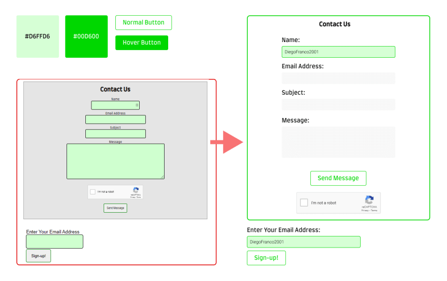
If you don't really like the idea or you don't have the possibility to change much, just put a green border, round it and remove the gray background, it's enough, ah!, and add some margin bottoms (8px recom.) between and and (12px recom) between an input, and the next label.
With the rest, it is simply layout, here I can't intervene much because I don't know the motives or the main idea of the project. Besides, I think I'm abusing dev.to by adding long comments XD.
Good luck!
"Regarding the gray-green combination, I suggest this" Wow, that's so cool! I will certainly add that.
"if the buttons have border-radius, the other elements like cards, boxes, etc. should have it."
Good idea. I think I will ditch the grey background and change it to a darker green.
I would also like to add you to my sites "Thank-you" page for all your help, what username and link should I use?
I'm glad I could help you!
Thanks for adding me, my username is DiegoFranco2001, and the link to my website is:
diegofranco2001.xyz,
If you need more support, you can contact me ;D. Good luck!
The content of your site is useful to me :D
How do things look now? Be sure to check out Site Credits - The TinkerTechLab for your attribution!
Better! - I want to join your project, Can I participate as a UI designer?
Of course! You can contact me at supporter@tinkertechlab.com
@diegofranco2001, do you think I should make the main navigation sticky on article pages?
Also, should the table of contents be placed in the sidebar, or below the article title+intro?
I send an apply request to support. I have not replied.
1: Just the breadcrumb
2: That depends of the layout purpose, if you have the sidebar as Advertisements bar, content table must be after the introduction to article.
The mail has been received. Your email provider was marked as a spam server by GMail, that is why is was not seen immediately. A filter has been implemented to prevent this in the future.
Heya! Welcome to the community!
Here's my personal advice for the web. The web is great, but i think that's need some improvement.
Use sticky head nav. It's annoying to scroll up to seeing or accessing something in the nav.
Change the dropdown. The dropdown making the whole header moving, and that's not that good. Here's a tips to fix that; set the parent position to relative, and the overlay position to absolute.
Use left text align for the newsletter input.
Welcome to dev.to!
I took a (very quick) look and at first glance noticed on mobile the search bar doesn't span the full screen in landscape mode like it does in portrait.
I really like what you're doing with the color scheme and the clean design.
Sometimes a visual break can be useful on pages when there's a lot of text. Even just a Horizontal Rule between articles can go a long way.
All that being said Im not a UI guru, so I tracked down a site I always found useful in the past and thought you might as well:
lawsofux.com/
In terms of whether you're doing anything right or wrong in your first post, there's never anything wrong with reaching out for help- great work!
it was Good if you are making for first time
Great work done
Great effort you made
Great use of time