A front-end web developer crafts a web page keeping in mind the viewers’ current trends and interests. Two decades ago, the options and technologies were limited. But today, the story has changed. There are a lot of tools and opportunities for a front-end web developer to consider. The usage of these tools increases the complexities of the overall arrangement while allowing a developer’s comfort area. There is a need to have a tool like LT Browser to help a web developer analyze his mistakes, provide a real-time view of the multiple devices, and help him understand how his web application might perform in the market.
In this post, we shall go through the LT Browser, which is developed specifically for front-end developers, designers, product managers, testers, and anyone who wants to ensure that their website looks great and can leverage those features to boost the website’s productivity.
1. Check For Responsiveness
Responsiveness is the property of the web application to adapt itself according to the viewport of the device. A responsive web application does not fear the device it is going to be rendered on. No matter what operating system, what resolution, or what browser an end-user uses, a responsive web application is consistent all across. But, it is not an easy job. Elements are so stubborn sometimes; they misalign, get disorganized and behave arbitrarily. As a web developer who would love to know the in-depth working of a responsive website, you can check the Responsive Web Design Testing Checklist to get started.
So, is there a way that we can check if our website will respond to the device?
LT Browser provides developer-friendly and faster responsive testing for front-end developers. A front-end web developer can check the responsiveness of your website on 45+ screen sizes with multiple standard resolutions using LT Browser. The browser provides a list of pre-installed mobile devices, tablets, and desktops. As a web developer, LT browser minimizes your efforts to install multiple devices or rent expensive device labs.
In the above image, I have selected Galaxy S8 Plus as a device to view the website. On the right-hand, I have a Google Pixel in the landscape mode to verify if the elements are rearranging themselves according to the changed aspect ratio or not. It is one of the most common responsive web design issues. With the above image, you must have guessed how a side-by-side view of two different devices helps build a responsive website faster.
The side-by-side view comes with another useful option for web developers. If you are working with two devices, you will be positioned into one of the two cases; first, how does your web application render and work. Second, you would want to compare certain areas of the web page with two devices. These elements may or may not be in the same position. LT browser provides a quick synchronous scroll option to resolve these issues, which toggles mirrored interaction in the two devices. So if you want to check the render and quickly view it, turn it on, and the web page will scroll together on both the devices as seen in the below image:
Turning it off will make the devices work as independent two entities and will not be scrolled together.
Note: You can also test your unpublished website, which is in the local system. Just fire up the server and enter the localhost address as the URL.
2. Wide Device Range
The most frustrating issue for the web developer while testing is to get all the devices in the target matrix. At this stage, the choice of physical devices becomes impractical to achieve. A platform with in-built devices can help the developer without digging deep into the pockets and improving the overall development time.
LT browser comes with a pre-installed set of mobile devices working on Android and iOS operating systems to help developers and testers test their website on 45+ screens, tablets, laptop, and desktop resolutions.
It is easy to ponder here that what if you do not get that one specific device that plays an important role in your device matrix? In any such cases, when you cannot find your favorite device, you can make use of the “Custom Device” feature of the browser. You can create your own customized device, which you can save and use in the future as well.
The following steps will help you create your customized device.
- Click on the “+” icon that shows ‘Add New Device,’ given on the second screen.
- Go to “Add Custom Device.”
- Add the name, dimensions, and device type of your choice.
- Click on “ADD DEVICE.”
The above image will guide you through the path. Once done, the customized device is ready for use. The device can then be viewed in the “CUSTOM” device list.
3. In-Built Debugger
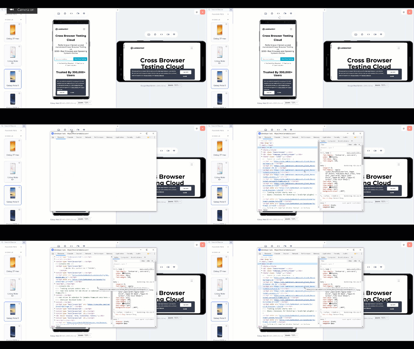
As a web developer myself, I find the debugger extremely important and something that I am using daily. Debugging a website is a process of finding and fixing the bugs on the page. The bugs can be from the user interface, functionality issues, or maybe server glitches. A suitable option for debugging the web application is to use the in-built web inspector available in modern browsers. But there is an issue with this approach. While debugging the web app will work fine, you might have to use different tools for different purposes, such as test responsiveness on another web browser. LT browser removes this time-consuming shift by providing a single solution.
LT Browser has a built-in debugging tool that allows users to debug the code quickly and reach the root cause. It is as easy as other browsers, and you get a responsive tool with other features in a single place.
4. Performance Report
The final question that comes to our mind once we have developed, tested, and debugged our web application is: How better is it? To judge the performance of a web application or compare it to other such projects, we need to check specific parameters and a tool that can calculate those parameters.
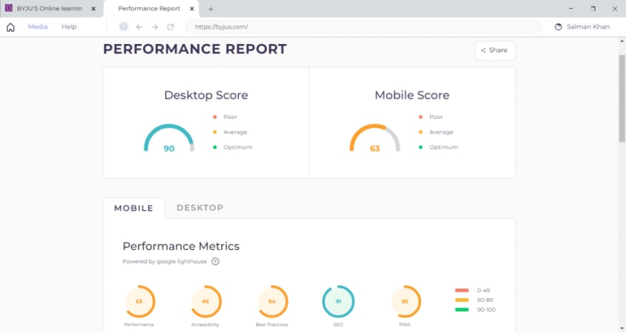
With LT Browser, a web developer can analyze the performance audit scores of the website for desktop and mobile with just a simple click. The performance report includes various aspects like performance, accessibility, best practices, SEO, and PWA of your website. After analyzing these reports, you can act upon the area of weakness in the web application and share your performance reports with your teammates and colleagues via a shareable link.
LT browser’s performance report section generates reports that contain all the necessary parameters. You’ll also find the list of opportunities that will help you load your page faster. You will also find a list of errors and alerts in the Diagnostics tab.
5. Network Throttling
The simulators and emulators can render the web application and show it to the web developer quickly. But they are not equipped with a measure to judge the application according to the network. The network bandwidth plays a significant role when an end-user is operating on the device. The end-users tend to ignore the bandwidth and want the web application to be loaded faster into their device even though they are on a slow network. Such situations increase the web developer’s job to use technologies that can perform partial loading (like AJAX) to see something for the user. Still, you need something to test the application on the network as you did for the responsiveness!
With LT Browser, developers can perform network testing very quickly. There is a built-in network throttle feature that shows the web application’s performance over various network conditions from low to high parameters. Besides, offline mode gives you an added advantage to analyze the website when there is no internet connection.
6. One-Click Bug Logging
Just like GitHub is used to work together synchronously even though it is apart geographically, bug logging works similarly. As a front-end web developer, you might be working with multiple people who have various assigned roles. When you find bugs while working in a team, you need to share them with other people to rectify them or discuss them on a common platform. For the same purpose, many platforms work as issue trackers, project helpers, or bug trackers. But the problem is the same as the debugger! You have to navigate back and forth to raise the issues, and the solution comes with the LT Browser.
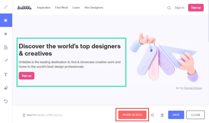
LT Browser comes equipped with a bug logging feature. The browser provides a built-in image editor (used while logging bugs or taking screenshots) that marks and highlights your bugs and allows you to share them with your colleagues or assign the bug to any other team member to solve it faster. LT Browser comes with more than 50 integrations for bug logging, such as Jira, Asana, Trello, and GitHub.
Once you are at this stage, select the “MARK AS BUG” button and then log the bug on the tools integrated with the LT browser.
7. Hot Reload Support
The hot reloading feature has become a “must-have” when working on the front-end of a web application. The front-end does not work on absolute numbers. We do not remember the color code of millions of colors. We keep on pressing the “Refresh” button to see how the changes look. Maybe sometimes padding is more than it meets the eye. There is no absolute number; we need to hit, try and refresh. What if the z-index is not appropriate? This “refresh” of a web page happens hundreds of times in a single day because it needs to be perfect and appealing to the user when it comes to the user interface. Hence, the LT Browser brings a feature specifically to resolve this issue.
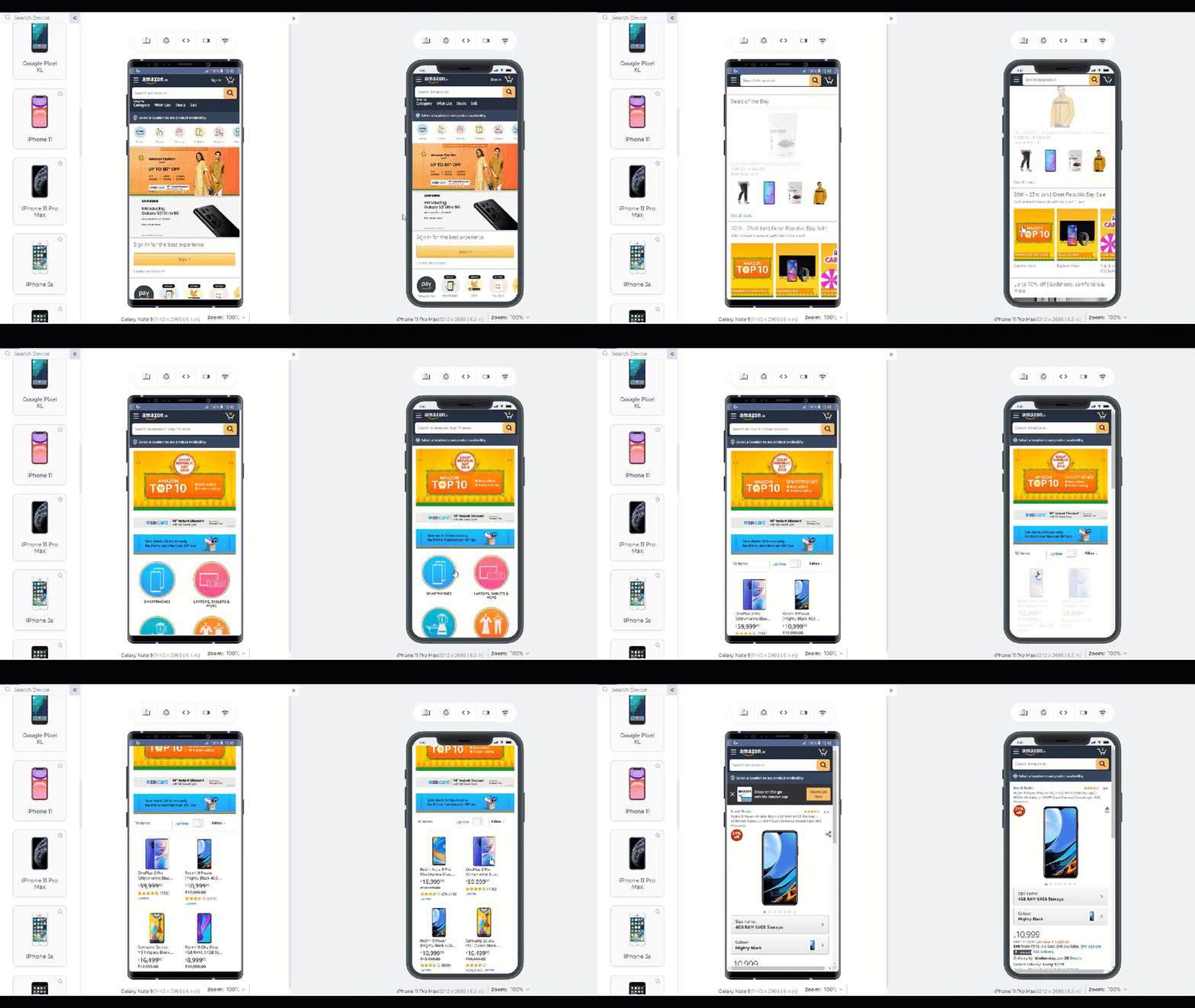
Hot reloading brings out the live render of the web page that we are currently editing side by side. As soon as you write the code and save it in your text editor or IDE, the final result will be shown within a second in the LT Browser on the device of your choice. The below-given demonstration will give you a more elaborated picture.
It is important to note that hot reloading should not be confused with Livereload. Hot reloading is more powerful and helpful than the Livereload function. While Livereload works only on HTML and CSS injection on the go, hot reload can inject JS and its libraries. So if you are working on a JS code and want to see the elements functioning live, hot reloading is the way to go.
8. Capture Full Page Screenshots
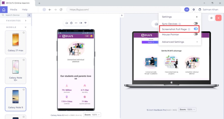
The ability to capture full screenshots of web pages is essential for web designers and developers, especially when your website has long-form content. With LT Browser, you can capture full-page web page screenshots for different devices such as Mobile, Tablets, Laptops, and Desktops with just one click.
9. Video Recording
While viewing your website, if you come across a case where a bug is too hard to replicate, you can record all of the tests performed on a tablet or smartphone view with the LT Browser.
You can see these videos later. If you notice something unusual about your responsive web application, you can share the recorded test session videos with your team and colleagues via a shareable link.
10. Sync Devices
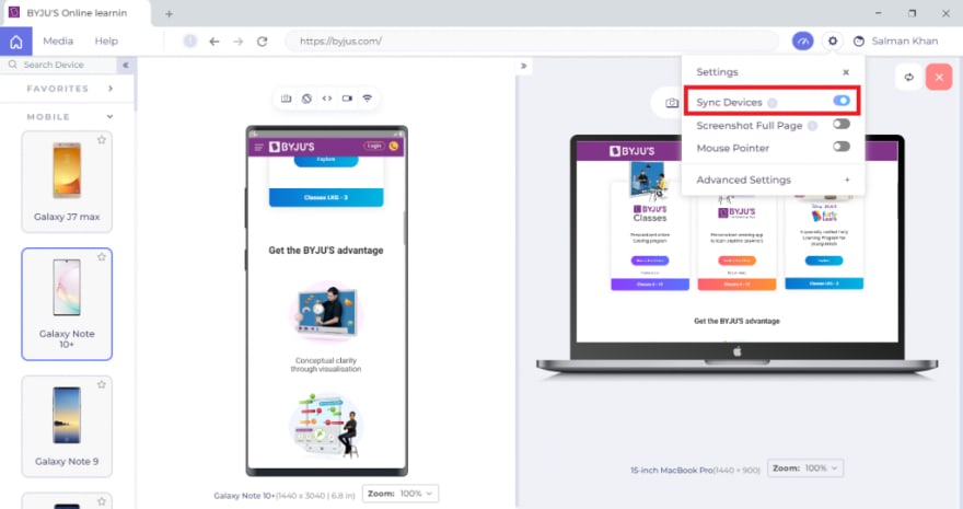
The sync devices functionality helps web developers to improve their workflow while using multiple devices. In LT Browser, you can synchronize your scrolls across all the devices so that scrolling on one device will scroll the same amount on others. It will help you perform testing a lot faster and get a better view of media content or objects over multiple devices and compare them.
11. Mouse Pointer
Users can use touch sensors to navigate through the website for portable devices such as smartphones or tablets. You need to ensure that all the clickable areas respond well. Therefore it is crucial to test the responsiveness of your website for both pointer and touch versions.
You can quickly test your website responsiveness for portable touch devices using the Mouse pointer feature of the LT Browser. It enables you to switch to the touch mode and navigate through your device in the same way you were using the touch feature on a real mobile device.
Bonus Feature: Generate JavaScript Error Reports
If you face problems with your website’s interactive functionality, this could be due to JavaScript errors. For example, the menus may be broken, or the media buttons may not function. There might be a case when your website has encountered some errors, or a particular web page has failed to load completely. LT Browser offers an easy-to-use feature to generate the JavaScript error reports of your websites that help you track web page errors and services that fail to load, thereby notifying you when an issue arises.
Conclusion
A front-end developer’s job relies on multiple tools that act as a helping friend during the testing. LT Browser is developed to cater to the needs of web developers and testers. Not only a tool but being an independent browser gives it the power and efficiency that speeds up the development process. It provides you the browser facilities along with a debugger, testing platform, and much more. The browser supports bug sharing with tens of integrations, making it a one-stop solution for the developers, designers, testers, and product managers.
The LT Browser was recently listed on the Product Hunt platform, and people shared their own experiences with the browser in comments. I highly recommend visiting the LT Browser Product Hunt page and writing down your own experiences in this post’s comment section. It will help the community gain a broader view of the browser.










Top comments (0)