
Learn how to create a responsive top navigation menu with CSS and JavaScript.
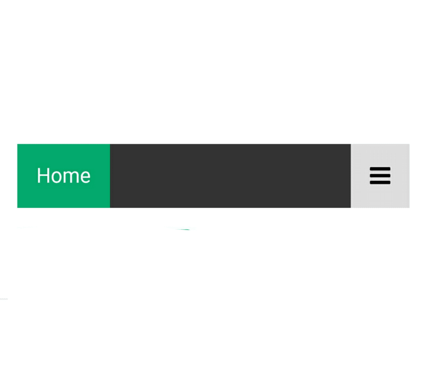
Responsive Navigation Bar
Resize the browser window to see how the responsive navigation menu works:


Create A Responsive Topnav
Step 1) Add HTML:
Example
<!-- Load an icon library to show a hamburger menu (bars) on small screens -->
<link rel="stylesheet" href="https://cdnjs.cloudflare.com/ajax/libs/font-awesome/4.7.0/css/font-awesome.min.css">

<div class="topnav" id="myTopnav">
  <a href="#home" class="active">Home</a>
  <a href="#news">News</a>
  <a href="#contact">Contact</a>
  <a href="#about">About</a>
  <a href="javascript:void(0);" class="icon" onclick="myFunction()">
    <i class="fa fa-bars"></i>
  </a>
</div>

The link with class="icon" is used to open and close the topnav on small screens.
Step 2) Add CSS ;
Example
/* Add a black background color to the top navigation */
.topnav {
  background-color: #333;
  overflow: hidden;
}

/* Style the links inside the navigation bar */
.topnav a {
  float: left;
  display: block;
  color: #f2f2f2;
  text-align: center;
  padding: 14px 16px;
  text-decoration: none;
  font-size: 17px;
}

/* Change the color of links on hover */
.topnav a:hover {
  background-color: #ddd;
  color: black;
}

/* Add an active class to highlight the current page */
.topnav a.active {
  background-color: #04AA6D;
  color: white;
}

/* Hide the link that should open and close the topnav on small screens */
.topnav .icon {
  display: none;
}
Add media queries
:
Example
/* When the screen is less than 600 pixels wide, hide all links, except for the first one ("Home"). Show the link that contains should open and close the topnav (.icon) */
@media screen and (max-width: 600px) {
  .topnav a:not(:first-child) {display: none;}
  .topnav a.icon {
    float: right;
    display: block;
  }
}

/* The "responsive" class is added to the topnav with JavaScript when the user clicks on the icon. This class makes the topnav look good on small screens (display the links vertically instead of horizontally) */
@media screen and (max-width: 600px) {
  .topnav.responsive {position: relative;}
  .topnav.responsive a.icon {
    position: absolute;
    right: 0;
    top: 0;
  }
  .topnav.responsive a {
    float: none;
    display: block;
    text-align: left;
  }
}
Step 3) Add JavaScript :
Example
/* Toggle between adding and removing the "responsive" class to topnav when the user clicks on the icon */
function myFunction() {
  var x = document.getElementById("myTopnav");
  if (x.className === "topnav") {
    x.className += " responsive";
  } else {
    x.className = "topnav";
  }
}
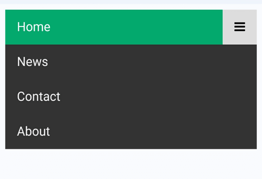
Here the Output
Hopefully, the tutorial above has helped you a lot to learn how to make a Menu Bar
If you like my post, please like the article
Follow me 👇
Twitter
Quora
Duolingo

Latest comments (0)