Consistent spacing across a website can make or break a design. When implemented correctly the visual quality of the page will really shine through.
I've pretty consistently been working with an 8px base spacing system for over a decade. It works, but using pixels as a unit of measurement can create a headache of complexity when building viewport/device responsive experiences.
Of course we've had the EM unit, but I've never liked it. The idea that the same component will look different depending on where it is placed seems fundamentally broken to me... And yes, the cascade in CSS is a fantastic tool, but I've always been against cascade as a doctrine, as "best practice". In my opinion, isolation through components will always be a better methodology to fall back on.
The REM unit give us the best of both worlds, pre-determined sizes that are consistent across implementations of a component, relative only to the root font size. But what about scale?
I can't suggest what scale would work for you when defining a spacing system, but it's important to have one. A codified scale will guide developers into using a consistent set of spaces, rather than simply random values. If you find yourself using custom values it probably means the scale is not good enough. But when the scale works, developers will work faster, and in my experience the page design falls into place almost effortlessly.
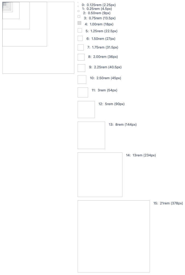
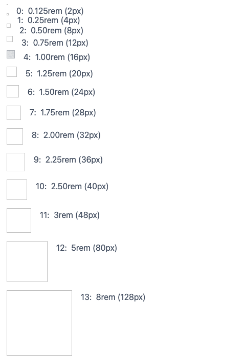
The scale I defined on a recent project is a simple array of values defined as TypeScript design tokens and shared using an Emotion theme. Linear increments of 0.25rem then switching to a fibonacci scale from 3rem, this gives plenty of options for internal component spacing and nudges, whilst still supporting the larger values needed for page layouts. Because I'm using REM, the actual pixel size will differ based on the base font-size, allowing me to holistically change the page layout based on viewport, page, and theme.
Below are a couple of screenshots from internal documentation (using Storybook). The first shows the scale using a 18px base unit for large viewports.
And the image below shows a 16px base for smaller viewports.
So far, so good. But it's hard to tell early in a project if and how this approach will pan out. I have worries about using an 18px base, but it's going to be easy to change if we want to. e.g. making 1rem equal 20px is literarily a one line change with a huge aesthetic impact. It's currently helping the team deliver faster and worry less about design, and that I think can only be a good thing.

Oldest comments (0)