Storybook is great for documenting UI components but what about data structures such as a themes and design tokens? Here's a super quick way to add design token documentation into your Storybook.
In designtoken.stories.mdx:
import { Meta, Story, Canvas, ArgsTable } from '@storybook/addon-docs/blocks';
import { Theme, Breakpoints } from './helpers';
<Meta title="Design Tokens/Theme" />
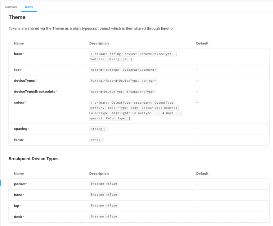
### Theme
<ArgsTable of={Theme} />
#### Breakpoint Device Types
<ArgsTable of={Breakpoints} />
<Canvas>
<Story name="Theme">
<span>See Docs tab</span>
</Story>
</Canvas>
Where helper.tsx is:
import { ThemeType, theme } from '../DesignTokens';

export const Theme: (Theme: ThemeType) => void = () => {};

export const Breakpoints: (Breakpoints: typeof theme.Breakpoints) => void = () => {};
This super simple approach allows us describe important contracts throughout our design system implementation, without the need to manually write and maintain that documentation. Below is a screenshot of how that might look.

Top comments (0)