
In the Part-A, we divulged in the following concepts:
- Elements of Structured Data
- Estimate of Location ( Central Tendency )
- Estimate of Variability
In this article, we will be moving ahead with the methodologies and techniques for Exploratory Data Analysis.
Exploring Data Distribution
Each of the estimates we have covered sums up the data in a single number to describe the location or variability of the data. It is also useful to explore how the data is distributed overall.
Percentiles and BoxPlots
In Part-A, we have seen how percentile can be used to measure the spread of the data.
Percentiles are also valuable for summarizing the entire distribution. Percentiles are especially valuable for summarizing the tails (the outer range) of the distribution.
import pandas as pd
data = pd.read_csv('winequality-red.csv')

# Calculating Percentiles - 5th, 25th, 50th, 75th, 95th
data['total sulfur dioxide'].quantile([0.05,0.25,0.5,0.75,0.95])

# Output:
0.05     11.0
0.25     22.0
0.50     38.0
0.75     62.0
0.95    112.1
Name: total sulfur dioxide, dtype: float64
As we can observe from the above code, the median (50th percentile) is 38.0 i.e Total Sulfur Dioxide has a huge variance with the 5th percentile being 11.0 and 95th percentile being 112.1.
Boxplots is based on percentiles and give a quick way to visualize the distribution of data
plt.figure(figsize= (5,8))
ax = data['total sulfur dioxide'].plot.box()
ax.set_ylabel('Concentration of Sulfar Dioxide')
ax.grid()
In this code, we use * pandas* inbuilt boxplot command, but many data scientists and analysts prefer matplotlib and seaborn for their flexibility.

The top and bottom of the box are the 75th and 25th percentiles, respectively. The median is shown by the horizontal line in the box. The dashed lines referred to as whiskers, extend from the top and bottom of the box to indicate the range for the bulk of the data.
Any data outside of the whiskers are plotted as single points or circles (often considered outliers).
Frequency Tables and Histograms
A frequency table of a variable divides up the variable range into equally spaced segments and tells us how many values fall within each segment.
The function pandas.cut creates a series that maps the values into the segments.
Using the method value_counts, we get the frequency table.
# Frequency Table for Sulfur Dioxide Concentration

binnedConct = pd.cut(data['total sulfur dioxide'], 10)
binnedConct.value_counts()

#Output:
(5.717, 34.3]     730
(34.3, 62.6]      471
(62.6, 90.9]      221
(90.9, 119.2]     113
(119.2, 147.5]     52
(147.5, 175.8]     10
(260.7, 289.0]      2
(232.4, 260.7]      0
(204.1, 232.4]      0
(175.8, 204.1]      0
Name: total sulfur dioxide, dtype: int64
It is important to include the empty bins. The fact that there are no values in those bins is useful information. It can also be useful to experiment with different bin sizes.
A histogram is a way to visualize a frequency table, with bins on the x-axis and the data count on the y-axis.
pandas support histograms for data frames with the hist method. Use the keyword argument bins to define the number of bins.
# Plotting Histogram
plt.figure(figsize= (7,5))
ax = data['total sulfur dioxide'].plot.hist(bins = 10)
ax.set_xlabel('Concentration of Sulfar Dioxide')
ax.grid()
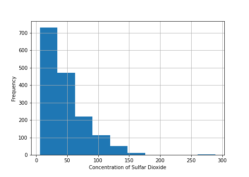
In the following histogram, we see that histogram is rightly skewed. (I will address Skewness and Kurtosis in upcoming articles)
Density Plots and Estimates
Related to the histogram is a density plot, which shows the distribution of data values as a continuous line. A density plot can be thought of as a smoothed histogram, although it is typically computed directly from the data through a kernel density estimate.
plt.figure(figsize= (10,7))
ax = data['total sulfur dioxide'].plot.hist(bins = 10, density = True)
data['total sulfur dioxide'].plot.density(ax = ax)
ax.set_xlabel('Concentration of Sulfar Dioxide')
ax.grid()

Note: A key distinction from the histogram plotted in is the scale of the y-axis: a density plot corresponds to plotting the histogram as a proportion rather than counts.
Exploring Binary and Categorical Data
Getting a summary of a binary variable or a categorical variable with a few categories is a fairly easy matter: we just figure out the proportion of 1s or the proportions of the important categories.
Bar charts, seen often in the popular press, are a common visual tool for displaying a single categorical variable.
adult_data = pd.read_csv('adult.data', header = None, skip_blank_lines= True)

# Plotting the Categorical Variable: Education
adult_data[3].value_counts().plot.bar(figsize =(7,5))
plt.grid()

Note that a bar chart resembles a histogram; in a bar chart the x-axis represents different categories of a factor variable, while in a histogram the x-axis represents values of a single variable on a numeric scale.
Some more concepts on categorical variables:
- Mode:
The mode is the value—or values in case of a tie—that appears most often in the data. The mode is a simple summary statistic for categorical data, and it is generally not used for numeric data.
- Expected Value:
The expected value is calculated as follows:
- Multiply each outcome by its probability of occurrence.
- Sum these values.
The expected value is really a form of weighted mean: it adds the ideas of future expectations and probability weights, often based on subjective judgment.
That's all Folks for Part-B of this series!
In this article, we covered various plotting paradigms used to analyze numerical and categorical variables along with its python code.
Fin

Top comments (0)