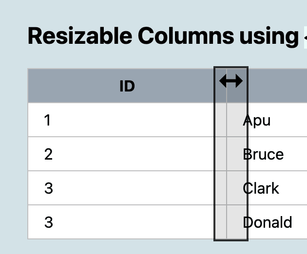
I love using the <input type="range">. It's an interactive control with touch-support, and you get accessibility baked-in for free!
After I ...
For further actions, you may consider blocking this person and/or reporting abuse


There is a typo in the ARIA attributes on the inputs: "aria-hideen"
Interesting concept and I like the principle, however from an accessibility standpoint this will cause issues with screen readers.
Your inputs will be read out as range sliders with no context. As you can't use
aria-hiddenon them (as it will both be ignored on an active element and also it appears to crash the browser when I was fiddling with your example) this means there are now 3 random tab stops for inputs that make no sense.Giving the sliders a label is a minimum step to at least inform screen reader users what they are interacting with. It is still not ideal but at least that gives them an idea that they can ignore this control.
I would also say that if you implement this a "skip this table" link should be provided if there are more than 3 columns as otherwise the tab stops could be frustrating.
The other issue is that on a mobile if you stack the columns too close to each other it is impossible to release them again due to tap target size. As you should have a minimum tap target size of 44 by 44 CSS pixels I am sure this can be fixed by just making the minimum number on the slider larger and the tap target area larger. However at that point we then run into the issue of needing a minimum of 132px just for column stacking and this solution becomes less useful as we lose over a quarter of the effective screen width.
To be fair it doesn't work well for mobile anyway as to view the columns requires moving several columns at a time and would be much easier just scrolling the whole table left and right so perhaps this could be desktop only?
Anyway keep fiddling with the concept as you might be on to something, but I think you might run into issues accessibility wise trying to do this with inputs.
Thanks for your reply! It is indeed work-in-progress, and I haven't added any aria-labels or anything yet. My main goal was to make it keyboard-navigable without a load of JS, and that's accomplished with this code. I have a condition, so I cannot use a mouse and prefer to navigate by (digitizer-) pen or keyboard - so my personal goal is always "keyboard first". Regarding Screen Reader-issues: wouldn't it be enough to hide the sliders for SR's with
aria-hidden? There's no point in resizing a table-column from a SR IMO. From a performance point-of-view this will hopefully also perform better, as it only updates two CSS Custom props, instead of updating all widths of all TD's.Then the touch target size thing is probably beneficial to you too as I assume your accuracy may not be perfect using the pen and large tap areas make life easier there.
They are just observations and suggestions, it is a concept I haven't seen before and so I am interested in what you can achieve with this idea as it is very clever.
The concept is much better suited to your image before and after post that is the inspiration for this article, as that is much easier to clean up with only one slider. I think that idea really does have merit as a mini library in itself!
The touch-target is only 32px, but I just tried it on my iPad, where it works quite well, although the draggable thumbs need some styling. I'll try with larger sizes - and you're probably right about mobile, where dragging columns might be too tiny!
This is excellent work.
I'm running into css issues and not able to get hold of input attributes. I'm using chrome. Is there an updated version of this? TIA
Thank you! Sounds like you're navigating with keyboard? You should get this visual clue:

This is from Chrome on Mac.
When I get some more time, I'll continue working on this, creating a better a11y-experience!
Yes, I'm actually navigating with keyboard. Not able to make it look as shown in your screenshot. Input element css are not binding and the sliders sit below the table. Functionality seems to work fine.
That is weird. Are you using the Codepen-example - in Chrome for Windows?
I'm using a Mac. I implemented the code in my storybook.
OK, but does the Codepen example work for you, in Chrome?
Interesting idea. Looks a bit buggy in Firefox.
Thanks! I mention Firefox at the end of the article - I haven't added -moz prefixes to style the ranges (yet!)
I have missed this note. Firefox is my default browser, so I just opened codepen... I wasn't nitpicking, just wanted to let you know
I just checked an older Pen I did with range-sliders - it works well in Firefox, so it should be easy to update the styles: codepen.io/stoumann/pen/oNzgWMo
However, there was a mis-calculation for the table column-widths in Firefox, that I need to look into.
This is really interesting. As the others have commented it seems like there might be more to flesh out to get this just right, but I really do like this.
Thanks! Yes, it's in "early stages", but I like the simplicity of it.
The CodePen is broken! How disappointing!
No? codepen.io/stoumann/pen/poNjMJV