A type of input that does not come out of the box is one for rotation. This is somewhat common when you are dealing with images as you typically want to rotate things like shapes, gradients etc. Or maybe you want to create a clock-like input for touch screens. Let's try to build one.
Requirements:
- User must be able to use mouse or touch to rotate input
- Rolls over at 360 degrees
- Arrow keys should increment a minimal number of degrees
- Input should fallback without web component support
The component will define values in degrees only, the user code may convert to radians if they wish.
Fallbacks
This component will be interesting since it's not pure display like others in this series. It's an input and that creates special problems with fallbacks and so we should plan for this up-front.
When the browser doesn't support web components, doesn't have javascript, or if the user has a screen reader that doesn't understand our component, we want to still have something reasonable. For this, I'm trying something new. Instead of having the component render its own input element into the shadow DOM, I want the input to be part of the initially rendered DOM. Users of the control will interact with that input and our custom component will simply wrap the input to enhance it. This creates a bit of weird API but the trade-off is this will always work regardless of what tried to render the page.
You might think it may be possible to class-inherit from HTMLInputElement and get similar benefits. This isn't viable for several reasons: Safari doesn't support this (and they've shown active disapproval for this capability), older browsers are dead in the water, and I doubt most screen readers will deal with it as they are generally terrible at working as expected. Still, it might be an interesting exercise for later to at least try it out.
The recommended way to use this rotation input will be to use a numeric input as the base.
<wc-rotation-input>
  <input type="numeric" />
</wc-rotation-input>
Most browsers have supported these for a long time (if not it falls back to plain text input which also works, just less well) though the UI tends to be pretty jank. This doesn't matter so much for us though since we'll be hiding it behind our component and rarely defaulting. Numeric inputs are especially nice since they have ranges and steps, something we might use. This creates another API choice. Do we use the input's attributes? The custom element's? Both? I don't have a great answer but a good rule of thumb is to start with the simplest choice. So let's read the input's properties as the source-of-truth. We might have syncing issues but they will be less complex.
Boilerplate
export class WcRotationInput extends HTMLElement {
constructor() {
super();
this.bind(this);
}
bind(element){
this.render = this.render.bind(element);
this.cacheDom = this.cacheDom.bind(element);
this.attachEvents = this.attachEvents.bind(element);
}
render(){
this.shadow = this.attachShadow({ mode: "open" });
this.shadow.innerHTML = ``;
}
connectedCallback() {
this.render();
this.cacheDom();
this.attachEvents();
}
cacheDom(){
this.dom = {
input: this.querySelector("input")
};
}
attachEvents(){
}
attributeChangedCallback(name, oldValue, newValue) {
this[name] = newValue;
}
}
customElements.define("wc-rotation-input", WcRotationInput);
```
## The Shadow DOM
So now that we have an idea of how this component might work, let's get something on the screen. Here we'll be using SVG to draw the control which will be circle with a line indicating the rotation, like the hand of a clock.
First, we draw a circle. This is as simple as making an SVG element and a circle inside. To draw a circle we need 3 things: the center X-coordinate, the center Y-coordinate and the radius. If we expect it to be centered then both X and Y are `50%` (of the container width) and to maximize the size the radius is also `50%`.
```html
<svg>
<circle cx="50%" cy="50%" r="50%" />
</svg>
```
I'm also going to set the element's height to `2rem` (`:host { width: 2rem }`) which is a general standard for small things and translates to `32px` in most cases but scales with the text size if the user adjusts it for their needs.

So we need a little more than that. We're quickly going to find that we need to define a few custom properties so users can customize the look. The obvious first step is to set some reasonable defaults. Note that instead of attributes we can define the SVG properties in CSS instead:
```css
circle {
r: 50%;
cx : 50%;
cy : 50%;
fill: var(--fill-color, #fff);
stroke-width: var(--stoke-width, 1px);
stroke: var(--stroke-color, #000);
}
```
So now the user can override the stroke-width, stroke color and fill color or we'll use a thin black/white look. But there's a problem:

We cut off the edges. This is because SVG strokes are measured from the center, so we need to do a little math to get the right radius (this is also why using CSS for SVG properties comes in handy):
```css
:host{
--half-stroke: calc(var(--stroke-width, 1px) / 2);
}
circle {
r : calc(50% - var(--half-stroke));
cx : 50%;
cy : 50%;
fill: var(--fill-color, #fff);
stroke-width: var(--stoke-width, 1px);
stroke: var(--stroke-color, #000);
}
```

Much better.
Now we need to add the "hand." This is just a line. There's actually a slight debate to be had about where "0" lies, is it up like a clock? Or right like it is in math diagrams? Maybe it's the lower left like on a volume knob? I'm choosing the the left like a math diagram but if you were to use this example to make something like a clock input maybe you'd start up instead. Unfortunately, we cannot use CSS to position the line as x1, x2, y1, and y1 are not valid CSS properties unlike other SVG properties, unless I missed something (if anyone knows why please tell me). Luckily id doesn't matter as we'll be using CSS transforms to move the dial, saving us the trouble of manual calculation, and giving us the GPU accelerated rendering performance.
We also need a label `#value`, since just looking at an angle doesn't give us a lot of precision. This is added to the right side of the svg using flex-box.
Along with that we should cap the size of the SVG so it doesn't expand to fill the container. I set the viewbox to `0 0 16 16`. If the input is made bigger it will simply scale to the right size while maintaining it's aspect ratio.
The final render function:
```js
render(){
this.shadow = this.attachShadow({ mode: "open" });
this.shadow.innerHTML = `
<style>
:host {
display: inline-flex;
flex-flow: row nowrap;
gap: 0.5rem;
align-items: center;
width: 8rem;
height: 2rem;
--half-stroke: calc(var(--stroke-width, 1px) / 2);
}
svg {
width: 100%;
height: 100%;
}
circle {
r : calc(50% - var(--half-stroke));
cx : 50%;
cy : 50%;
fill: var(--fill-color, #fff);
stroke-width: var(--stoke-width, 1px);
stroke: var(--stroke-color, #000);
}
#pointer {
stroke-width: var(--stoke-width, 1px);
stroke: var(--stroke-color, #000);
transform-origin: center center;
}
</style>
<svg viewBox="0 0 16 16">
<circle />
<line x1="50%" y1="50%" x2="100%" y2="50%" id="pointer" />
</svg>
<div id="value"></div>
`;
}
```
Note that for the pointer we need to set the transform origin to the center, rather than the default center of the pointer.
And make sure we have references to the things we'll be manipulating:
```js
cacheDom(){
this.dom = {
input: this.querySelector("input"),
pointer: this.shadow.querySelector("#pointer"),
value: this.shadow.querySelector("#value"),
svg: this.shadow.querySelector("svg")
};
}
```
## Events
```js
#isManipulating = false;
attachEvents(){
this.dom.svg.addEventListener("pointerdown", this.onPointerDown);
}
onPointerDown(e){
this.#isManipulating = true;
document.addEventListener("pointermove", this.onpointermove);
document.addEventListener("pointerup", this.onPointerUp);
}
onPointerMove(e){
}
onPointerUp(e){
this.#isManipulating = false;
document.removeEventListener("pointermove", this.onPointerMove);
document.removeEventListener("pointerup", this.onPointerUp);
}
```
First we have the pointer events. When we press a pointer down we want to go into a manipulation mode where the mouse movement changes the input value. So when down we create a new event registration to the whole document because we want to track movement outside of the element itself. When the pointer goes back up we clean up the events and come back from manipulation mode.
So now we need to actually change the value.
```js
onPointerDown(e){
this.#isManipulating = true;
const rect = this.dom.svg.getBoundingClientRect();
this.#center = { x: rect.x + (rect.width / 2), y: rect.y + (rect.height / 2) };
document.addEventListener("pointermove", this.onPointerMove);
document.addEventListener("pointerup", this.onPointerUp);
}
onPointerMove(e){
const offsetX = e.clientX - this.#center.x;
const offsetY = this.#center.y - e.clientY; //y-coords flipped
let rad;
if (offsetX >= 0 && offsetY >= 0){ rad = Math.atan(offsetY / offsetX); }
else if (offsetX < 0 && offsetY >= 0) { rad = (Math.PI / 2) + Math.atan(-offsetX / offsetY); }
else if (offsetX < 0 && offsetY < 0) { rad = Math.PI + Math.atan(offsetY / offsetX); }
else { rad = (3 * Math.PI / 2) + Math.atan(offsetX / -offsetY); }
const deg = (180 / Math.PI) * rad;
this.dom.pointer.style = `transform: rotateZ(-${deg}deg)`;
this.dom.input.value = deg;
this.dom.value.textContent = deg.toFixed(2);
fireEvent(this.dom.input, "input");
fireEvent(this.dom.input, "change");
}
```
When we hit pointer down we lock in the center (we don't want to calculate per `pointermove`). Then on `pointermove` we do some calculations:
1) Get the x offset from the center of the input to where the pointer is.
2) Get the y offset from the center to where the pointer is. This is negative because in screen coordinates, y grows downward, but in normal math figures it grows upward.
3) We take the arctangent of the ratio of X to Y. This will only give us valid results for the first `PI/2` (90deg) segment, and if we go backward it's negative. However we want the whole circle (360deg) so we need to calculate per quadrant.
- Quadrant I (top right): We use trigonometry, opposite over adjacent, Y / X.
- Quadrant II (top left): We need to add `PI/2` (90deg) but we also need to rotate the figure 90 degrees so the arctan varies from `0` - `PI/2`, we do that by flipping the X and Y to X / Y, but we also need to change the X back to positive so -X / Y.
- Quadrant III happens work out because the signs cancel out but we still need to add `PI` (180deg).
- Quadrant IV (bottom right) is like quadrant II, except X is already positive and we need to flip Y so X / -Y, and then we add `3 * PI / 2` (270deg).
4) Then we convert from radians to degrees
5) Finally we can apply the CSS rotation to the pointer.
6) Set the value to the input.
7) trigger input changed event
For step 7 we use with the `fireEvent` function introduced in a previous post, with a small bugfix to not add the data property unless there was actual data. Otherwise it'll add a data property with undefined:
```js
function fireEvent(element, eventName, data, bubbles = true, cancelable = true) {
const event = document.createEvent("HTMLEvents");
event.initEvent(eventName, bubbles, cancelable); // event type,bubbling,cancelable
if(data){
event.data = data;
}
return element.dispatchEvent(event);
}
```
This is necessary because we are simulating the `change` event programmatically. We do this because changing an input does not fire events (to prevent infinite loops).
It's important to note there's also a couple of edge cases here. Our event will not work exactly like a regular change event. You can see the differences here:
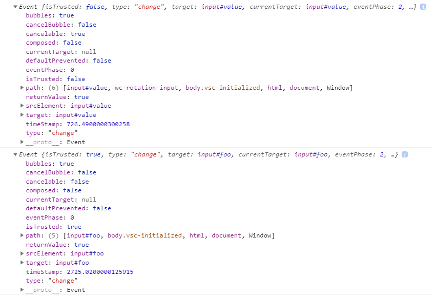
On the top is our fake change event. The bottom is a real change event. The differences are ours will be cancelable (makes sense) and and our event isn't trusted (meaning it came from the browser). In most actual scenarios this won't be a problem but be aware of it.
In the above code I made an executive choice to trigger `change` and `input` on each `pointermove`. However, this is not the only choice we could have made and we'll look at that soon.
## Attributes
The first attribute is to change the precision shown in the value label.
```js
#precision = 2;
set precision(val){
this.#precision = parseInt(val);
}
```
And we can update `pointermove`:
```js
onPointerMove(e){
//...
this.dom.value.textContent = deg.toFixed(this.#precision);
}
```
Another will be the unit type, `rad` or `deg`:
```js
#unit = "deg";
static #unitType = ["deg", "rad"];
set unit(val) {
this.#unit = validateEnum(val, WcRotationInput.#unitType);
}
```
We validate this one since we can only use those 2 types. You could save a tiny bit of code by just defaulting if you get an unexpected type but since we'll have another enum-based property we can share code and give a slightly better dev experience.
```js
//this function is not part of the class
function validateEnum(val, choices){
if(choices.includes(val)){
return val;
}
throw new Error(`invalid type, only ${choices.join(",")} allowed.`);
}
```
Another thing to think about is when the value is written. In many cases we'd have two events, one for when manipulation happens (the user is dragging the pointer) and another for when the value settles (the user releases the pointer). However, since we are writing the value to another input we need to stay within those bounds. So to remedy this ambiguity, we can add another attribute that specifies when the `input/change` event fires on the input, either during each manipulation step, or when we release.
```js
#trigger = "manipulate";
static #triggerType = ["manipulate", "settled"];
set trigger(val) {
this.#trigger = validateEnum(val,
WcRotationInput.#triggerType);
}
```
Here's how we change `onPointerMove` and `onPointerUp`:
```js
onPointerMove(e){
//...
const deg = (180 / Math.PI) * rad;
const finalValue = (this.#unit === "rad" ? rad : deg).toFixed(this.#precision);
this.dom.pointer.style = `transform: rotateZ(-${deg}deg)`;
this.dom.value.textContent = finalValue;
if(this.#trigger === "manipulate"){
this.dom.input.value = finalValue;
fireEvent(this.dom.input, "input");
fireEvent(this.dom.input, "change");
} else {
this.#currentValue = finalValue;
}
}
onPointerUp(){
this.#isManipulating = false;
document.removeEventListener("pointermove", this.onPointerMove);
document.removeEventListener("pointerup", this.onPointerUp);
if(this.#trigger === "settled"){
this.dom.input.value = this.#currentValue;
fireEvent(this.dom.input, "input");
fireEvent(this.dom.input, "change");
}
}
```
With this we have the mouse working and you can actually play around with the control. However, this is already a bit longer than expected so we'll have to finish some of the other features next time.
# Demo So Far

Latest comments (2)
SVG and trigonometry FTW! Really nice write-up.
It is fun to see how other web component nerds organize their code. There should be way more of us rather than "Framework all teh thingz!" [Don't get me wrong, frameworks have their place. Blah, blah, blah...]
Interesting note, that this.attachShadow() returns a ShadowRoot instance, but it also creates a "this.shadowRoot" property on the component. Assigning the ShadowRoot seems more readable, but it is strangely not necessary. Don't believe me? Try it. Don't assign it, and then reference "this.shadowRoot" in the subsequent code. Mind blown!
You're right, I can probably axe the extra property. Thanks for the tip!