
You often hear the phrase “diagrams as code” referring to using a text editor to write some code that can be parsed to create a diagram rather than using a graphical editor and UI to create a diagram. If however, you parse real source code to create a diagram then you are reverse engineering it. So what value does “code as diagrams” give us as engineers?
The simplicity of the structure according to Monet
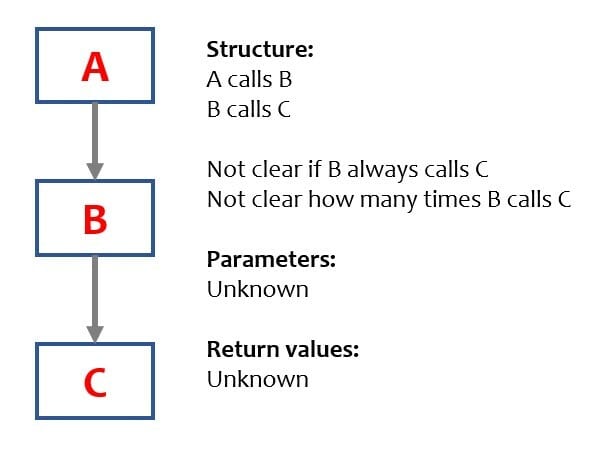
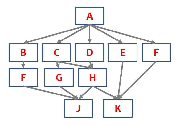
The evening scene in the painting by Monet of San Giorgio Maggiore At Dusk shows the outline of the building, with no details on the building just a dark shape. A simple graphical representation of the calling structure of a piece of software is often shown as a simple A calls B, then B calls C. On initial inspection, this basic diagram doesn’t seem to offer much value until you have seen lots of them and then it becomes easy to spot the problems. In reality, this is the human eye and mind doing complexity analysis which could be done with a command-line tool that highlights all modules over a certain value.
Beauty in the detail according to Fazio
The Hyperrealistic hand drawings that look like photos by Diego Fazio offer an amazing level of precision and detail that give a purity in the level of depth and perception. It is possible to generate diagrams of software structure that include a significant amount of detail to complete the overall picture. This extra information can include:
- sequence the functions are called in
- parameters passed into functions
- values returned
- whether functions are public or private Standard diagrams that include more details are:
- UML
-
Yourdon DeMarco structure charts, showing data and control flows.
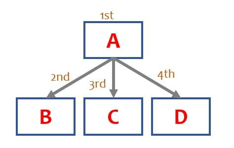
 -Jackson charts — Call charts that are read top-down and left to right to show the sequence that functions are called.
 The advantage of extra information is it allows the reader to get a fuller picture of what is going on. However, it adds clutter to the diagram and if the focus of the chart is not kept to a few modules then it becomes hard to render and view due to the sheer volume of information and complexity in trying to lay it out.
Clarity through movement
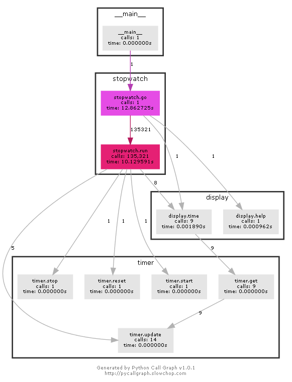
The great wave off kanagawa by Katsushika Hokusai is a block print and shows the motion of a crashing wave capturing its dynamic movement. Rather than statically analyse the call structure of software it is also possible to scan and monitor a dynamically operating piece of software. This can then show the call tree for that specific execution of the code and its paths as well as augment it with additional information. This diagram using pycalltree shows how many times each function was called (number on the arrow) and its execution time (within each box). Additionally, it has graphically grouped functions into their packages showing the logical cohesion of functions.
Deep and narrow like the Mariana Trench
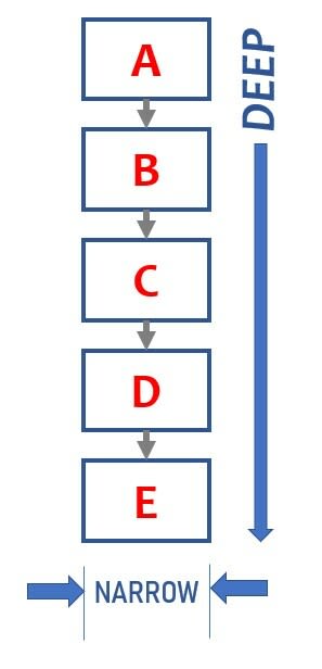
A deep and narrow structure is normally a cause for concern and further investigation. All the modules show a lack of reuse, and layers typically indicate slow software with lots of extra unnecessary calls.
Wide and shallow like the Platte River

The wide and shallow structure could be typical of a package with a large number of API endpoints. Shallow depth indicates the simplicity of each endpoint however little commonality of lower layers shows a lack of coupling within the package.
Wide fan-out like the Nile Delta

A wide fan-out typically identifies a module doing control aspects, such as implementing a finite state machine or acting as an API access point which is dependent on data for guiding the subsequent action.
Fan-out then fan-in like an Egg
Typically shows a reasonable structure with perhaps a simple public API or interface then a layer to handle logic with only a few lower-level routines for data or device access.
Flowchart Diagrams
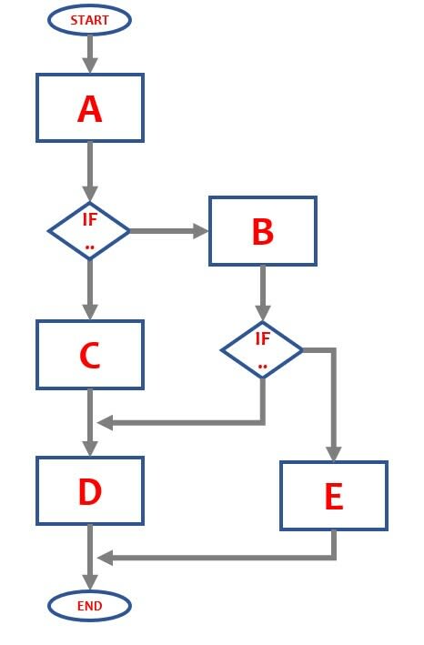
Rather than showing the hierarchial calling tree of a module it can be useful to visualise the flow of software in a flowchart. These types of diagrams have been around for a long time which has the advantage that everyone knows how to read them. Although there are some formal standards, such as the 1985 ISO5807, the symbols of a square process box and a diamond decision box are well known. Lots of tools support the basic symbols e.g. MS Word and Powerpoint, as well as other non-standard but easily understandable ones with a more pictorial representation of a device or logic.
- ISO5807 , 1985, flowchart symbols, https://www.iso.org/standard/11955.html
Nassi-Schneidermann diagram
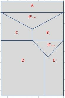
Another style of diagram to show flow was developed in 1972 by Nassi and Schnediermann, sometimes called structograms. This style of diagram is not often used. However, it does uphold good practice by not being able to represent “GOTO” commands.
- How to draw Nassi-Schneidermann diagrams in Excel — https://www.breezetree.com/articles/nassi-shneiderman-diagram/
Code size as Treemaps (Oak or Beech or Maple)
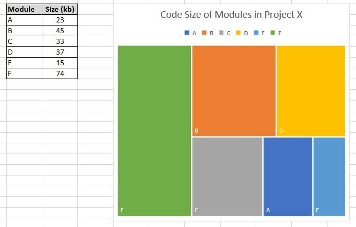
There are a variety of charts and diagrams for showing the relative size of software modules in a solution. The size of each package or function is computed as a % of the entire size and then shown as a rectangular block on a larger square that represents the entire size (100%).
- Tree maps — https://en.wikipedia.org/wiki/Treemapping
Tools
Here are a few tools (focused on Python) as an example, rather than a comprehensive list:
- pyflowchart — https://pypi.org/project/pyflowchart/ parses static Python code to create a structured text file that can be rendered into a diagram showing the flow of the code.
- pycallcallgraph — https://pycallgraph.readthedocs.io/en/master/index.html# — traces dynamic execution of python software to produce a call tree.
- pynsource — https://github.com/abulka/pynsource — parses static python code to produce UML class diagram, see in action at gituml
- pylint and pyreverse — https://www.pylint.org/
- Excel for Nassi-Schneidermann charts
- Excel for treemap charts
Final Thoughts on getting the right perspective
All of the diagrams discussed have a benefit to the reader and the key is being able to see the required view or views, i.e. having the right tool for the job and at the right level of resolution and granularity (rather than google earth at maximum zoom). There is a range of tools on the market which either need to be chained together to get a variety of views or only give a single outlook. The top end of the toolchain with CASE tools/design tools gives a more holistic solution but there is not a wide industry adoption of a common approach or product.

Final thoughts on what is the right tool for the job?
When reverse engineering a software application we currently use a variety of separate and disparate tools. These tools can be connected and sequenced by a CI/CD build pipeline and the output viewed using text editors, image viewers, and a browser but it doesn’t feel very integrated. As modern-day code development platforms have become more advanced, we have evolved from notepad.exe and vi to more complex IDE environments with a myriad of customised plugins. Having a real-time view of these various perspectives with a code editing environment feels like the holistic way to go, the equivalent of a holo-lens visor for a technician working on a complex nuclear reactor who needs to know which wire to cut.
More About The Author
Greg is an experienced software professional and CTO at outsource.dev , having worked in several businesses he is now passionate about helping others succeed in software development, management, and outsourcing.
If you enjoyed this article then please like it and follow me.


Top comments (0)