
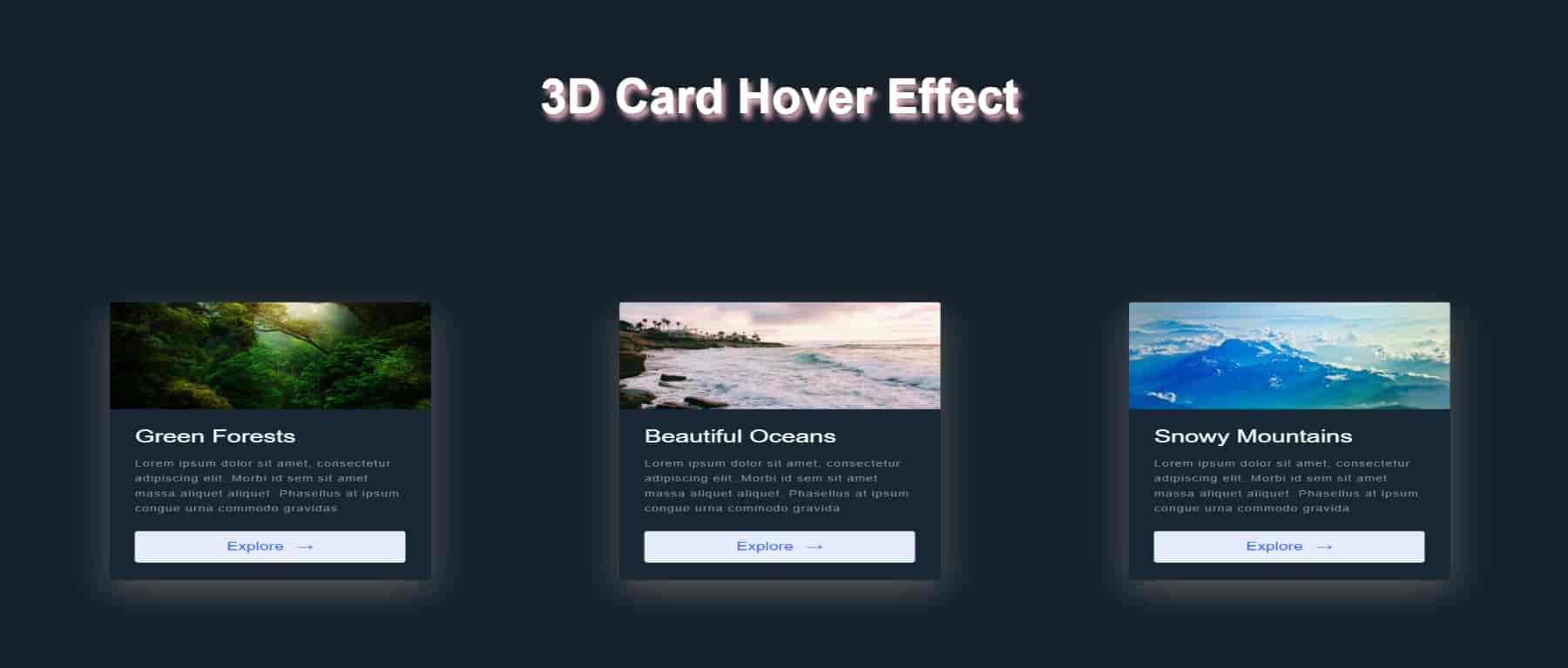
In this post , we are going to create very 💖 beautiful and unique 3D card hover effect with HTML and CSS. We will use some modern properties in CSS to achieve this effect. Below is the demo of what we will create in this post -

We will proceed as below:
- Creating a HTML Markup.
- Adding Basic Styling For All Elements.
- Creating Actual Hover Effect.
So lets first add all the HTML code to build required structure.
🚧 Creating HTML Markup
<body>
<h1 class="heading">3D Card Hover Effect</h1>
<div class="container">
<div class="item">
<div class="card"><img class="card__img"
src="https://images.unsplash.com/photo-1588392382834-a891154bca4d?ixid=MXwxMjA3fDB8MHxzZWFyY2h8NXx8bmF0dXJlfGVufDB8fDB8&ixlib=rb-1.2.1&auto=format&fit=crop&w=500&q=60"
alt="Green Forests">
<div class="card__content">
<h1 class="card__header">Green Forests</h1>
<p class="card__text">Lorem ipsum dolor sit amet, consectetur adipiscing elit. Morbi id sem sit
amet massa aliquet aliquet. Phasellus at ipsum
congue urna commodo gravidas</p><button class="card__btn">Explore
<span>→</span></button>
</div>
</div>
</div>
<div class="item">
<div class="card"><img class="card__img"
src="https://images.unsplash.com/photo-1505245208761-ba872912fac0?ixid=MXwxMjA3fDB8MHxzZWFyY2h8Mzd8fG5hdHVyZXxlbnwwfHwwfA%3D%3D&ixlib=rb-1.2.1&auto=format&fit=crop&w=500&q=60"
alt="Beutiful Oceans">
<div class="card__content">
<h1 class="card__header">Beautiful Oceans</h1>
<p class="card__text">Lorem ipsum dolor sit amet, consectetur adipiscing elit. Morbi id sem sit
amet massa aliquet aliquet. Phasellus at ipsum
congue urna commodo gravida</p><button class="card__btn">Explore
<span>→</span></button>
</div>
</div>
</div>
<div class="item">
<div class="card"><img class="card__img"
src="https://images.unsplash.com/photo-1431512284068-4c4002298068?ixid=MXwxMjA3fDB8MHxzZWFyY2h8OTB8fG5hdHVyZXxlbnwwfHwwfA%3D%3D&ixlib=rb-1.2.1&auto=format&fit=crop&w=500&q=60s"
alt="Snowy Mountains">
<div class="card__content">
<h1 class="card__header">Snowy Mountains</h1>
<p class="card__text">Lorem ipsum dolor sit amet, consectetur adipiscing elit. Morbi id sem sit
amet massa aliquet aliquet. Phasellus at ipsum
congue urna commodo gravida</p><button class="card__btn">Explore
<span>→</span></button>
</div>
</div>
</div>
</div>
</body>
Here we have div with class 'container' which will be the parent of all the three cards. Then we are having each 'card' inside div with class
'item'. Each 'card' div has its image,its header and some text related to it. It also has one button inside it.
So that's the basic HTML markup of the webpage we are going to build.
Now lets see add some styling for all the elements like 'card',img,text inside card, button and also some styling for layouting of card.
🦋Basic Styling For All Elements
Below is the CSS code for styling of these elemets -
*,
*::before,
*::after {
    margin: 0;
    padding: 0;
    box-sizing: inherit;
}
html {
    box-sizing: border-box;
    font-size: 62.5%;
}
body {
    padding: 6rem;
    background-color: #15202b;
    color: white;
    font-family: "Inter", sans-serif;
}

.heading {
    font-size: 4rem;
    text-align: center;
    margin-bottom: 3rem;
    text-shadow: 3px 4px 5px pink;
}

.container {
    display: flex;
    justify-content: space-around;
    align-items: center;
    flex-wrap: wrap;
}

.item {
    background-color: #192734;
    border-radius: 0.4rem;
    overflow: hidden;
    cursor: pointer;
    width: 30%;
    transition: .5s all ease;
    box-shadow: 0px 20px 50px #555;
}
.card__img {
    display: block;
    width: 100%;
    height: 18rem;
    object-fit: cover;
}
.card__content {
    padding: 3rem 3rem;
}
.card__header {
    font-size: 3rem;
    font-weight: 500;
    color: #fff;
    margin-bottom: 1.5rem;
}
.card__text {
    font-size: 1.5rem;
    letter-spacing: 0.1rem;
    line-height: 1.7;
    color: #8899a6;
    margin-bottom: 2.5rem;
}
.card__btn {
    display: block;
    width: 100%;
    padding: 1.5rem;
    font-size: 2rem;
    text-align: center;
    color: #3363ff;
    background-color: #e6ecff;
    border: none;
    border-radius: 0.4rem;
    transition: 0.2s;
    cursor: pointer;
}
.card__btn span {
    margin-left: 1rem;
    transition: 0.2s;
}
.card__btn:hover,
.card__btn:active {
    background-color: #dce4ff;
}
.card__btn:hover span,
.card__btn:active span {
    margin-left: 1.5rem;
}

@media (max-width: 992px) {
    .item {
        width: 45%;
    }
}

@media (max-width: 768px) {
    .item {
        width: 80%;
    }
}
So this is the all basic styling needed to style our webpage. After this we will now see how we can create the actual 3D Card Hover Effect
with some interesting CSS properties.
😉 Creating Actual 3D Hover Effect
Firstly , for giving starting position to our cards , we will add transform property to it which will have value as rotateX(45deg) scale(0.7). Now here
-
rotateX()- TherotateX()method rotates an element around its X-axis at a given degree in 3 dimensions. -
scale()- Thescale()method increases or decreases the size of an element (according to the parameters given for the width and height). these methods will make our item to be rotated along X-axis with 45 degrees with its size decreased to 0.7 of its original size. ```css
transform: rotateX(45deg) scale(0.7);
Now by adding this line we won't get our initial positions of our card , instead we will get it as below -
from which it looks like item is scaled down to 0.7 of its original size but it doesn't look like it has rotated through 45 degrees around X-axis. But it did. It doesn't look like rotated because while doing 3D transformation we have tell browser that how far is that item from the user's eyes. And to do that we can use `perspective` property in CSS.
### 🧐Perspective In CSS
1.The `perspective` property is used to give a 3D-positioned element some perspective.
2.The `perspective` property defines how far the object is away from the user. So, a lower value will result in a more intensive 3D effect than a higher value.
3.When defining the `perspective` property for an element, it is the CHILD elements that get the perspective view, NOT the element itself.
To learn more about `perspective` in CSS and other properties related to it like `perspective-origin` [Click Here](https://developer.mozilla.org/en-US/docs/Web/CSS/perspective)
So now to get desired positioning of our items , we will add `perspective` property to container which is a parent of item components and set its value to `900px`(While using perspective you should try and test values to get desired look).
```css
.container {
perspective: 900px;
}
So now we will get correct initial look for our cards which is as below -

So that's hard part done. Now we only have to add hover state to our item which will be its normal position for which we will set transform property as rotate(0deg) scale(1).
.item:hover {
    cursor: pointer;
    transform: rotate(0deg) scale(1);
    transition: .5s all ease;
    z-index: 400;
    box-shadow: 0 2px 2px rgba(0, 0, 0, 0.16);
}
And with that we have completed our beautiful and awesome 3D Hover Effect. I know perspective property is little difficult to understand. But with practicing more examples and reading docs you will get comfortable with it.
For more articles related to programming do visit my
Personal Blog.
I Hope this will help you guys. Thanks 😇 for reading as always.

Oldest comments (5)
It looks like the animation from a Yu-gi-oh! videogame. Pretty cool
So much memories
Please share a codepen for this! Apart from that, nice animation!
Dropped it in codepen. See codepen.io/r-i-c-h/pen/GRrwPXQ Layout doesn't really work out very because the spacing is dependent on the full size cards...
wow, super cool